Last week, I laid out my 2020 to-do list. Perhaps more importantly, this week I want to share 20 things NOT to do for the new year. Forgive me if this comes off as a rant, but some things simply need to be said!
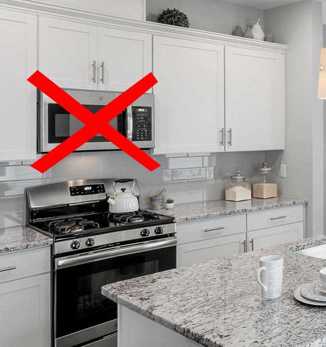
- Placing the microwave over the stove: We can do better than that! Find a more accessible (and less conspicuous) spot for this appliance, preferably away from the rest of the cook area.
- 6’-8” tall doors next to 8′ tall windows: It’s not a good look when your wimpy doors are overshadowed by your expensive windows. Add a transom, or better yet – spec taller doors!
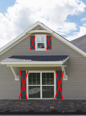
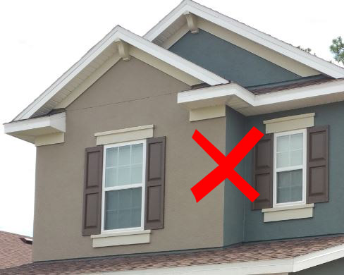
- Shutter Foul: I know most shutters are purely decorative, but at least pretend that they are functional. If the shutters aren’t large enough to cover the window, don’t bother. The other point is on placement, shutters don’t close over trim (as seen below).
 Instead, just show the header and sill with shutters as demonstrated below:
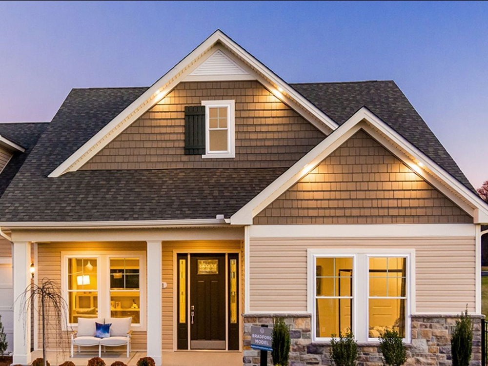
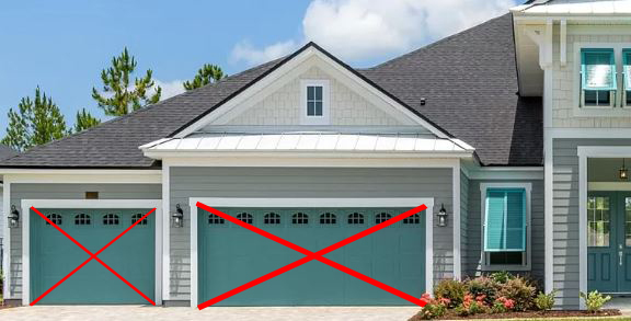
This is also a good time to note that while shutters can enhance certain architectural styles, they are not a last-minute afterthought to infuse character into a house! But I digress… Moving on. - Garish accent-colored garage doors: A pretty garage door is never a bad thing, but the primary focus should be on the front door. Don’t let the garage overwhelm it!
- Automatically restricting the dishwasher to the right of the sink: Instead, locate the dishwasher where it works best for both loading and unloading. Consider where most cabinets are in the kitchen. If that happens to be on the right, great. But it isn’t always the case, so don’t restrict yourself.
- Thinking 42” is enough clearance between the island and the countertop: Put simply, it’s not. Make 48” your minimum and 56” your goal.
- Tiny garages: I know I mentioned that we want to de-emphasize the garage, but what’s the point in having one at all if you can’t use it properly?
- Changing color and/or materials on outside corners: Think of it as the color of the entire mass, not just the front. Change colors on inside corners.
- Cutting corners on the front elevation. The front elevation adds value for the customer and the community. It is the one thing the buyers can’t easily upgrade after they move in.
- Limiting your streetscape to just three styles. Consider six styles for the community, then vary the styles from house to house.
- Cutting costs at the last minute: The results could be disastrous. Be strategic about your choices from the beginning.
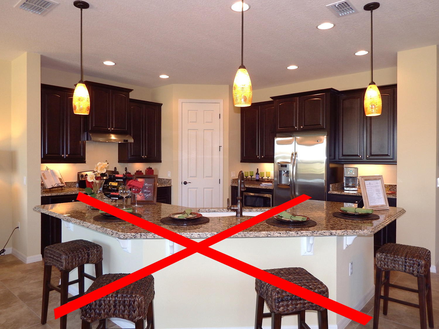
- Bat wing islands/peninsulas: Costly, inefficient, and outdated – and yet I still see them in new homes! Let’s make 2020 the year we say farewell (and good riddance) to the bat wing.
- Letting plans stagnate in a strong market: Now is not the time to grow complacent (is it ever?). Continue to improve your plans so they will be better than the competition.
- Overdoing farmhouse white: It’s a good look, but if we’re not careful, farmhouse white is going to become the next builder beige.
- Letting your personal tastes overtake the house: Trust me, I sometimes have to remind myself that most buyers aren’t as in love with red as I am. Unless you are the buyer, don’t fill the house as if it’s your own. Instead, focus on your buyer’s wants and needs.
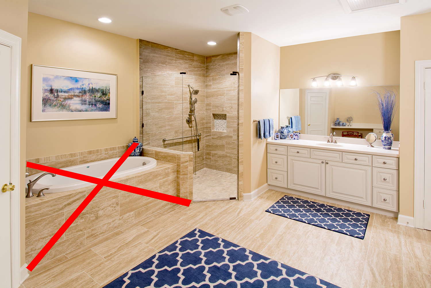
- Specifying giant tubs over large showers: The shower takes precedence over the tub. If you are pinched for space, leave out the tub.
- Visiting the house only during the day: Walk them at night to experience how your buyers will view them at night. You might end up adding or moving the lights.
- Shallow front porches: Consider a minimum of 6’ inside the columns. If you’re using a Craftsman style pier that is 2’ square at the base, make the porch 8’ deep.
- Snout garages: They aren’t cost effective, they’re ugly, and they eat up the precious backyard. Need I say more?
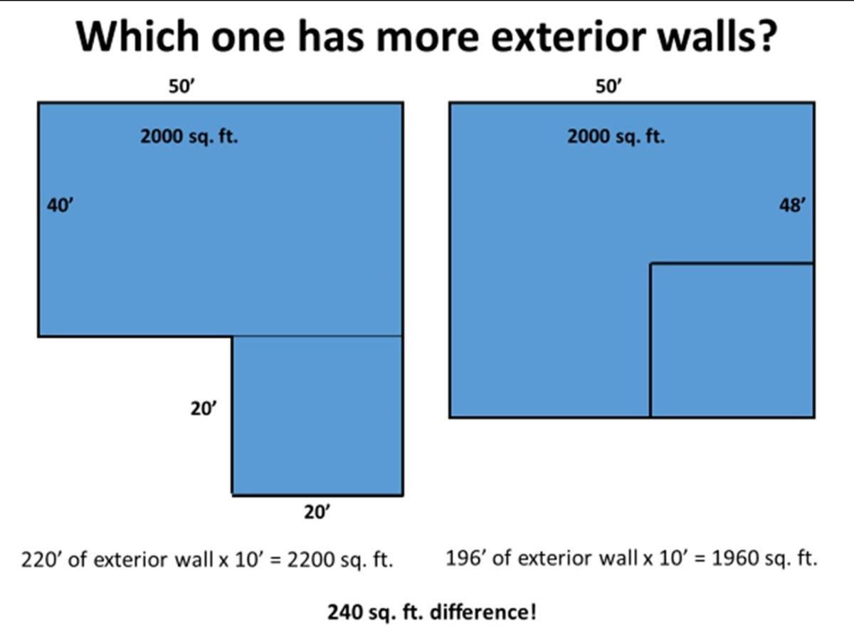
- Pinching pennies on the design of the home: Sounds a bit self-serving, I know. But builders know more than anyone that you get what you pay for. Instead, focus on the value a great design will add to your bottom line
Whew! I’m glad I got that off my chest. Are there any other things that you want to see go away for 2020? It takes all of us. Let’s make this decade the best yet!
Categorized in: Trends in Design
This post was written by Housing Design Matters

