I received a picture of an ugly house yesterday – and it made me mad.
Look, I understand the dilemma we all face trying to build affordably. But we can’t lose sight of the fact that this will be someone’s home. Don’t we want our homeowners to have pride in their houses? Shouldn’t we show respect for the other houses in the neighborhood? Imagine how you would feel if one of the houses we’re about to review was built next door.
Box on Blah
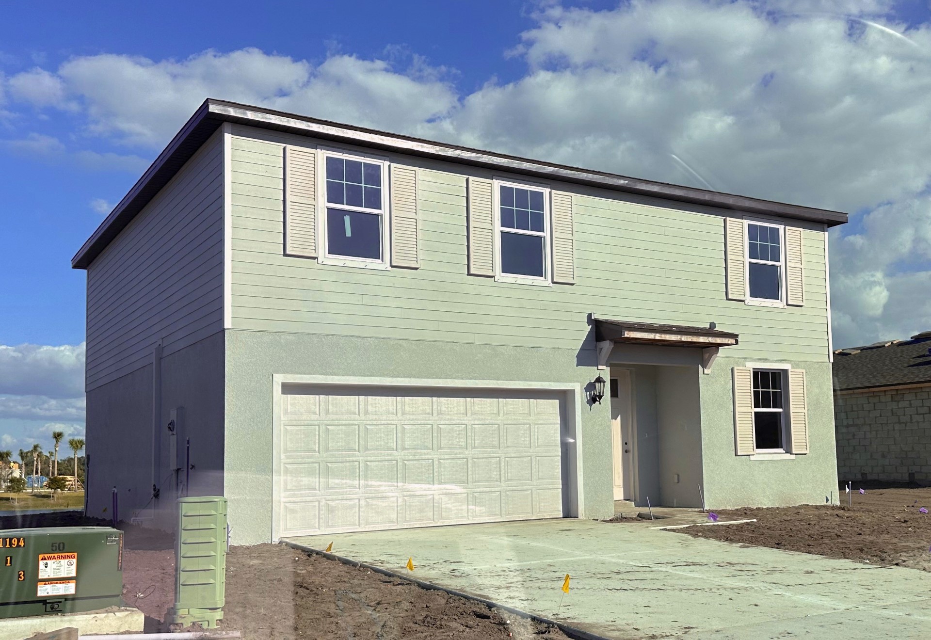
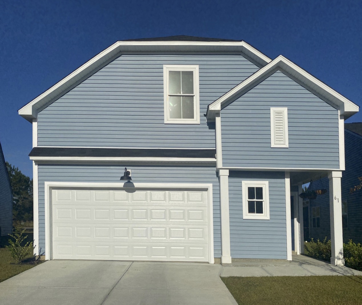
The first ugly house is a box on box, two story house with a tiny roof over the front door.
Doesn’t exactly conjure warm feelings of home. Note the giant blank space above the tiny shed roof, which tells me a larger entry element may have been designed for the blank space but was value engineered out. Ouch. What’s worse is there is very little from keeping the rain off guests as they walk to the front door.
Missed opportunity to use color
The potential impact of the siding on the second floor is completely lost since it was painted the same color as the stucco. A second body color separated with a white floor band would help. Lastly, the shutters and the front door should pop with an accent color.
How much more does this cost?
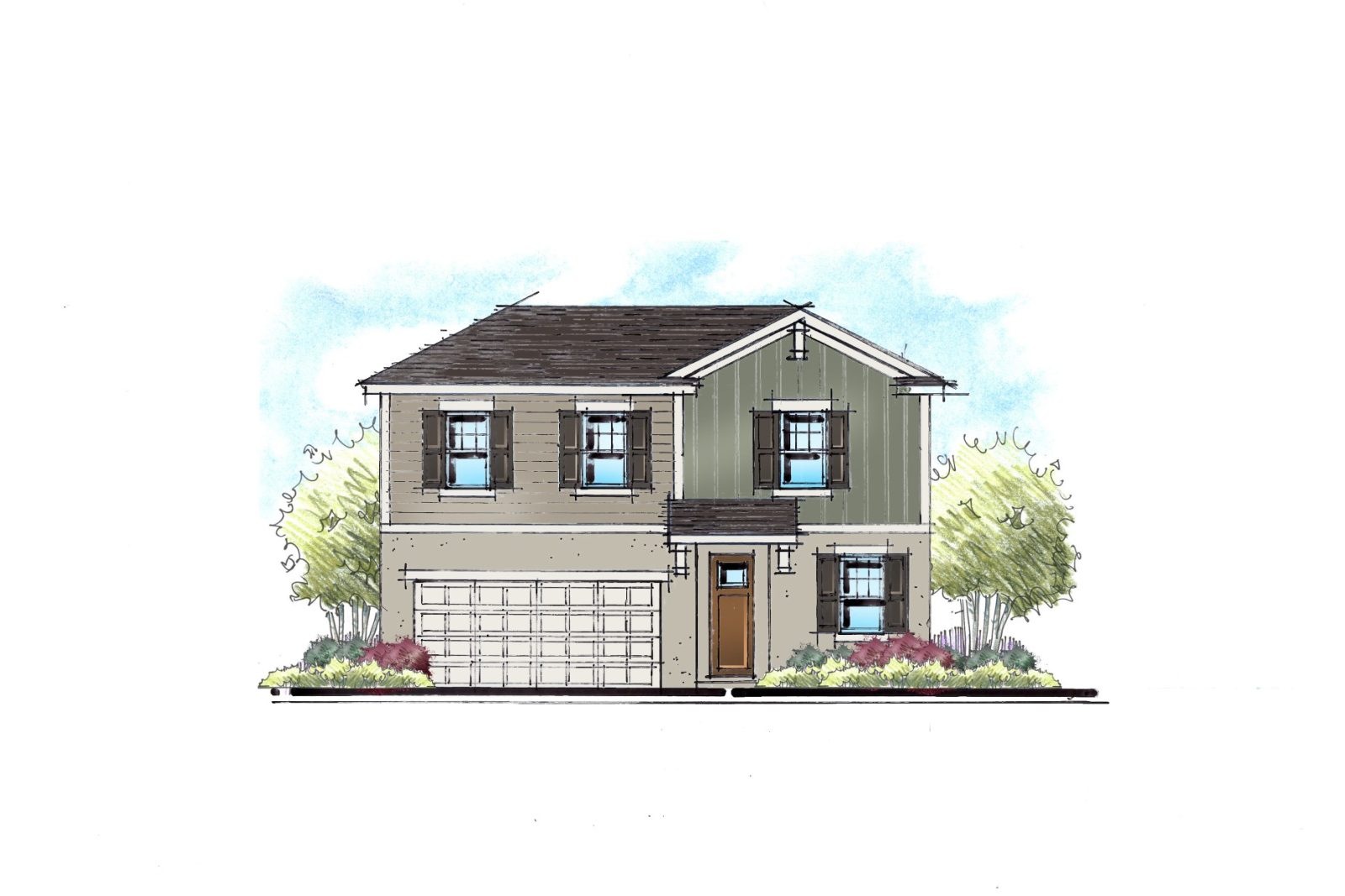
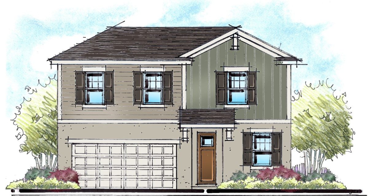
Our first instinct was to add a porch. But porches are expensive. We then looked at some incremental changes that we feel make the box feel better. Let’s start with a higher pitch on the shed over the front door. Then, without adding any windows, we moved one second floor window to get rid of the blank spot over the front door. Next, we popped a gable over this window. Yes, this adds cost, but it also draws the eye to the entry side of the home and away from the garage door. Lastly, we changed the siding profile in the gable and added one bracket to the peak of the gable to tie it all together.
Small changes that make for a big impact. What do you think?
The giant vent house
The next house that bothers me has a weak attempt at an entry feature. Hey – at least they were trying. But what is it, really? It’s not a porch, since the left column is up against the house. I believe this house would benefit from extending the shed roof over the garage door to this element.
Cyclops Alley House
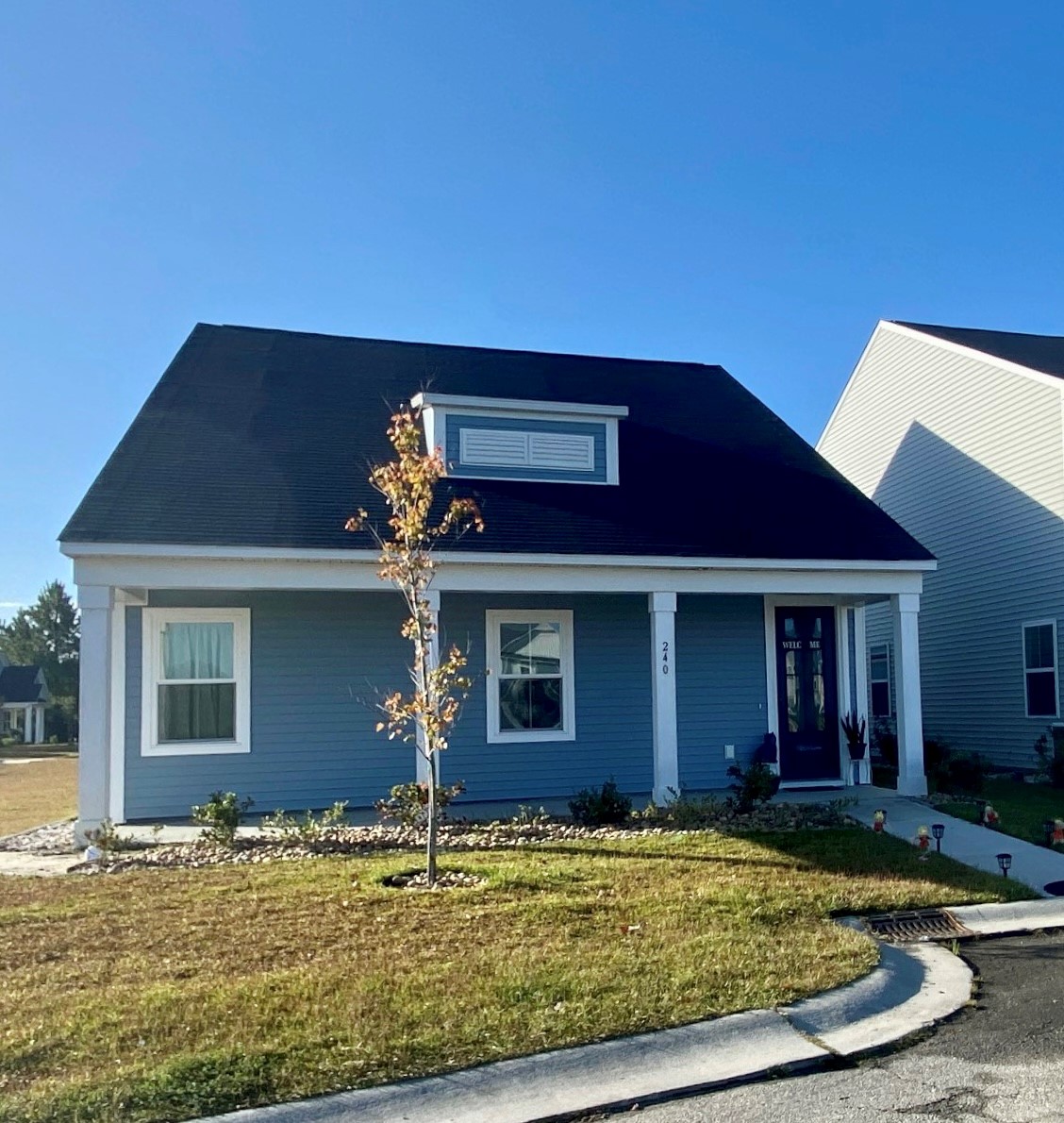
So often, we hear that alley-loaded houses look so much better than front-loaded houses. But that doesn’t seem to be the case with the Cyclops house with the faux dormer.
Notice the relationship between the columns and the windows – there isn’t one. I would love to add shutters to the windows and center them between the columns. Here too, I would add a gable of the front door and lose the dormer. Imagine walking up to this front porch during a torrential downpour – there’s nowhere for that water to go other than your head!
In a market where bringing costs down is at the forefront of everyone’s mind, it’s important to remember that this is the most important purchase in a home buyer’s life. I believe we can and should design attainable homes without completely abandoning good design. How would you fix these two houses? I’d love to hear your thoughts. Thanks
Categorized in: Affordability, Uncategorized, Value Engineering
This post was written by Housing Design Matters
