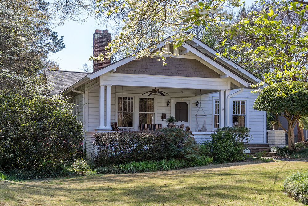
We have all seen them – alterations made by homeowners that make you scratch your head. Or, if you’re an architect, make you want to pull your hair out – especially when those aberrations (as I like to call them) ruin an otherwise adorable home. Oh yes, this week is going to be a design critique blog!
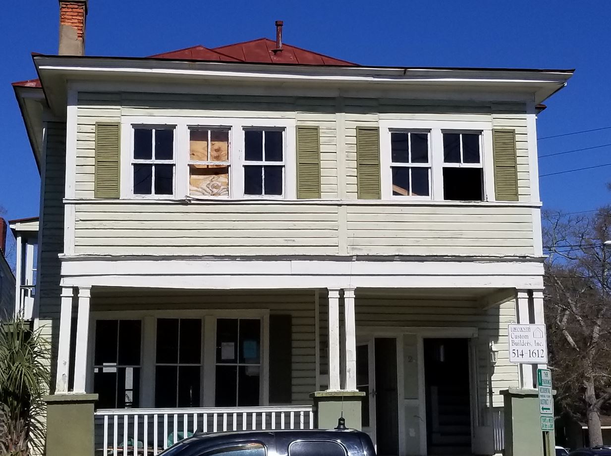
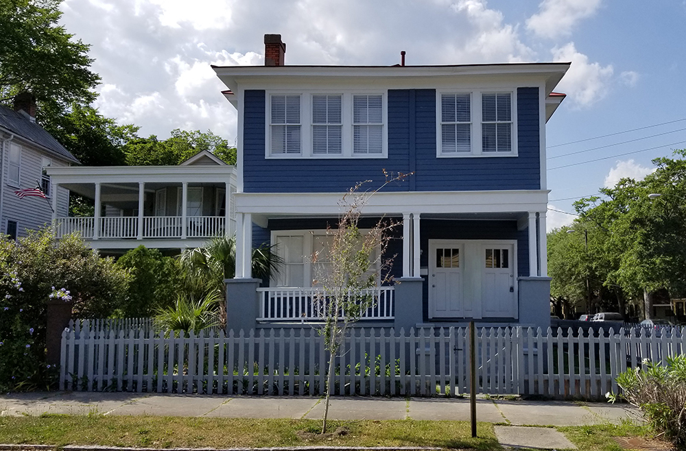
But even adorable houses need to be altered as time goes by. Often, those alterations are to capture additional interior square footage. That may mean closing in a front porch. One of our recent renovations in downtown Charleston had obviously been altered over time. During our renovation, we attempted to right the architectural wrongs – but chose to keep the additional square footage.
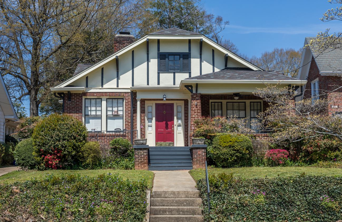
Another small South Carolina town has a charming street filled with some excellent examples of Craftsman architecture (special thank you to Rebecca Lehde of Inspiro 8 Studios for the photography)
Beautiful! Then there’s aberrations. Like the Charleston example, many were an attempt to capture more square footage – some more successful than others.
Why is the porch roof so low?
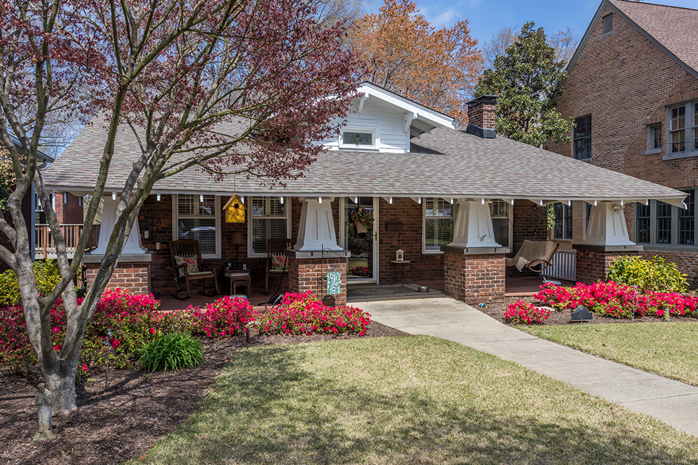
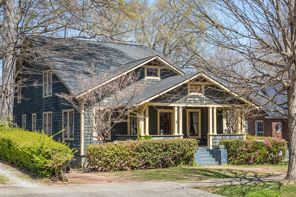
One such house has a super low front porch roof – contrasted with extra large craftsman columns on brick piers. At first you notice the columns and bases look too fat. Then you realize the are actually too short – making them look fat. And they are too short because it appears the front porch roof has been extended so far it falls below the top of the front door – hopefully the homeowner isn’t tall.
Half a Porch
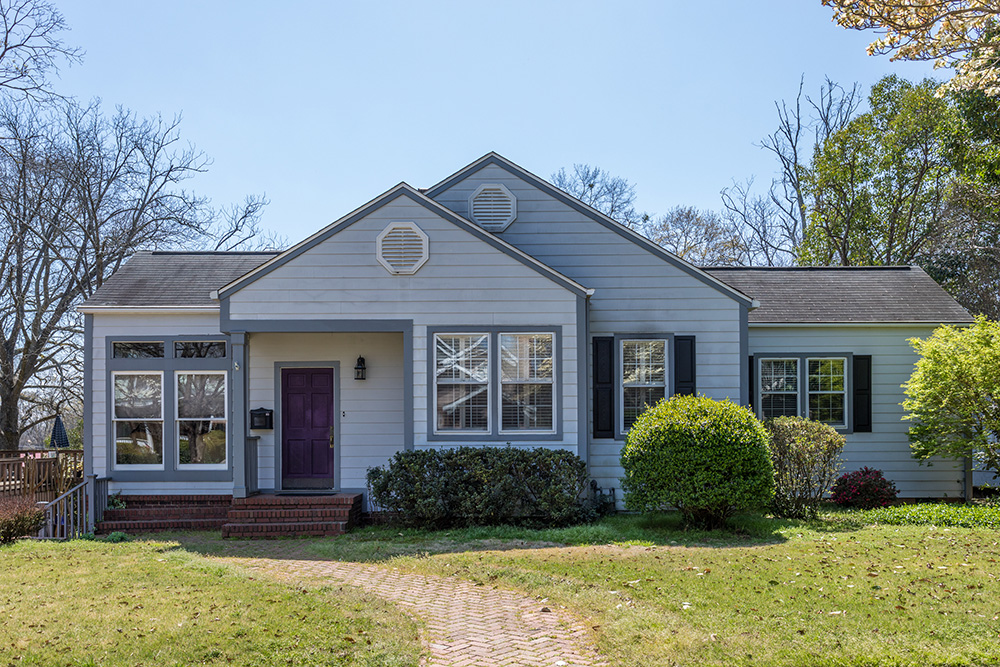
This next example is full of irregularities. Let’s start with the forward most gable which has been cut in half. To my eye, I’m guessing that was a wide porch – now half-filled in. To the left of the half porch is another addition whose windows are much higher than the rest of the home. Turns out, many of the houses in this neighborhood had drive-under port cocheres. Looks like this one was filled in. Then to add further insult to a house now devoid of it’s original character, let’s slap some skinny shutters onto a pair of double windows. The cherry on top are the two octagonal vents. This hasn’t aged well.
The big forehead
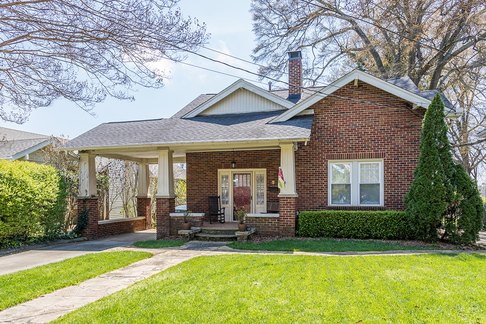
I am not certain what happened here, but the result doesn’t make sense. Why is the gable on the right so high and plain? It makes me wonder if there used to be a cool detail over the window that was removed when brick was added. Then you have the gable over the front porch – looking a lot like T1-11 siding from the sixties. We should also give special mention to the porte-cochere growing out the left side of the house.
Classic Shutter Foul
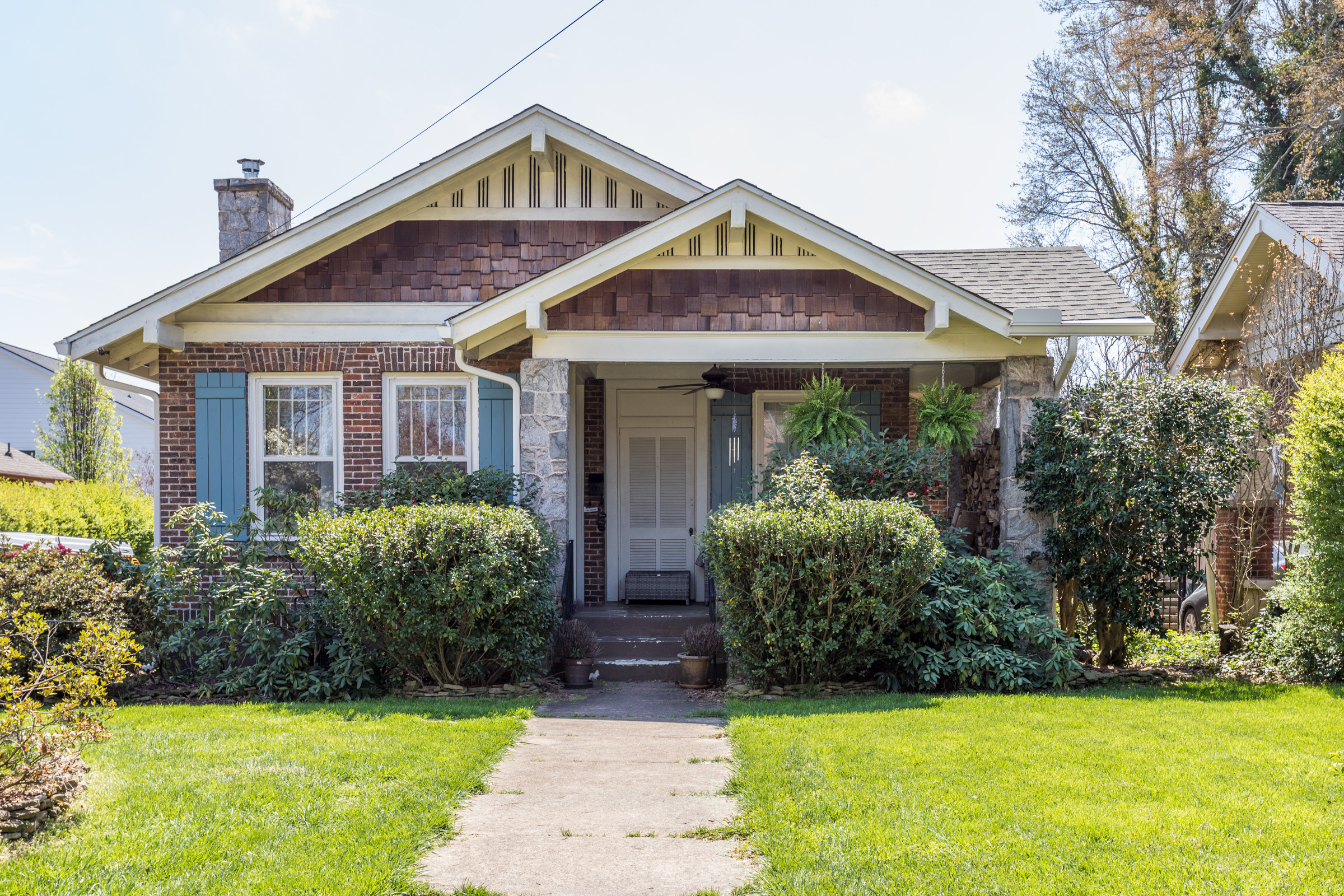
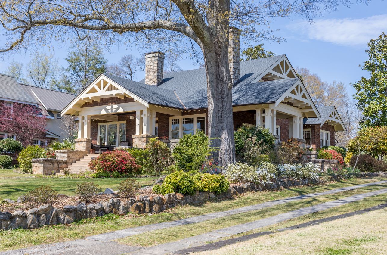
At first glance, this next house is adorable with the cute front porch, broad overhangs, and super cool gable vents. Why then, with all the animation created by three exterior materials (brick body, stone columns, and shake shingle gables), did someone feel the house needed shutters? And since the windows are close together, only shutters on one side… This is at least an easy fix.
In this off-white Craftsman, Palladian windows were added above the front porch. It that wasn’t incongruous enough, they decided to add shutters on each end – sending me spiraling.
Off-centered front porch
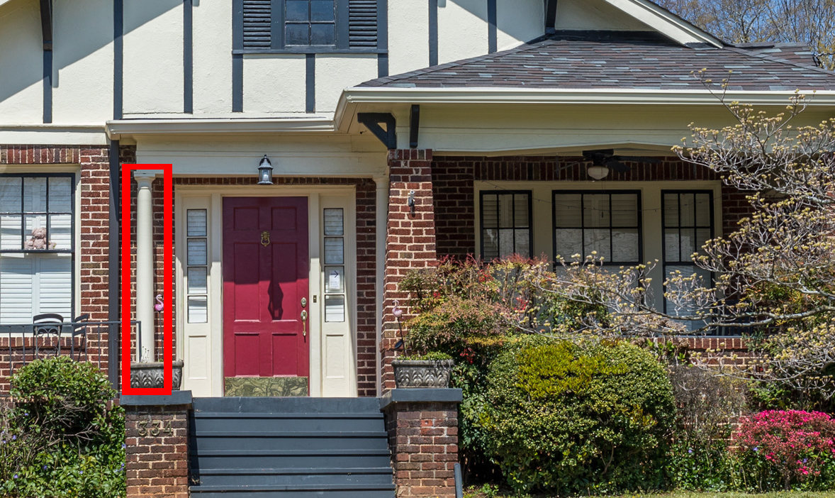
Here is another example I can’t quite wrap my head around. The front porch is to the side of the front door, resulting in an uncovered entry. Hey, it rains in South Carolina. Uncovered doors often leak and leave arriving guests soaked when it rains. Was the front door moved? The little bit of roof over the front door is obviously an after-market aberration along with the super skinny round column – an absolute insult to the broad, tapered brick columns to the right.
Where is the beam?
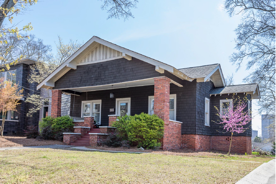
This next example has fabulous, broad front porch. But where is the beam spanning between the two broad columns? In silent protest of its invisible beam, the front porch appears to have a little sag in it…
A true Craftsman style house would let the beam be expressed as seen below.
Centered on the mailbox
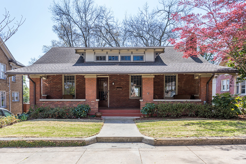
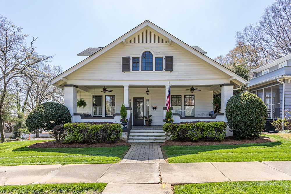
The last example is a very handsome craftsman with a broad front porch, held up by sturdy brick piers and top with a four-window wide shed dormer. But front and center of the porch – in line with the sidewalk is the mailbox? Convenient for the mailman, but not the most welcoming entry.
I hope you found this pictorial journey entertaining if not educational. I know as architects; I can help our client’s convert old houses to be more functional for today’s lifestyle – without ruining the character of the original house. I hope other design professionals and builders will join me in preserving the old while making homes livable today.
Categorized in: Uncategorized
This post was written by Housing Design Matters

