Some people simply prefer symmetry. This applies to front elevations, but it also extends into the house. For these folks, asymmetry makes them very uncomfortable. There’s no discussion, “Just change it!” Conversely, the folks who like asymmetry aren’t bothered by symmetry; they just find it less interesting (perhaps boring) and predictable.
Front elevations
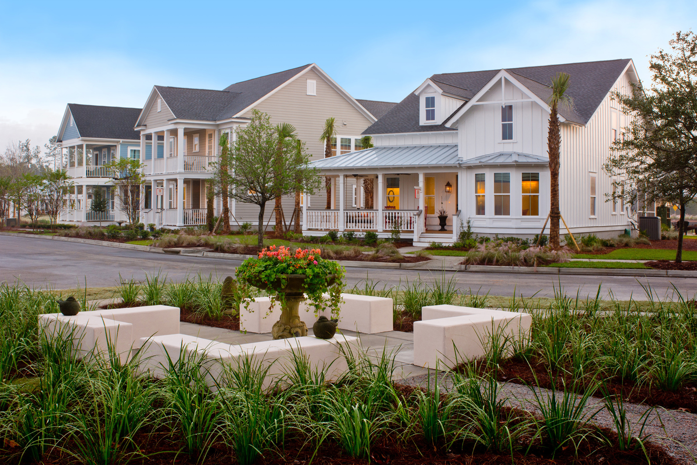
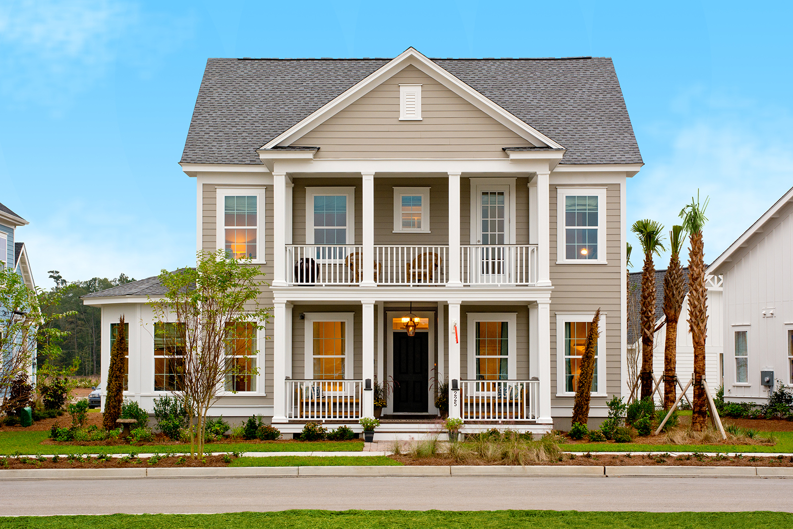
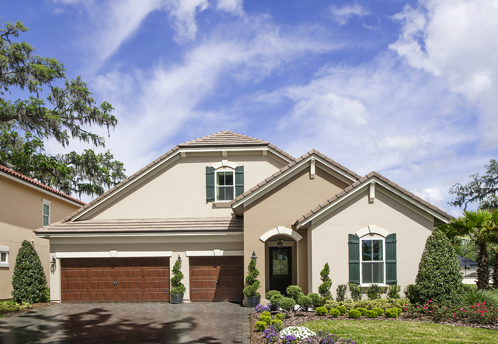
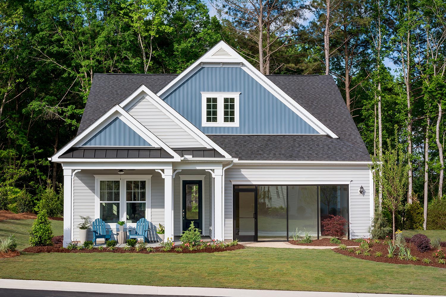
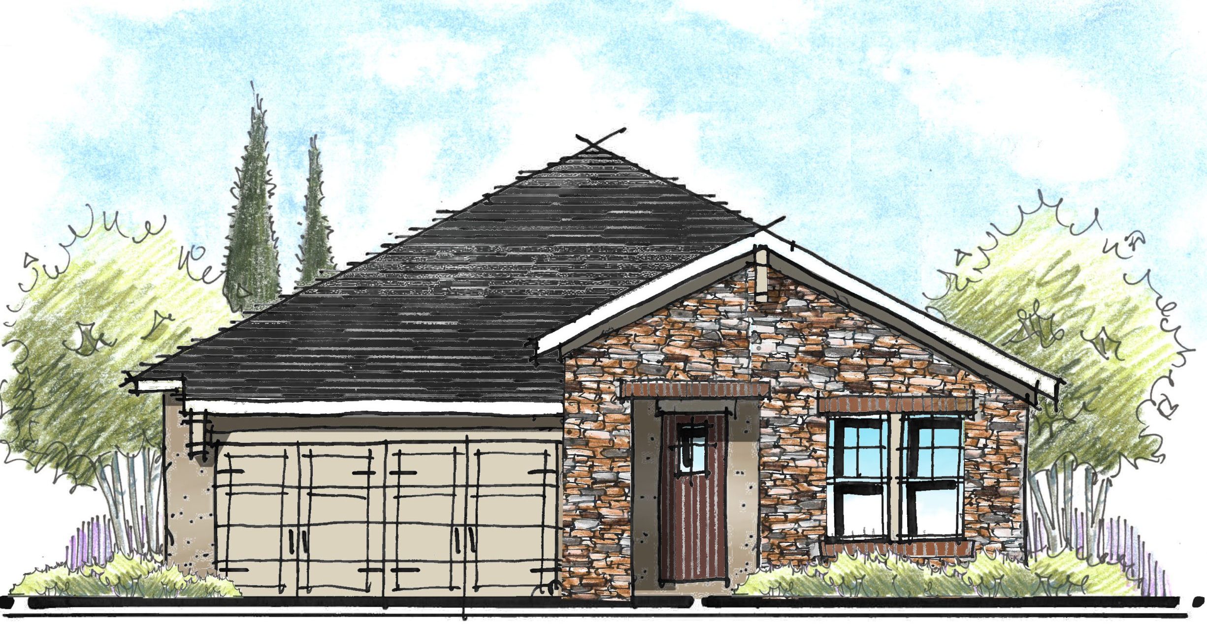
In many cases, to achieve symmetry on a front elevation, sacrifices and compromises need to be made to floor plans. In some cases, symmetry is simply impossible to achieve – say on a 30’ wide house with a 2-car garage. A two story, alley loaded plan is a great opportunity to achieve a symmetrical front elevation. Many traditional styles like Georgian or Italianate lend themselves to symmetry.
Other styles, like Tuscan and French Country, thrive in asymmetry based upon the additive nature of the style.
Making Asymmetry Work
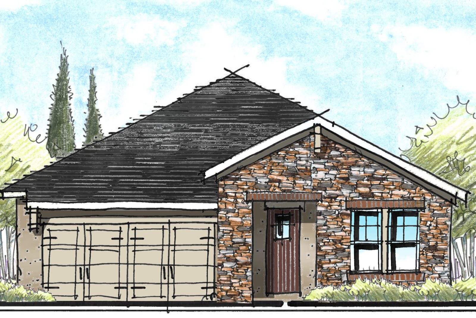
If you’re looking to add an asymmetrical elevation to your offering, you need to be looking to add balance to the design. How do you create balance in a asymmetrical home? Imagine Lady Justice, blind-folded and holding up a scale in front of your house: Does it balance? If not, see if you can add visual weight to one side or the other to balance the shapes. This can be accomplished in the form of gables, towers, etc. Dark colors or masonry can add visual weight as well.
Streetscape
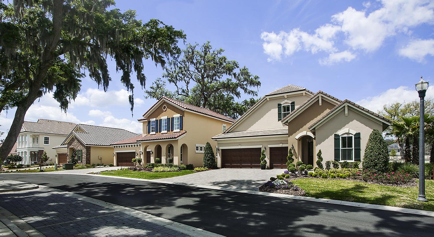
Consider offering a variety of symmetrical and asymmetrical elevations to your streetscape. This is essential to capture the symmetry-only buyer. If you’re the builder and you only like symmetry – I strongly urge that you broaden your horizons and remember you’re not buying all the houses! Adding asymmetrical elevations will create a more dynamic and interesting streetscape. And yes – some people really do prefer asymmetry!
The Kitchen
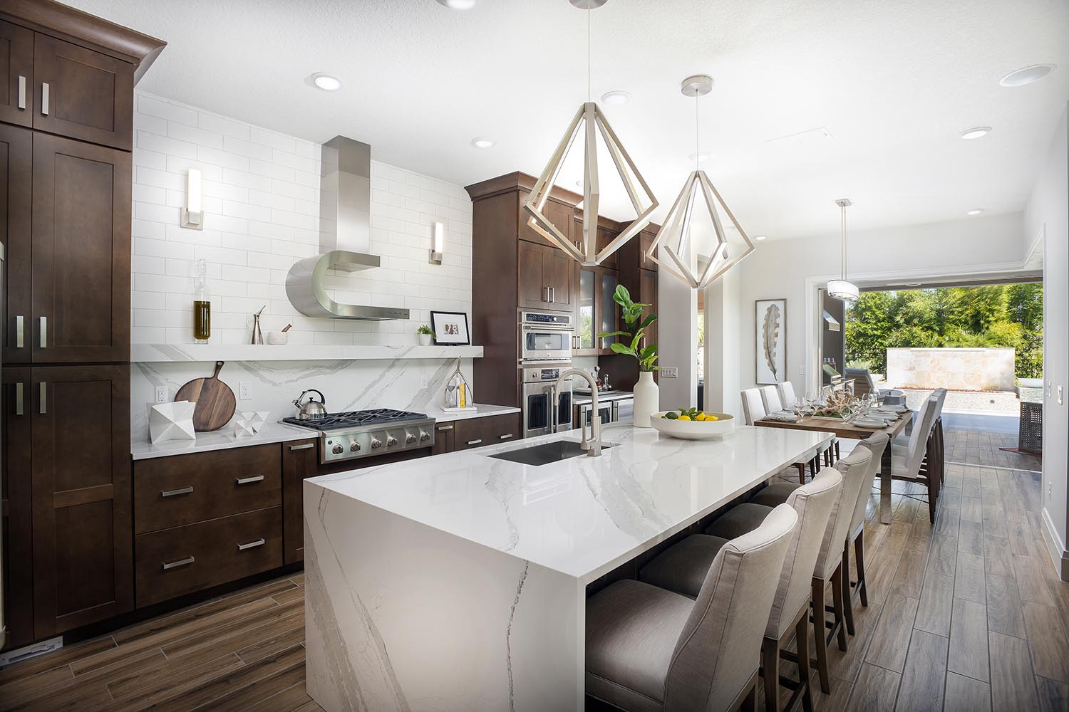
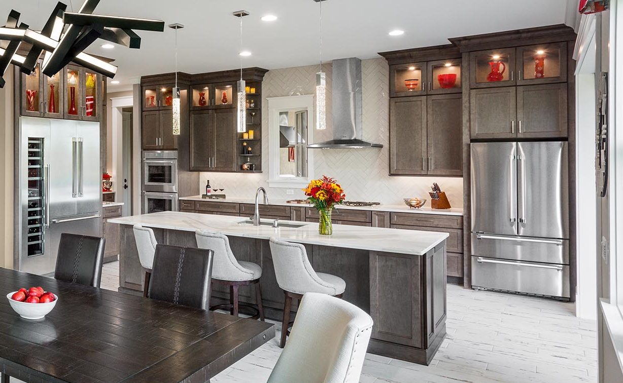
Moving into the kitchen, here again, I find buyers and designers who demand symmetry in their kitchen cabinets – especially the cabinets directly behind the kitchen island. But that is not always possible. You may have a very symmetrical design with a range, but when the buyer selects the cooktop and wall oven option, the symmetry is lost. Placing the full height elements is the key – like the refrigerator and oven tower.
But what if you have two refrigerators? It’s not perfectly symmetrical, and you know what? It works beautifully!
The Owner’s Suite
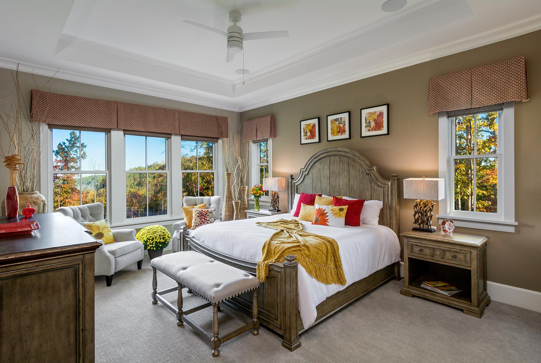
Let’s say you have a room that has a 16’ long bed wall. One interior designer that I worked with demanded the bed be centered on that wall. But that meant there was no longer room for the two chairs at the end of the room. Of course, moving the bed down should not have been an issue – unless of course there are windows placed an either side of the bed – centered in the room.
Instead, slide the flanking windows down to one end of the room leaving approximately 7’ in between for the headboard. This will leave room for the chairs.
Closet Doors
Don’t be lulled into letting CAD center the door in your strip closet without taking a closer look. Often, sliding the door down away from the corner will allow room for a night stand at the end of the bedroom. Consider leaving two feet of wall before starting your closet doors – yes, even if this means they are not center.
Clothing
I digress, but asymmetry in woman’s clothing is a thing. You see it in neck lines, different lengths of a shirt or skirt. I am a big fan of asymmetry in my clothing.
Which side of the symmetry debate do you lean? Do you embrace (balanced) asymmetry or do you love the comfort and structure of symmetry? I personally love both. I do enjoy the challenge of creating balance with an asymmetric elevation.
Categorized in: Exterior Styles, Housing Design Tips, KitchenDesign, Uncategorized
This post was written by Housing Design Matters
