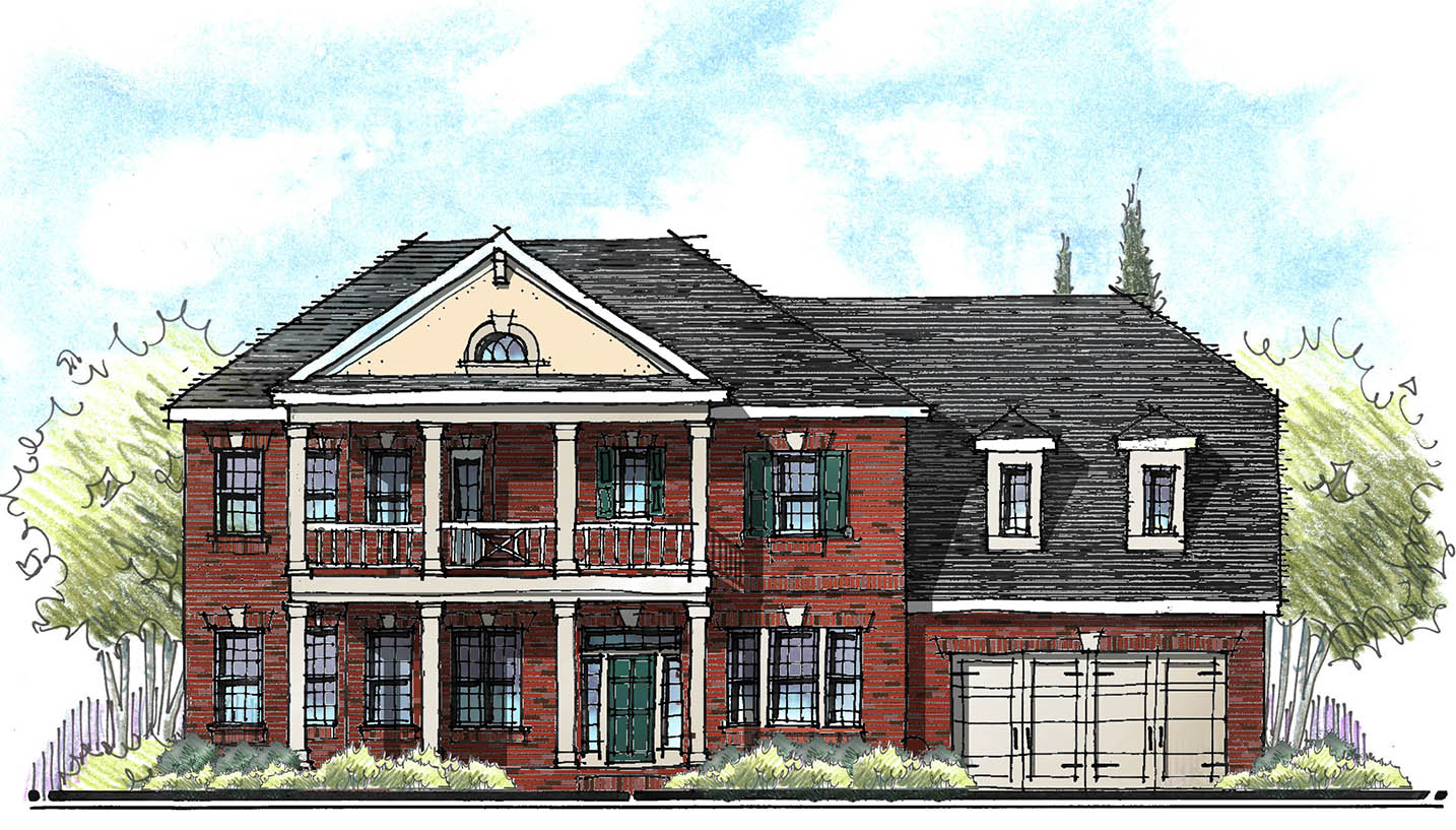
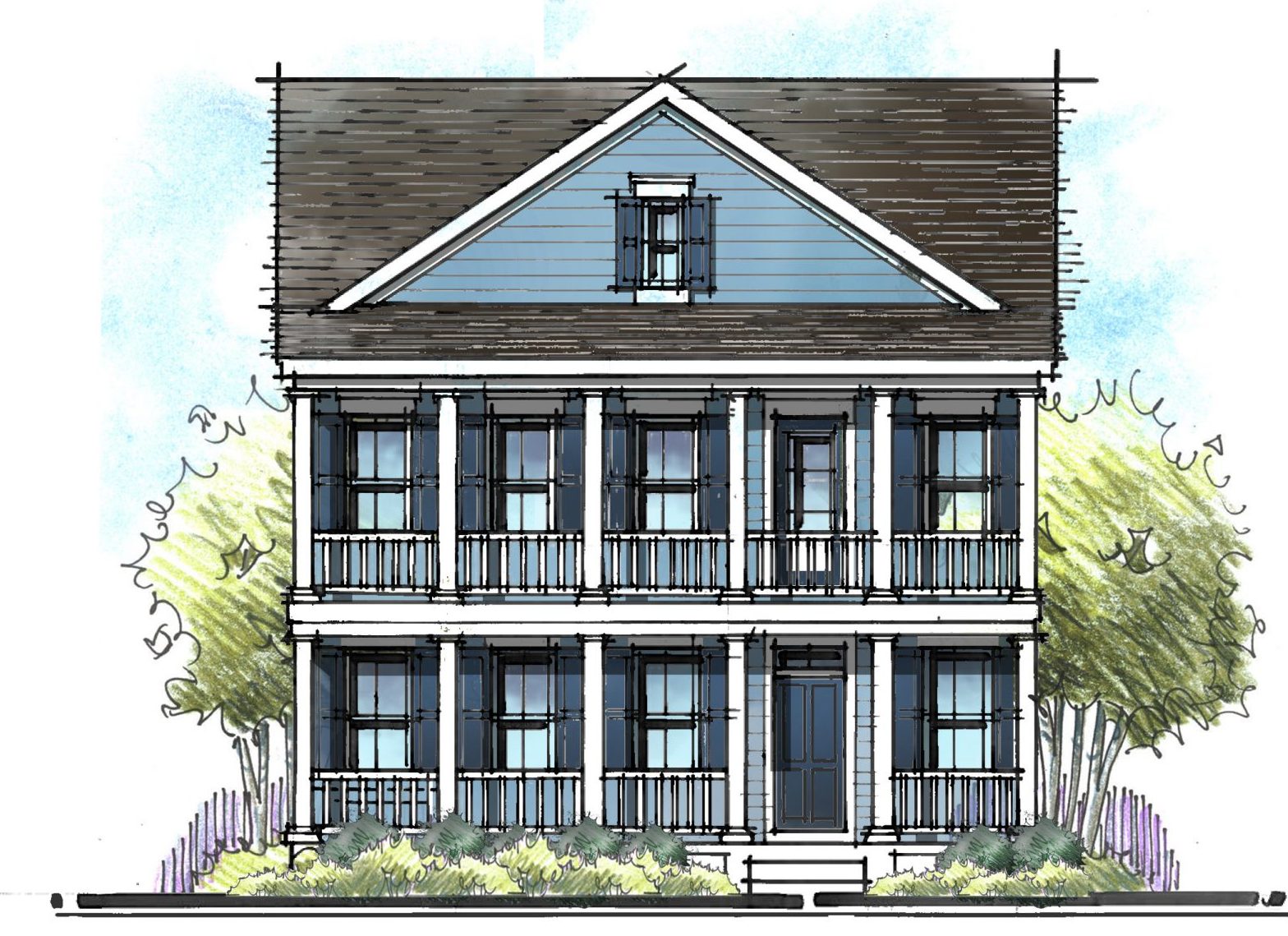
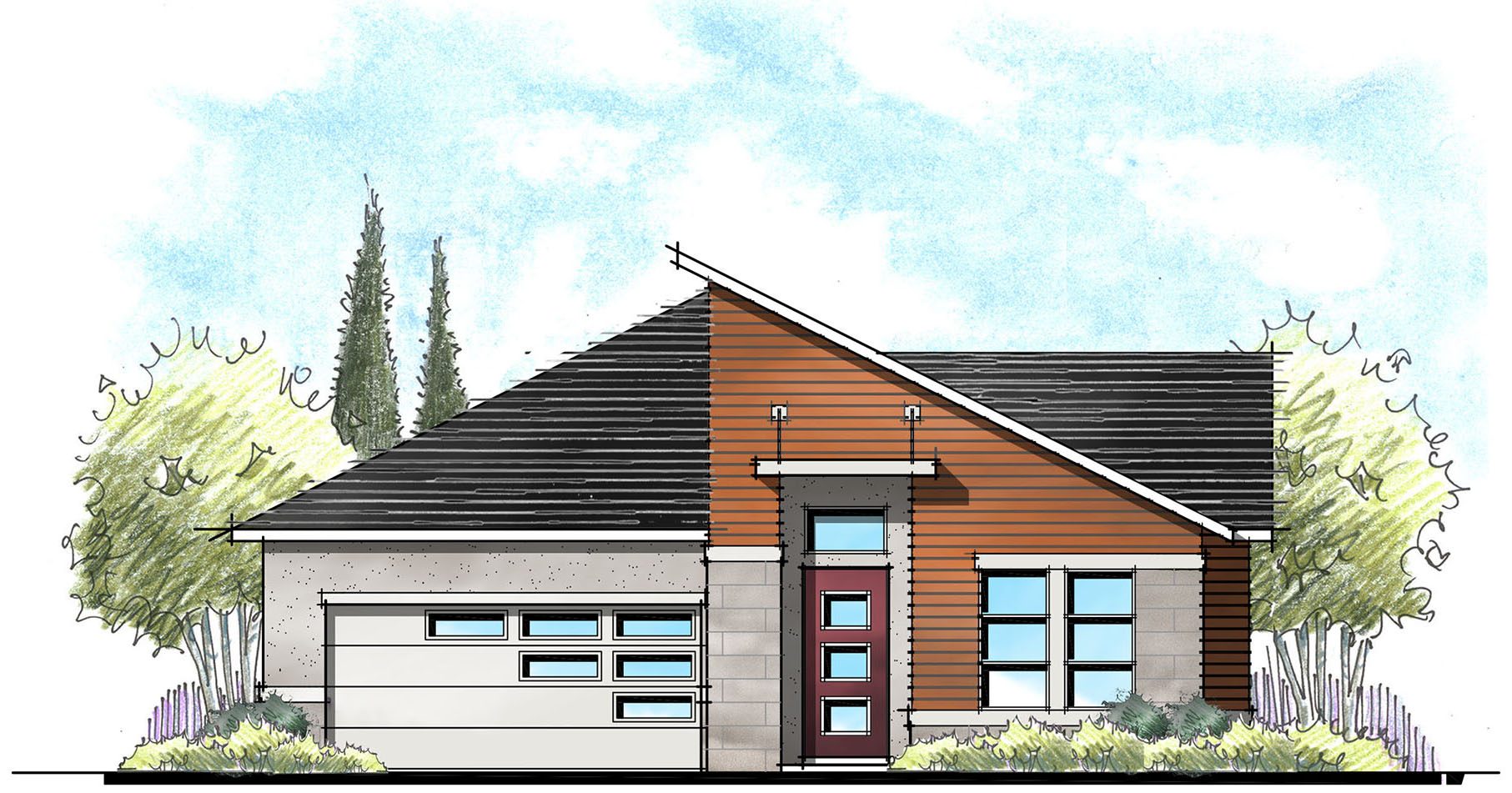
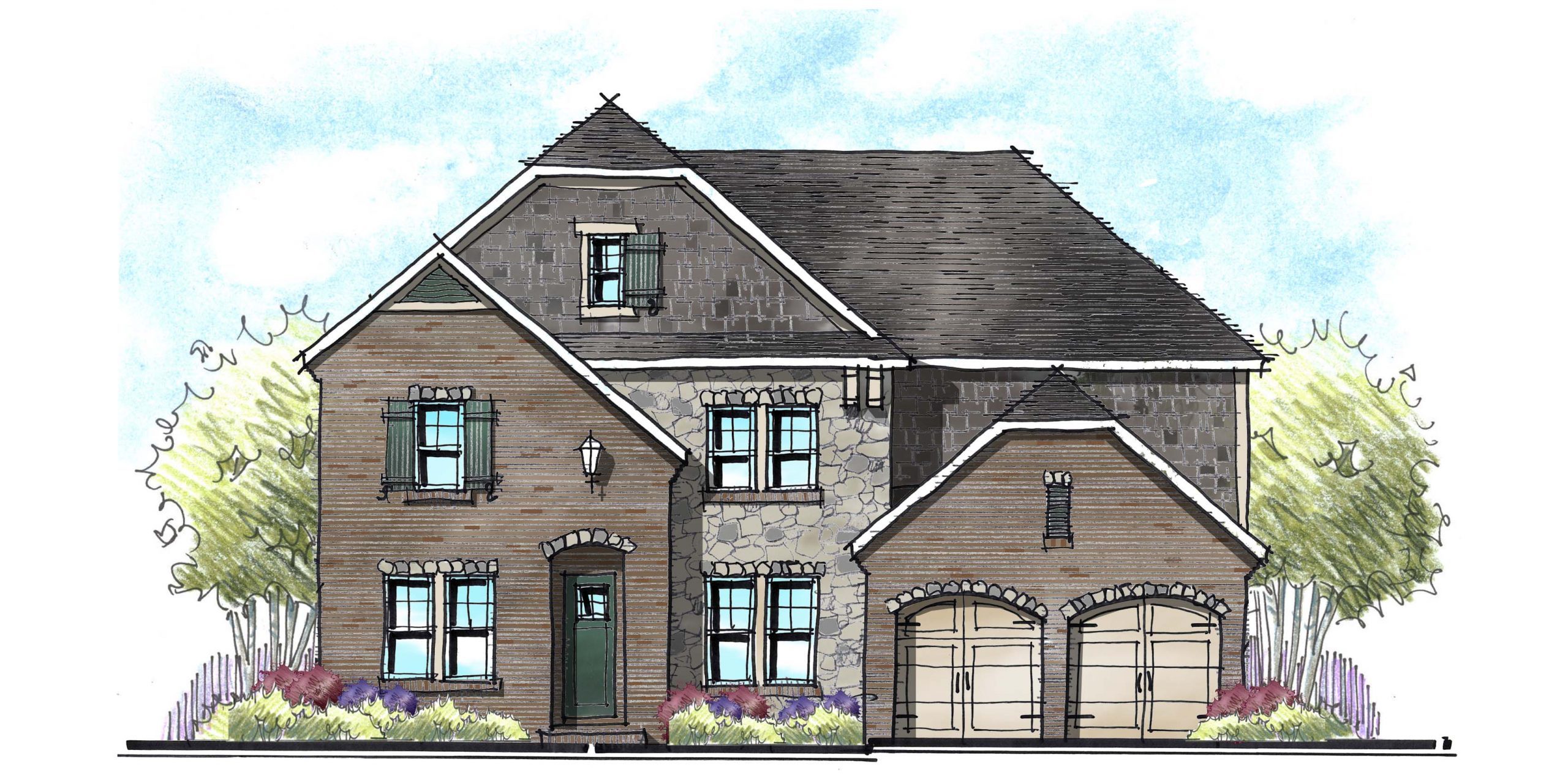
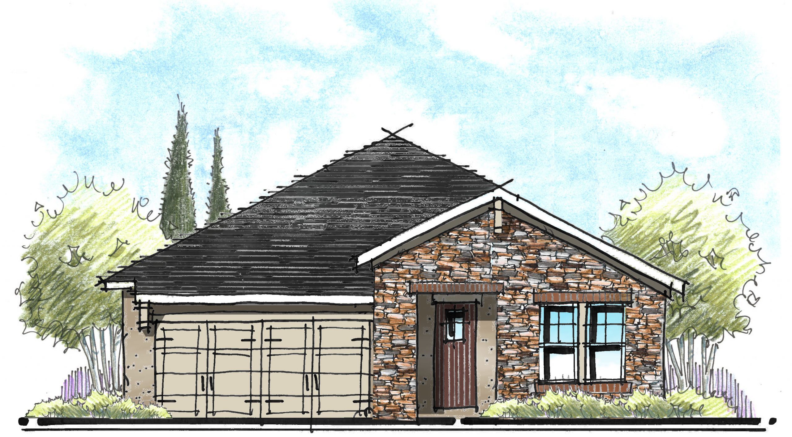
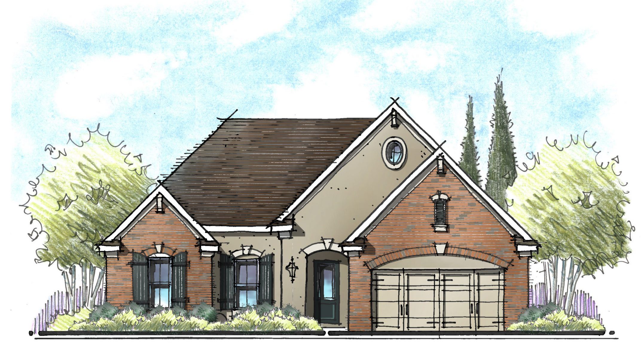
Over many years of designing houses, I’ve discovered many clients prefer symmetrical front elevations. In fact, for some people, asymmetrical houses make them very uncomfortable. There’s no discussion, “Just change it!” Conversely, the folks who are drawn to asymmetry aren’t bothered by symmetry; they just find it less interesting (perhaps boring) and predictable.
Why does this matter? If you’re a builder or architect designing a series of homes or one house with many elevations, you should consider offering both a symmetrical and asymmetrical elevation. Whether symmetry is your personal preference or not, you need both forms in your arsenal. The result is a more diverse and animated streetscape. You will also broaden the appeal of your homes since you now can attract buyers of either end of the spectrum. The need for diversity of form is as important as having diversity of styles, colors and materials.
It Still Needs to Balance!
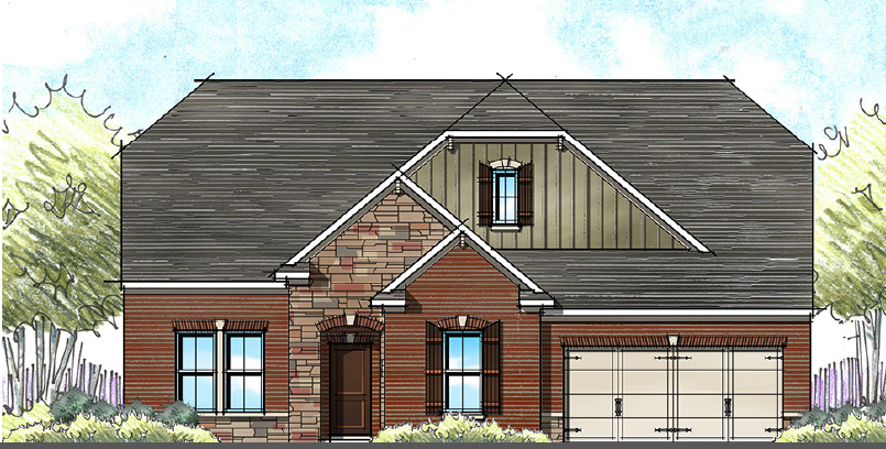
If you’re looking to add an asymmetrical elevation, don’t forget you still need balance. That can be tricky, so it may be easier to design a symmetrical elevation – at least from the outside. However, many floor plans don’t lend themselves to symmetry – so you need to understand how to create balance in your non-symmetrical homes. Imagine Lady Justice, blind-folded and holding up a scale in front of your house: Does it balance? If not, see if you can add visual weight to both sides to balance the shapes. This can be accomplished in the form of gables, towers, etc. Dark colors can add visual weight as well.
Additionally, some building footprints simply don’t lend themselves to symmetry. A 30’ or 35’ wide house with a two-car front entry garage will never be symmetrical. We have found adding weight and focus to the entry is a great way to achieve that balance.
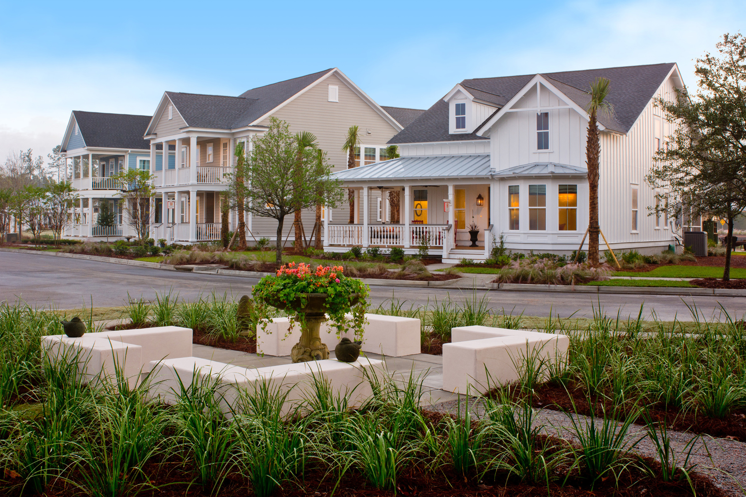
As for styles, some styles lend themselves better to each geometric construct. Traditional styles like Georgian, Low Country and Folk Victorian work well as symmetrical building forms.
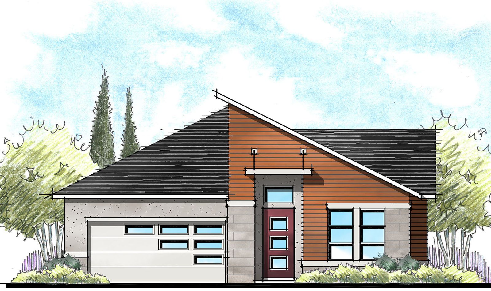
Styles such as Tuscan and Modern demand asymmetry. Then there are many styles that can go both ways, think French and English country.
As a designer, I have learned the hard way about how strongly clients can feel towards symmetry. I have frequently mistaken the rejection of an elevation for its style when in fact, it was the lack of symmetry that bothered my client. Because I work with a lot of builders, we both need to understand that we should push through our personal preferences to ensure we are offering both forms to our buyers. This is easier said than done, since those who prefer (need) symmetry tend to naturally reject an asymmetrical elevation without a second thought. Our communities need diversity in form as well as style and color to provide true character and capture that broad-based appeal!
So, which do you prefer? Symmetry? Asymmetry? Both?
I personally love both. I do enjoy the challenge of creating balance with an asymmetric elevation. I also adore asymmetry in my clothing.
Asymmetry: Love it or leave it, but you still need it!
Categorized in: Exterior Styles
This post was written by Housing Design Matters
