This Thursday from 2-2:15 PM, I am honored to present my first Design Bite for the NAHB design committee. Design Bites are 15-minute presentations about design and are free to NAHB members! Click here to register.
I am so excited because I get to talk about creating inviting elevations and entries. This is a very passionate topic for me, and I realized it has been a long time since I have included this topic in our weekly blog. What a great opportunity to share with you my weekly readers a few highpoints of the speech.
Front Door Focus
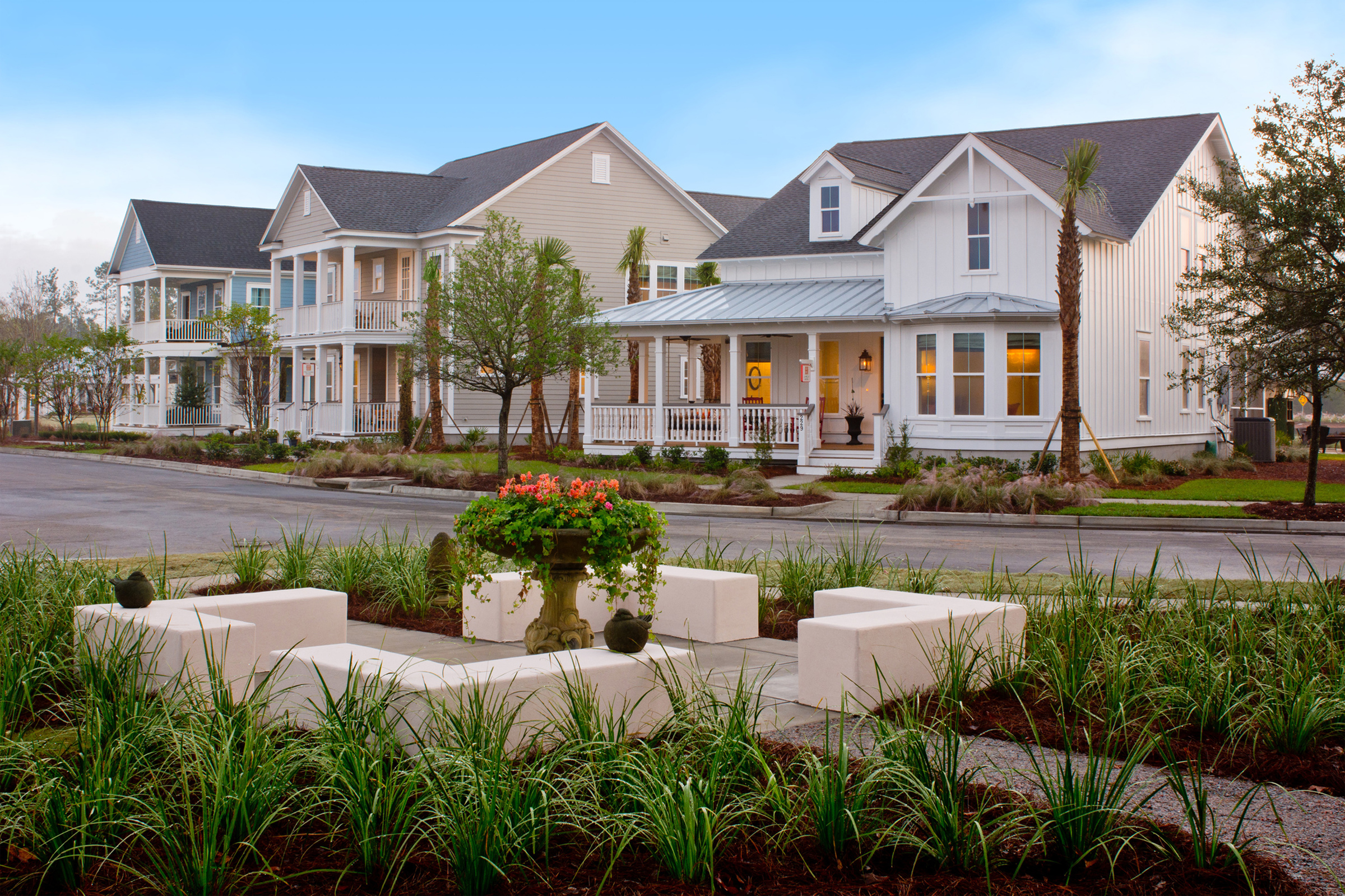
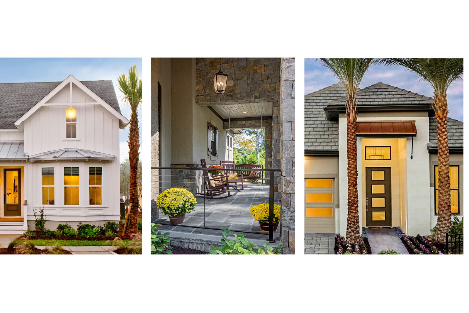
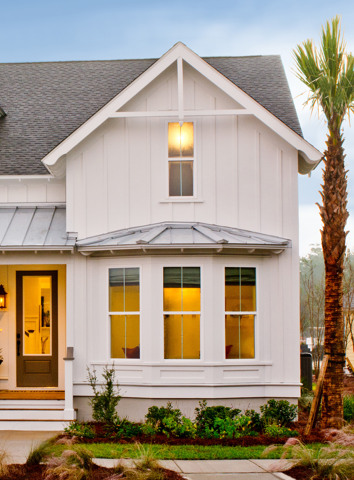
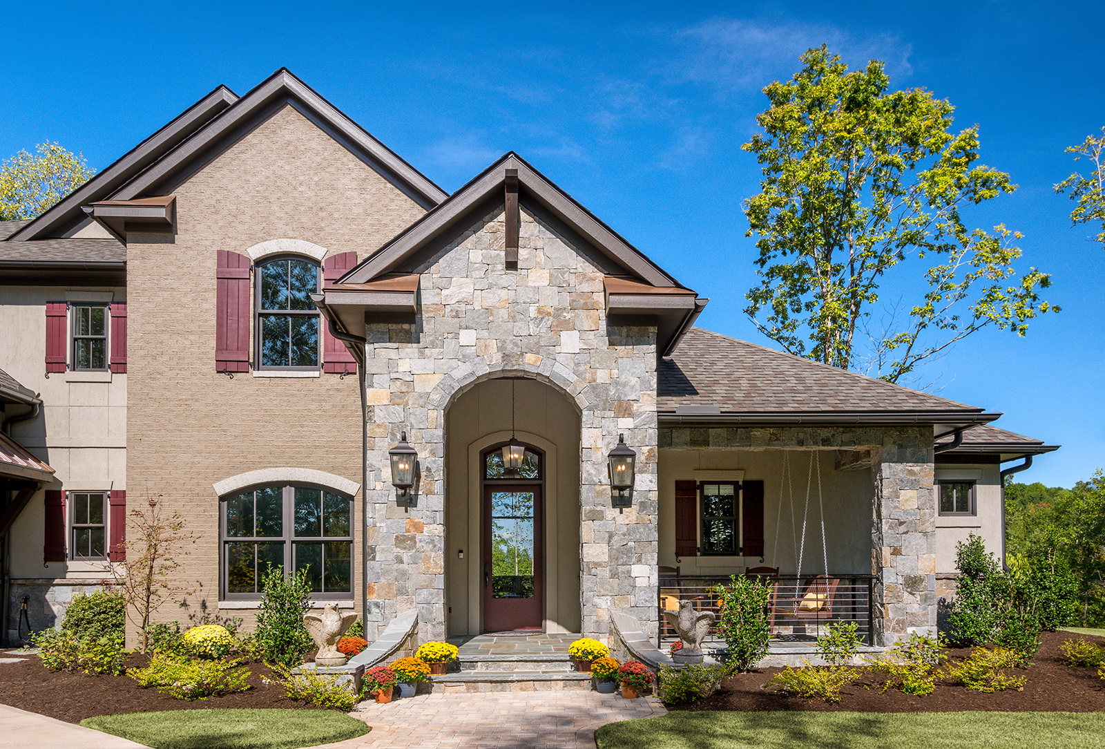
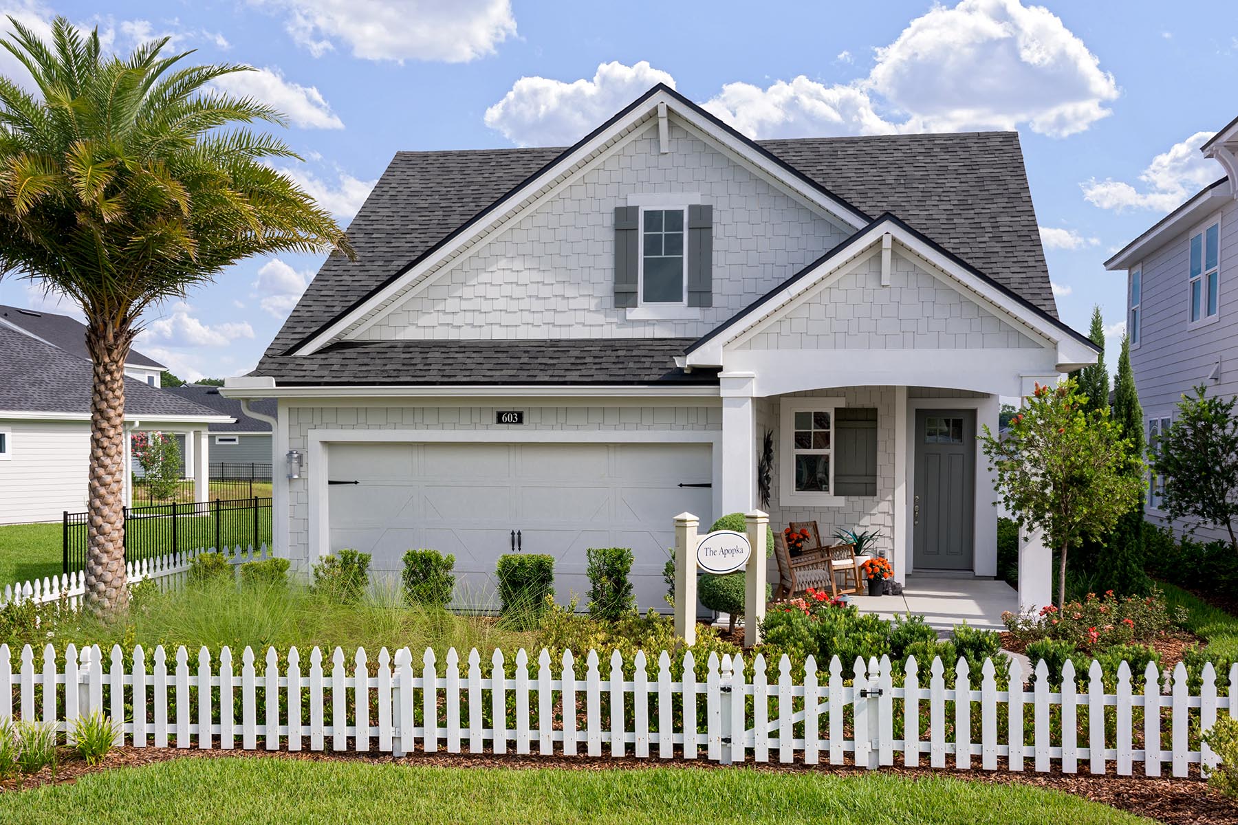
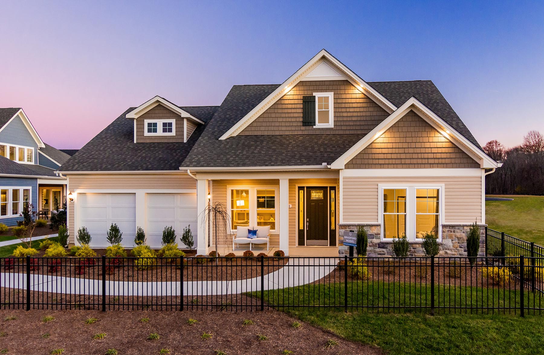
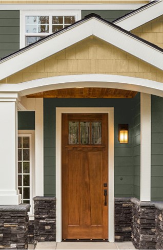
Regardless of the style of the home, there should always be a focus on the front door. That’s what makes a home welcoming. You can also emphasize the front door with color texture and materials. The location of the front door should be immediately identifiable – at the very least, for your mailman’s sake.
Balance and Proportion
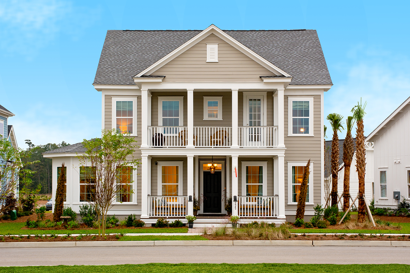
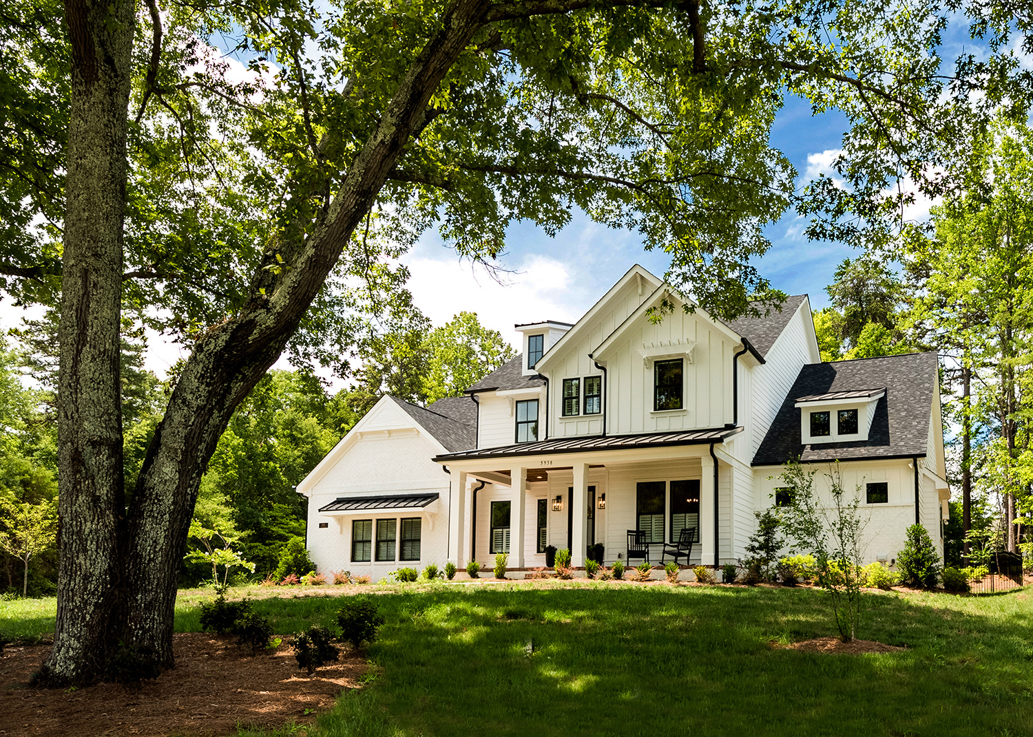
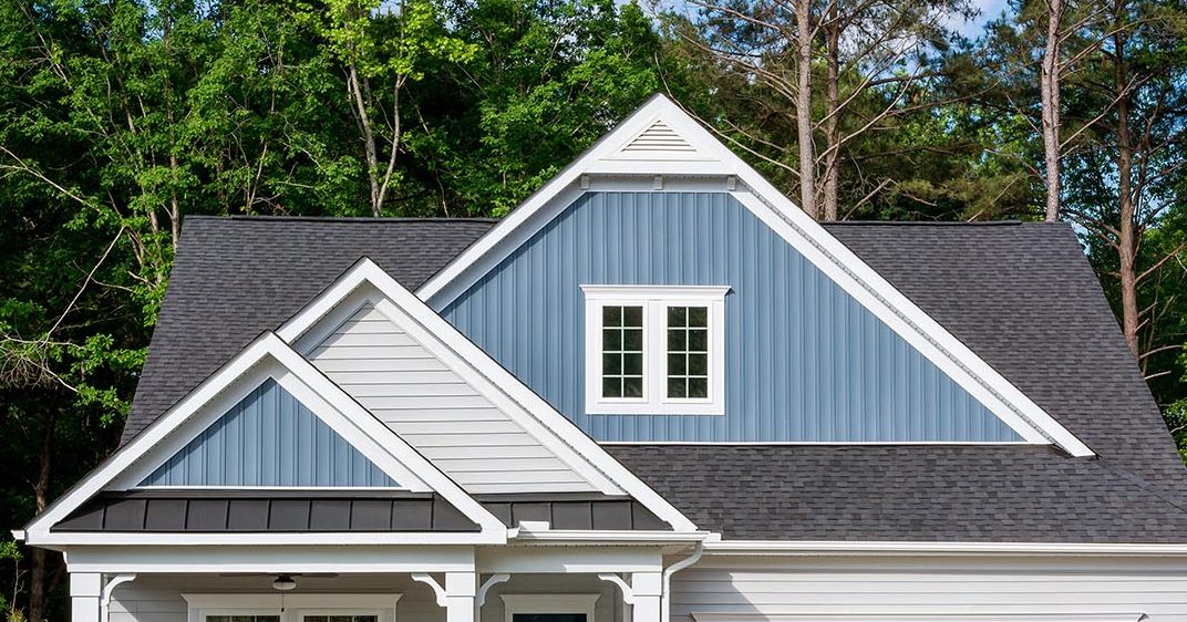
Another way to create front door focus is with the balance and proportion of the front elevation. Ideally, the front door should be below the highest element of the front elevation. You can do this with a gable or hip roof. However, one should remember human scale and avoid the two-story rocket ship entry.
Welcoming front porches
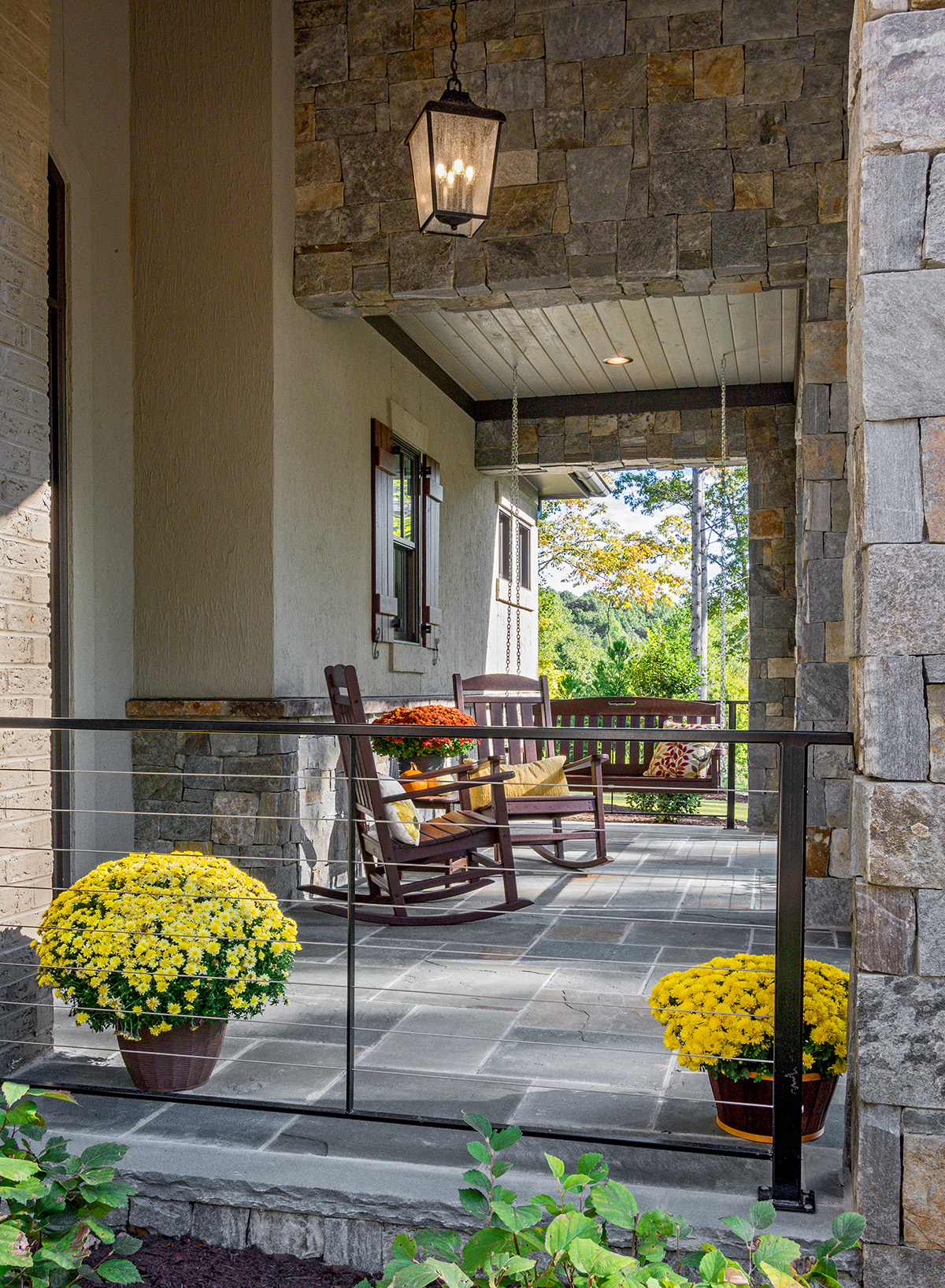
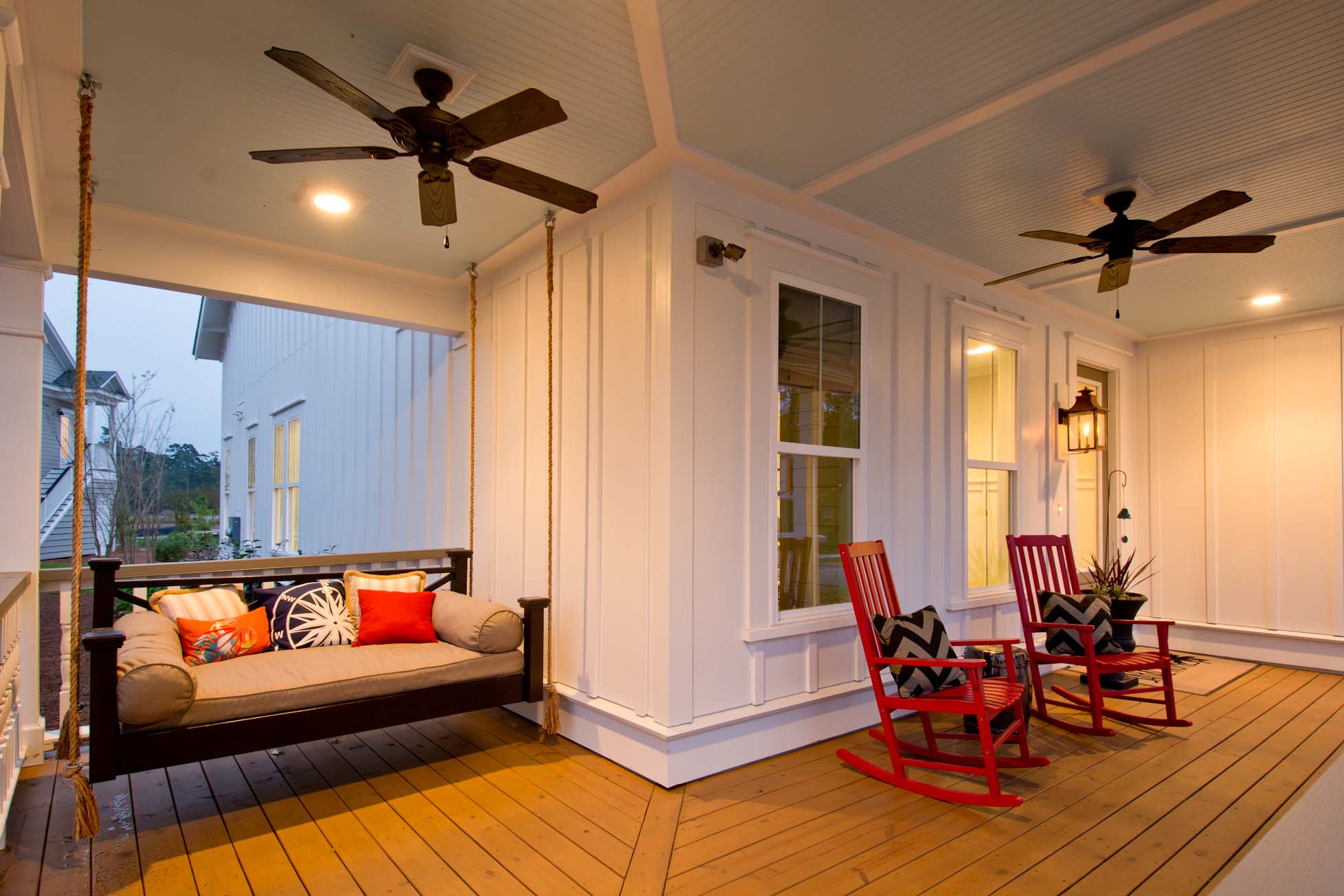
Everyone loves the look of a front porch, but too often, I see porches that are too small to actually use. Porches need to be deep enough to allow humans to sit – 6’ being the minimum while 8’ is preferred. The minimum width should be about 10’ – considering three of those ten feet is for circulation to the front door. The front porch is an integral part of the elevation, so don’t skimp on the finishes – the floor, ceiling, and the detail of the columns can make or break a home’s first impression.
Color, Texture, and Materials
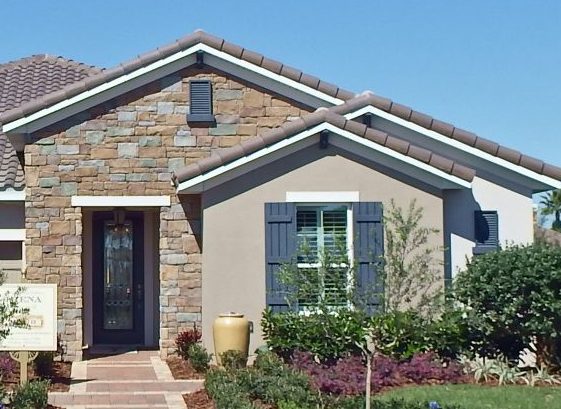
Using these three elements together create not only interest at the front door but also the entire streetscape. Considering a maximum of three exterior materials – then finish off the composition with trim and accent colors. Remember to use materials in their inherent manner. Stone is a heavy material and doesn’t float – It works best when it is grounded. The manufacturers of synthetic stone go to great length to make their product look like real stone. Don’t ruin the aesthetic by applying the synthetic stuff like paint. Just because you can, doesn’t mean you should.
Tame the Out-of-Control Garage
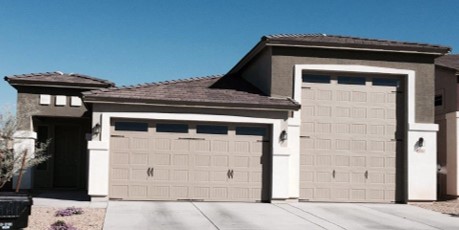
We have all seen the houses where the garage overwhelms the front of the house. Maybe because it is forward of the rest of the house, the garage door is painted an accent color, or it has a huge roof over it. Always remember to “solve” for the automobile but design for the humans who live in the house. Pulling the house forward and pushing the garage back is a great way to diminish the garage. The once popular FROG – finished room over the garage – has waned in popularity because of the poor proportion that creates.
Beware of the Big Forehead Garage
We did an entire blog on this one, but apparently, I’m not reaching the right companies because I continue to see these unfortunate garages pop up in new communities! This is especially the case when you have a dropped garage because of topography, or the house is raised up. Avoid this design faux pas by creating an accurate elevation for each lot condition before you build. Then work at breaking down the oversized surface above the garage door.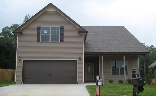
Select the Right Front Door
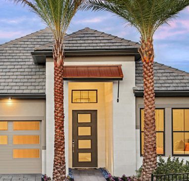
You wouldn’t know it driving through some neighborhoods, but there are more options than the six-panel front door being sold in the industry today! Match the style of your front door to the style of your house. After all, it is the first thing your customer’s touch. Make a good first impression.
I hope you find these highlights helpful when considering your own houses. I hope you can join me for a 15 minute discuss this Thursday. And as always, thanks for including me in your day.
Categorized in: Community Design, Exterior Colors, Exterior Styles
This post was written by Housing Design Matters
