“Collaboration” is a term we hear a lot in the industry. With collaboration comes a better outcome. We often collaborate with our builders and their product development team – typically consisting of sales, construction, purchasing, and perhaps the land person.
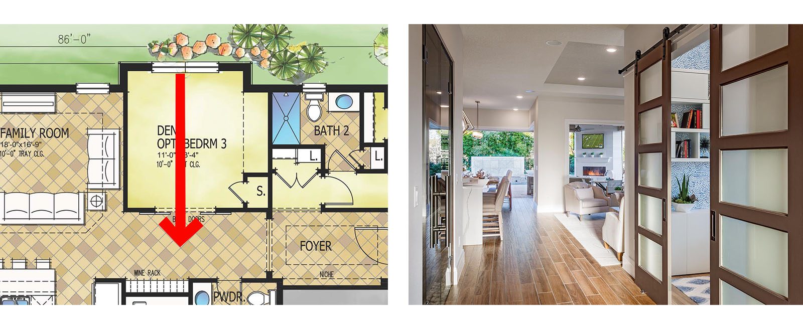
But when it comes to designers, collaboration is often missing. Architects rarely get the opportunity to work with the interior designer and merchandiser for the model. Too often, the interior merchandiser receives the plans after the construction documents are completed. “Oh, if we could only have three more inches for the drapes” or “what would you think about taking the space in that art niche leading into the master and make it a small storage closet in the bath?”
These are simple but timely design tweaks that make a project better – if only they were suggested during the design phase when there was time to make adjustments!
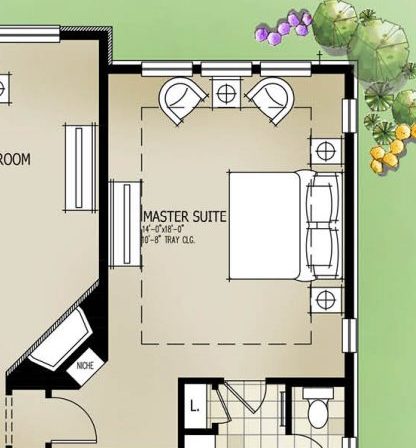
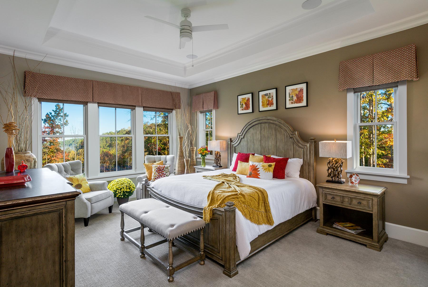
Placing the bed in the owner’s suite is another often debated item. Sure, there is a great bed wall – but where on the wall should the bed go? Working with the designer early, I learned she preferred the bed centered on the wall. But if you center the king size bed on a 16’ long bed wall, you will crowd the sitting area. Our solution was to add bedside windows to lock down the bed wall and still leave room for chairs. If a headboard hasn’t been selected, I recommend 7’ between the windows.
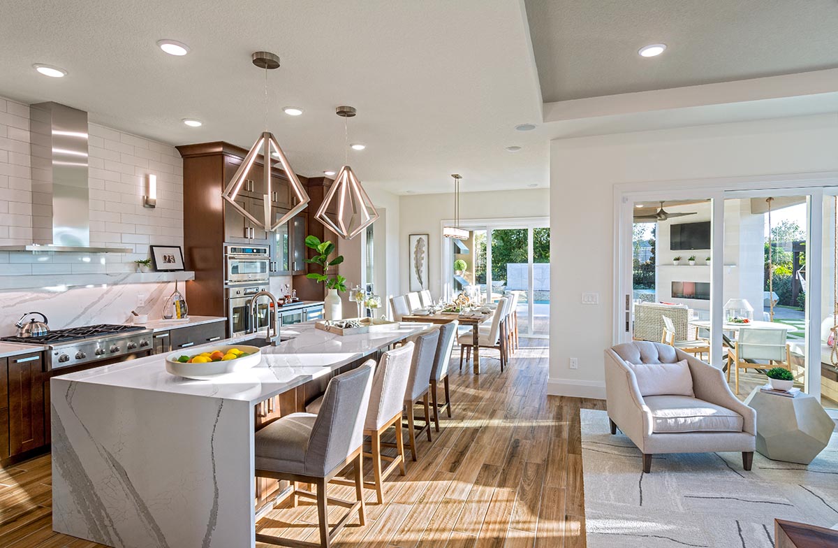
As architects, when we walk into a furnish model without any prior dialogue with the designer, we might say – why is all the “stuff” cluttering up the kitchen while the Messy Kitchen looks like an art gallery. Shouldn’t it be the other way around?
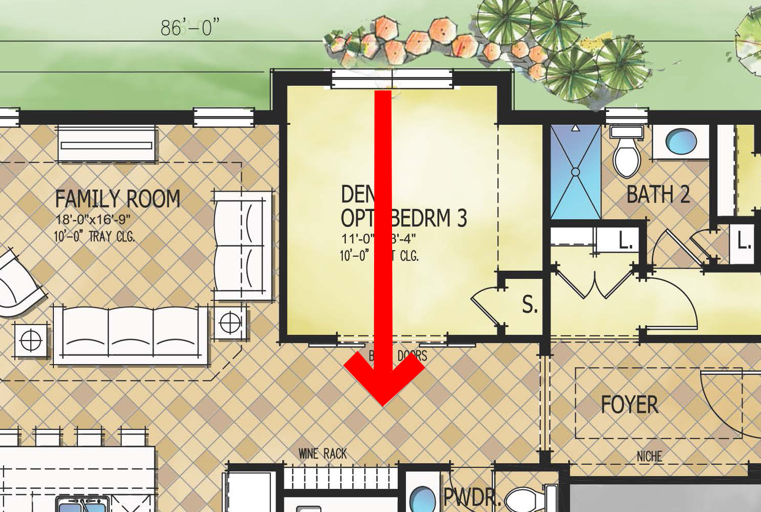
Window placement is always a hot topic between architect and interior designer, especially in secondary bedrooms. First, you must agree on the bed wall, then the dresser wall. With that out of the way, where should the window go? The designer might say, “if you put the window in the far corner, the room will feel larger.” “True, but if you line the window up with doorway, the hallway will benefit from borrowed light from the bedroom.” This kind of dialogue can be useful in teasing out the greatest outcome.
What about the vibe of the interiors? Should it complement vibe of the exterior? As we often create multiple exterior styles, selecting the style of the exterior could certainly jive with the interior style. Then there’s color. Interior and exterior color palettes differ with more muted colors on the outside because of the brightness of the sun versus brighter interior colors. But certainly, there should be a thread of consistency?
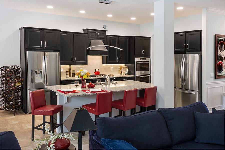
Perhaps there’s a new, cool kitchen cabinet color the interior designer is dying to showcase. Ah – but this interior kitchen doesn’t have a lot of natural light. Will the dark cabinets darken the kitchen too much? Can we go with a lighter cabinet, amplify the lighting, and select a lighter countertop to reflect the lighting?
I think you get the idea. I have found that designers work best when they can bounce ideas off of each other to bring out the best possible result.
When do you involve your interior designer in your product development process? If you have ever heard grumbling from your designer that you should have, could have – then you know you didn’t involve them soon enough.
Categorized in: KitchenDesign, Trends in Design
This post was written by Housing Design Matters


