Let’s face it, home design – like fashion, becomes dated over time. Sometimes you don’t realize how much design trends have changed until you look back at older houses. For some readers, you might never see these faded design trends unless you’re buying up old houses. But for some of us who’ve been around longer than we liked to admit, this is a trip down memory lane. Or could it be a trip to a haunted house.
Sunken Living Rooms
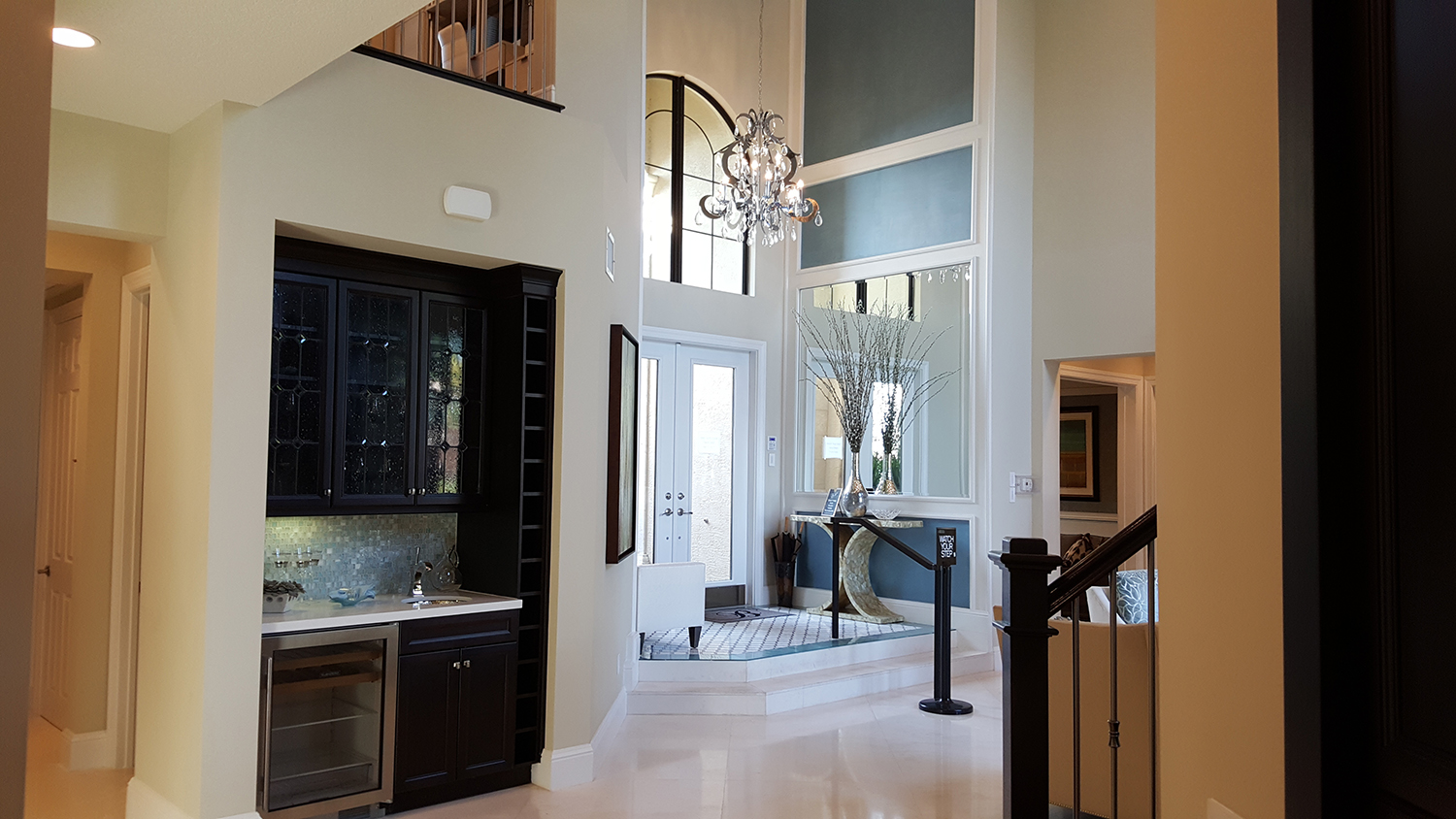
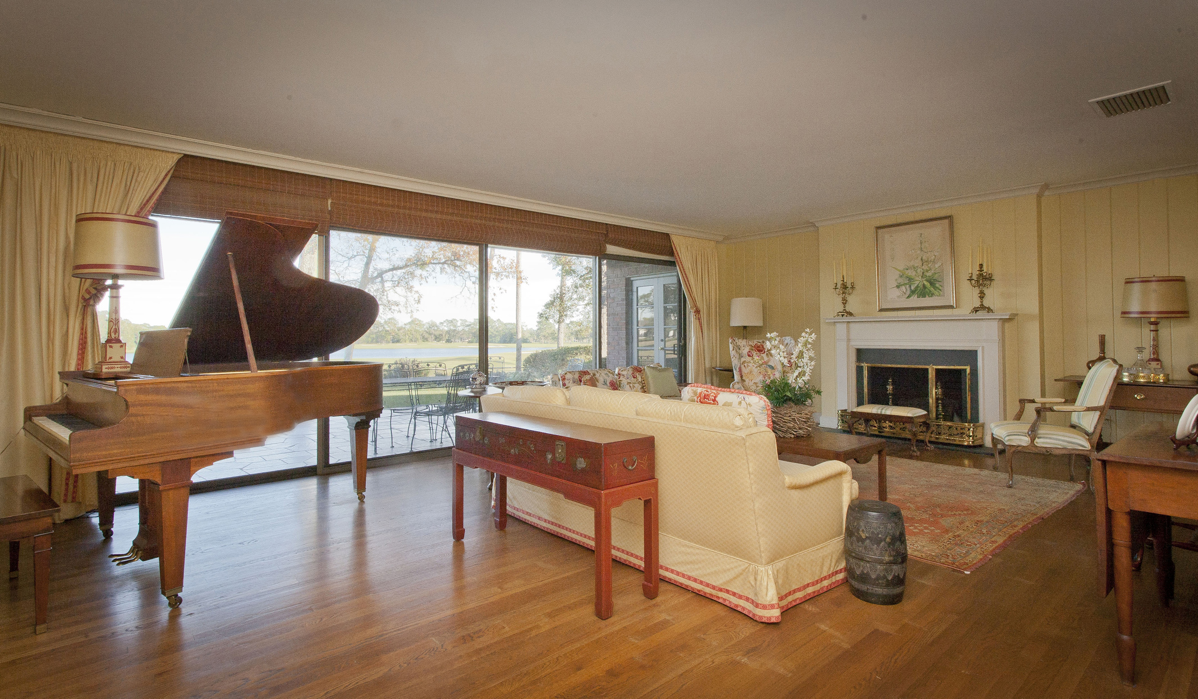
Sunken living rooms were very common from the 1950’s to the early 1980’s. It was thought to be a way of indicating the importance of a room or space – thus the living room as the key entertaining and most impressive space in the house. Elevation changes using stairs were often used to signify importance. Think of the steps in front the Acropolis and Parthenon – and every federal courthouse built in the classic Greek Revival style. Some thought it delineated spaces in an open floor plan. In reality, it became a way to gobble up square footage and add a tripping hazard! I once toured a model home with a raised foyer leading to the grand two story living room. And while the builder thought it was dramatic, their attorneys saw it differently – thus adding a handrail and warning signs.
That’s one way to add “drama”…
Living Rooms in general
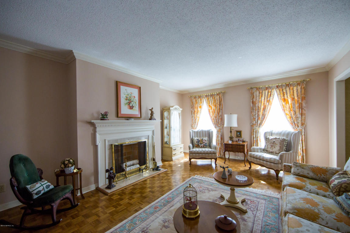
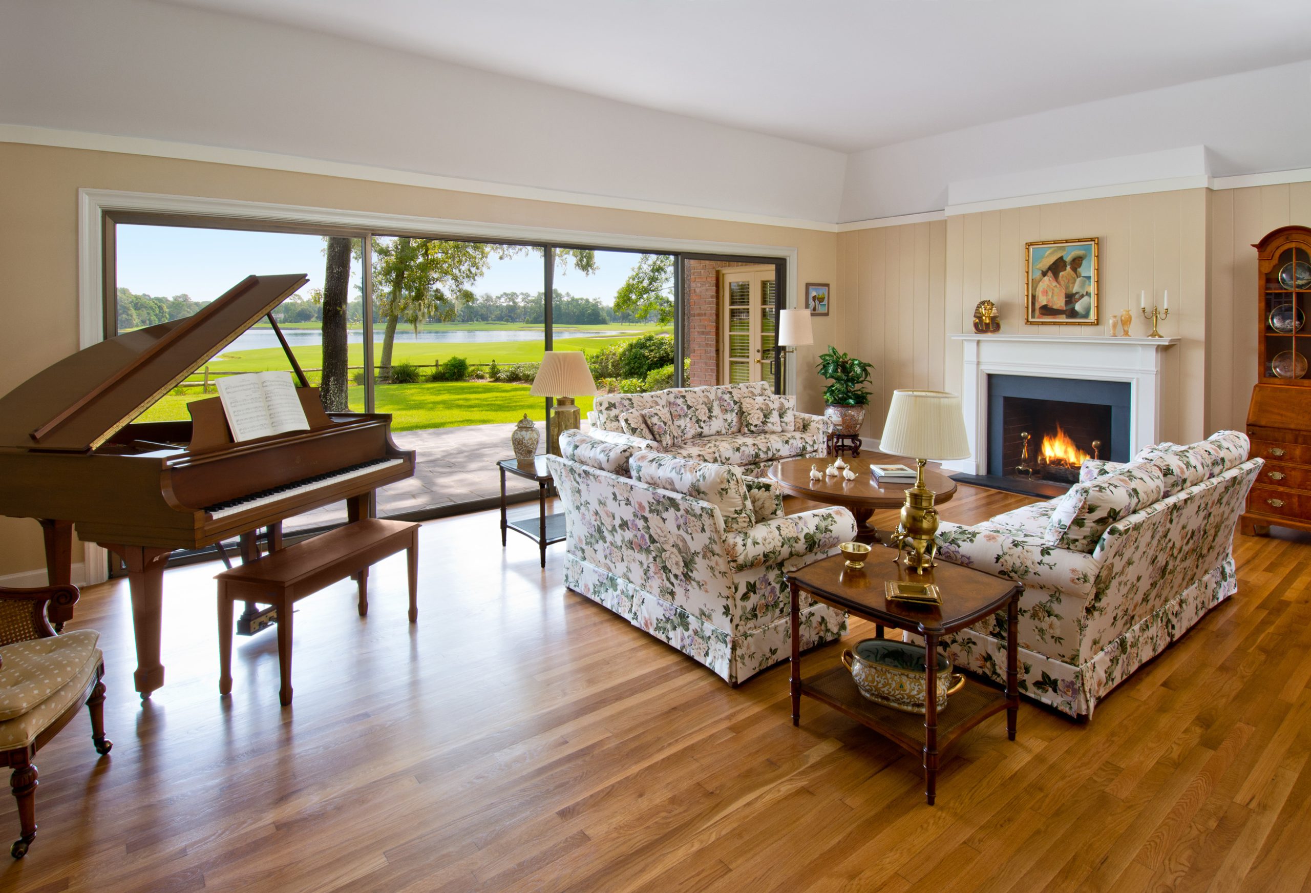
Just as dated is the entire concept of a living room. The living room was thought to be that special room in the house that was always clean (no dogs, drinks, TV or kids allowed) in case unexpected guests or the preacher stopped by. As a young designer working on custom homes, my clients would tell me they never used their living room, but felt they needed it for resale. After hearing this so many times, I began to wonder, who was this phantom living room buyer?
The living room in the 90’s and early 2000’s was just a “show” room designed to impress friends and family and simply a visual extension of the foyer. Your furniture and square footage budget is best utilized elsewhere.
The View from the Foyer
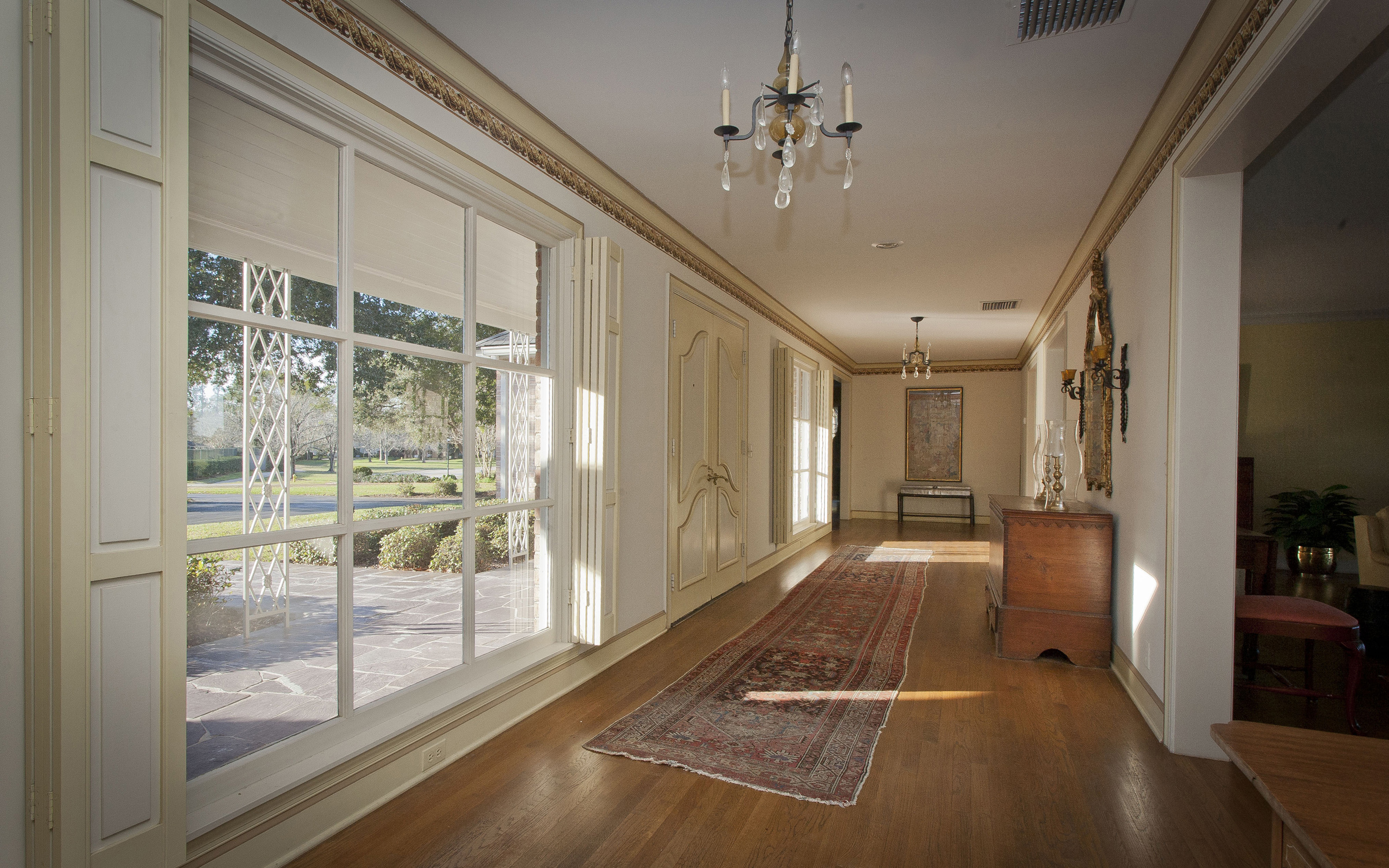
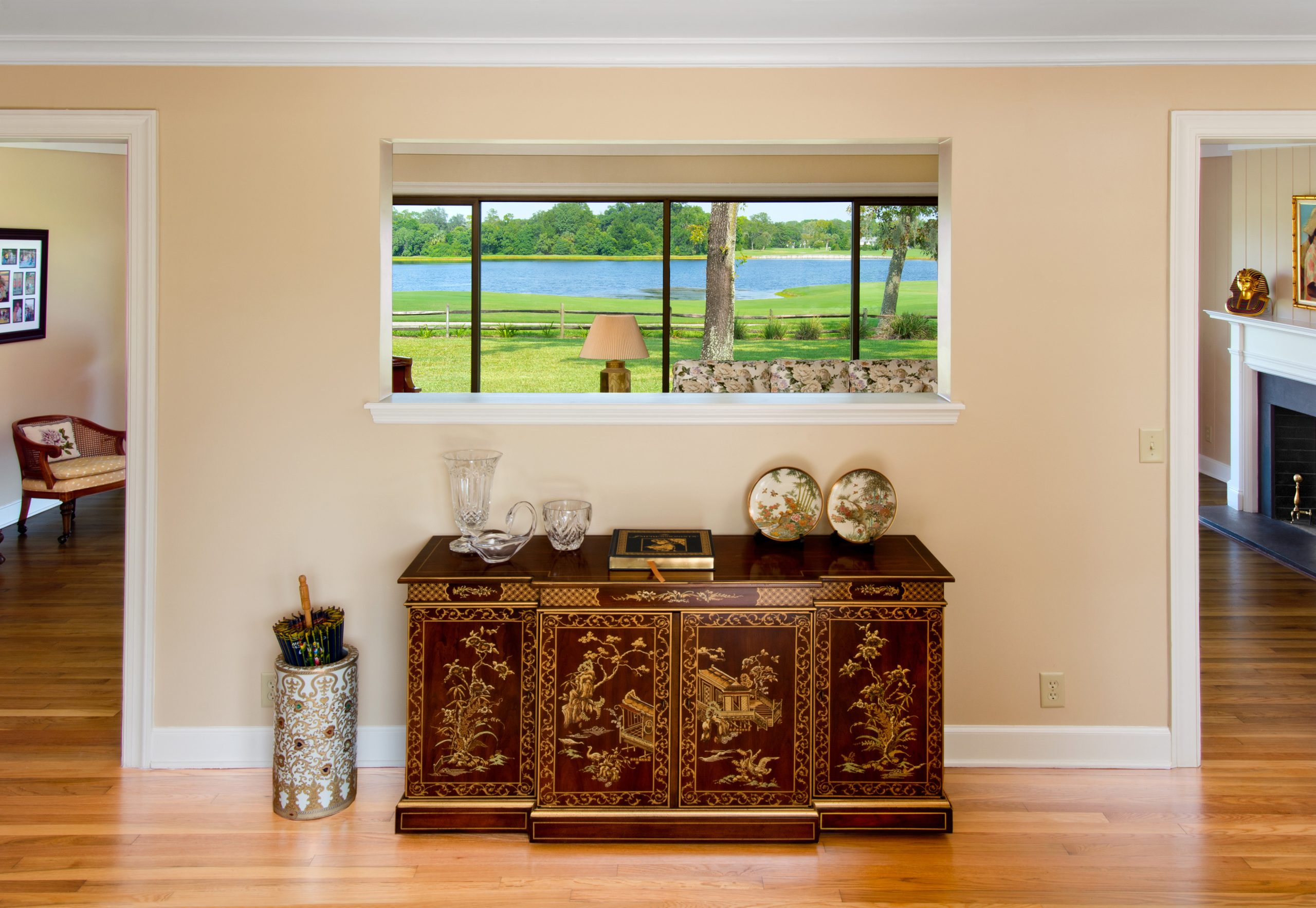
A current trend in design is to have the most expensive view possible from the front door. But this wasn’t always the case. In the fifties and sixties, the front door opened to a wall – I suppose to provide privacy.
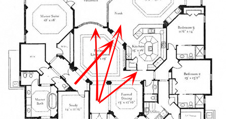
At some point, designers decided the view from the foyer needed opened to the longest possible view and always to light. In the nineties, this meant not only a view across the formal living room but also a diagonal view to the furthest point possible. One way to do this was with the dreaded 45-degree angles!
Of course, you still had to guard against viewing into the kitchen – and heaven forbid a view of the kitchen sink! Today, we want to have a view into the kitchen – sink and all – provided the sink is in a beautifully designed island with furniture grade cabinets, quartz countertops, and designer pendants inviting your visitors to pull up a seat and get comfortable. We (and every designer ever) have covered the view from the kitchen sink in previous blogs, but it’s worth another look if you’re interested.
Two Story Foyers
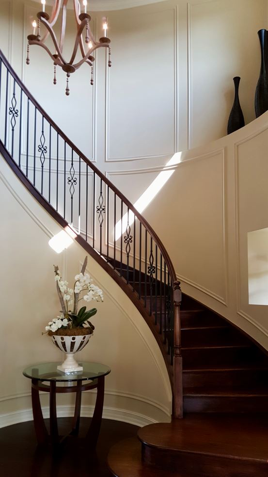
Staying on the topic of foyers, for years, it had to be two stories – even in small production houses. Of course, this design philosophy was inspired by large custom homes with grand foyers and sweeping staircases.
But here in the real world, where most people live their daily lives, the stairs were always cluttered with stuff like kids’ shoes, socks, backpacks, etc. The solution was either a back set of stairs or simply a two-story space with only a pendant fixture. When pinched for square footage, the two story foyer got so small, it felt like an elevator shaft.
Two Story Family Rooms
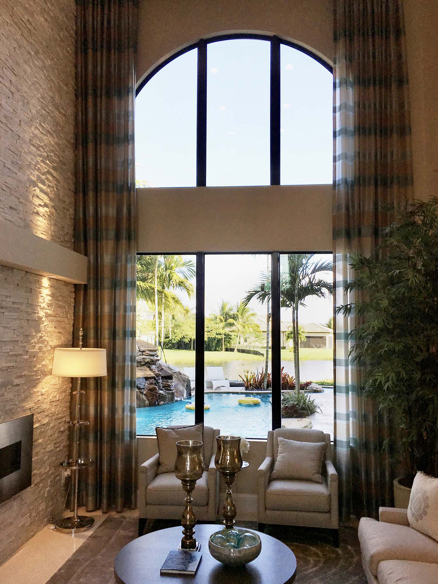
My old house had a two-story family room. This was the room we watched TV in – something with sunglasses because it was so bright. As the kids got older, they had their own TV in the loft overlooking the family room. This way, neither one of us could hear our TV’s. At first, it was the annoying laugh of the purple dinosaur, Barney emanating from the kids TV. Then it was the sounds coming from their video games. To this day, I can still hear the sounds Sly Cooper.
Plant Shelves
For some of my readers, this just unlocked an unpleasant memory they forgot they had. Our house that was built in 1991 had a two story family room with two walls of windows on both floors – again, an acoustical nightmare. Ringing the room was this 2’ deep plant shelf. Oh yes – not my proudest moment.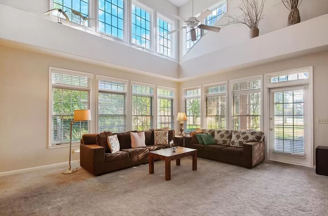
The first issue was finding “stuff” large enough in scale to not disappear. The second problem was the giant dust bunnies that liked to breed here. But it gets better. Because there were windows above the plant shelf, it was a favorite place for bugs to die. Naturally, I was clever enough to have the kids play loft overlooking this room for the best view possible of the dead bugs. Sadly, the only way to clean this shelf was with a ladder and vacuum. It was quite an ordeal.
Eight Foot Ceilings
I consider the time period when 8’ ceilings became a “thing” the dark ages of residential architecture. I’m told they were first utilized because houses had air conditioning and didn’t need the air space above our heads for hot air to pool. Sorry – but they just don’t feel as good as houses with 9’ ceilings. Maybe they felt okay with the undersized, minimalist mid-century furniture or delicate Victorian pieces. But they quickly date a house and make it harder for resale. My mother bought an old house with 8’ ceilings and we painstakingly raised the ceiling with a tray. Sure, it felt immensely better, but we paid for it in dollars and headaches. Feel free to reach out to me directly for that whole story – it may make you think twice before taking on that renovation project.
In the interest of time, let’s save the following faded floor plan fads for next week. They include:
Corner bathtubs
Tiny showers
Glass block – windows or showers or both
Laundry room entry
Continent-sized Islands
TV built ins
And more…
Have I forgotten anything? Send me your (least) favorite faded floor plan fads and I will include them in next week’s blog. Thanks for reading.
Categorized in: Uncategorized
This post was written by Housing Design Matters

