Last week we covered several fads that have thankfully faded from our current design philosophy. They included:
- Sunken Rooms
- Living Rooms
- The View from the Foyer
- Two Story Foyers
- Plant Shelves
- Two Story Family Rooms
- Eight Foot Ceilings
Ah – but the list of faded fads goes on. This week, we’re going to cover:
- Window at the Kitchen Sink
- Peninsula Kitchen
- Bat Wing Island
- Corner bathtubs
- Tiny showers
- Glass block – windows or showers or both
Window above the Kitchen Sink
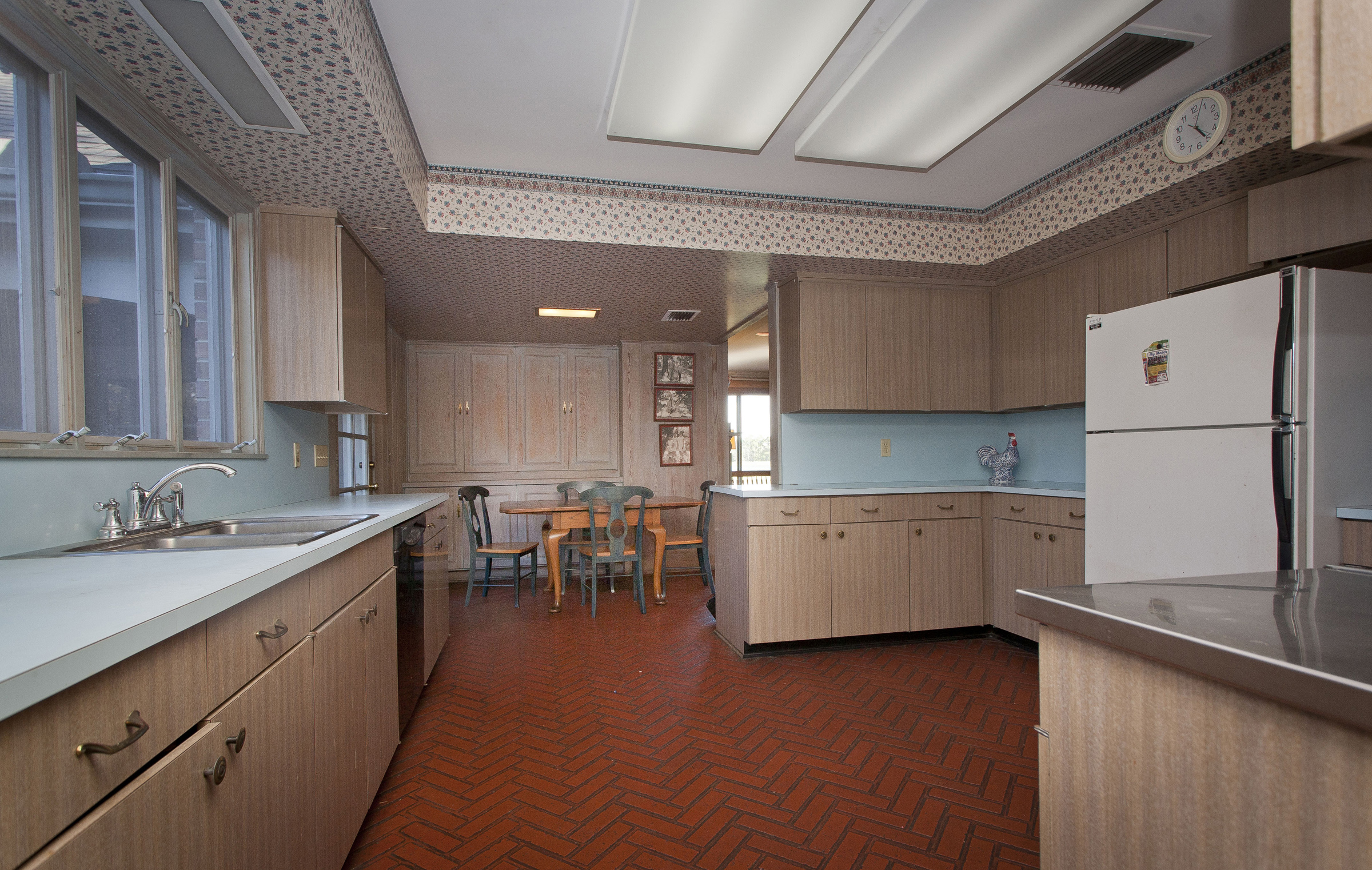
As we travel down memory lane, it seems the location of the kitchen sink has been a moving target. First, it was on the outside wall of the house with a sink – so June Clever could gaze out the kitchen window while the house was empty washing dishes. Typically, these kitchens were closed off from the rest of the house – as if the person cooking or cleaning up wasn’t a part of the family.
The Kitchen Peninsula
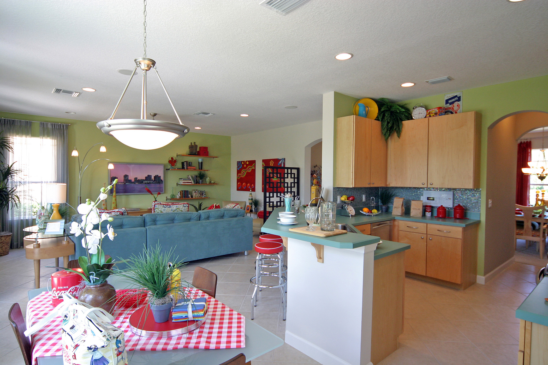
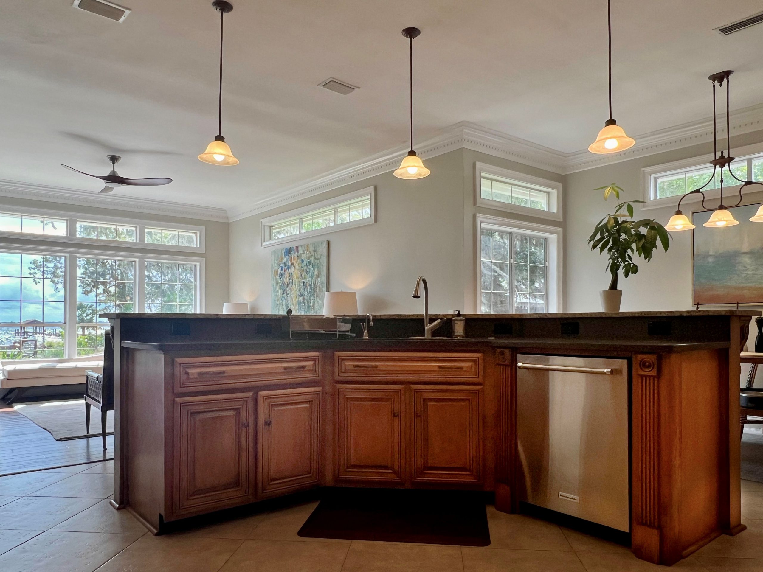
Following a “design revolution”, the kitchens began to open to the family room and casual dining area. This was a major victory for working families! But with this new, open kitchen concept, the sink didn’t make sense looking outward – especially since the focus was now on interacting with the family. These new, open kitchens had a peninsula with the sink facing the action. Often, the sink was set on a 45-degree angle – a bold departure from the past. And since the cabinets were connected, it was easy to get power, water, and sink vent to and from the sink.
The Bat Wing Island
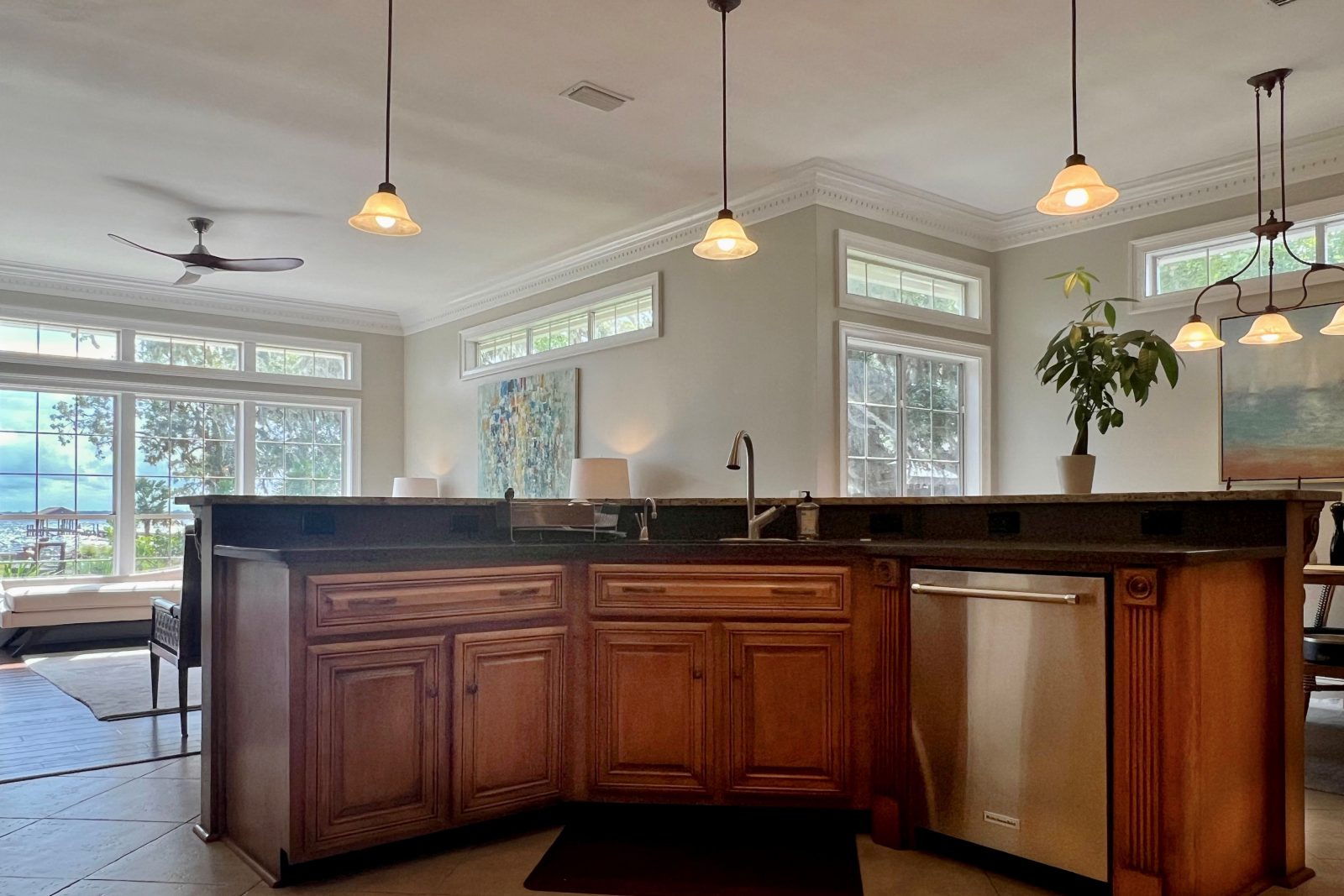
Then, as more family members became active in the kitchen, the sink was moved to an island. This was a big step that required rethinking the vent for the kitchen sink and getting power to the island through the slab or crawl space. But it changed the dynamic of the flow of the kitchen. This new concept allowed more than one way in and out of the kitchen – making it easier for families trying to have all hands-on deck to deliver the evening meal after work.
But there were a couple of lingering flaws with this new island. It still has the sink on a 45-degree angle giving it what we call its bat wing shape – a shape that requires a lot of square footage and yet cuts into counter surface area at the same time. It also had a 42” high raised countertop around it to “hide” the dishes stacked up in the sink. This countertop for this beauty was absolute torture for the installer with multiple seams on a 45-degree angle three bull nosed edges and a segmented back splash.
The simplicity of the one level, rectangular island was a win-win. Easier, more affordable to build, and more inviting for family and friends to gather around to converse or dine. There are millions of homes with this tortured island, and they are discovering the challenges to replace it. Too often for these folks, the floor in the kitchen was installed up to the island and not under it – making replacing the island a more costly task than anticipated.
Corner Bathtubs
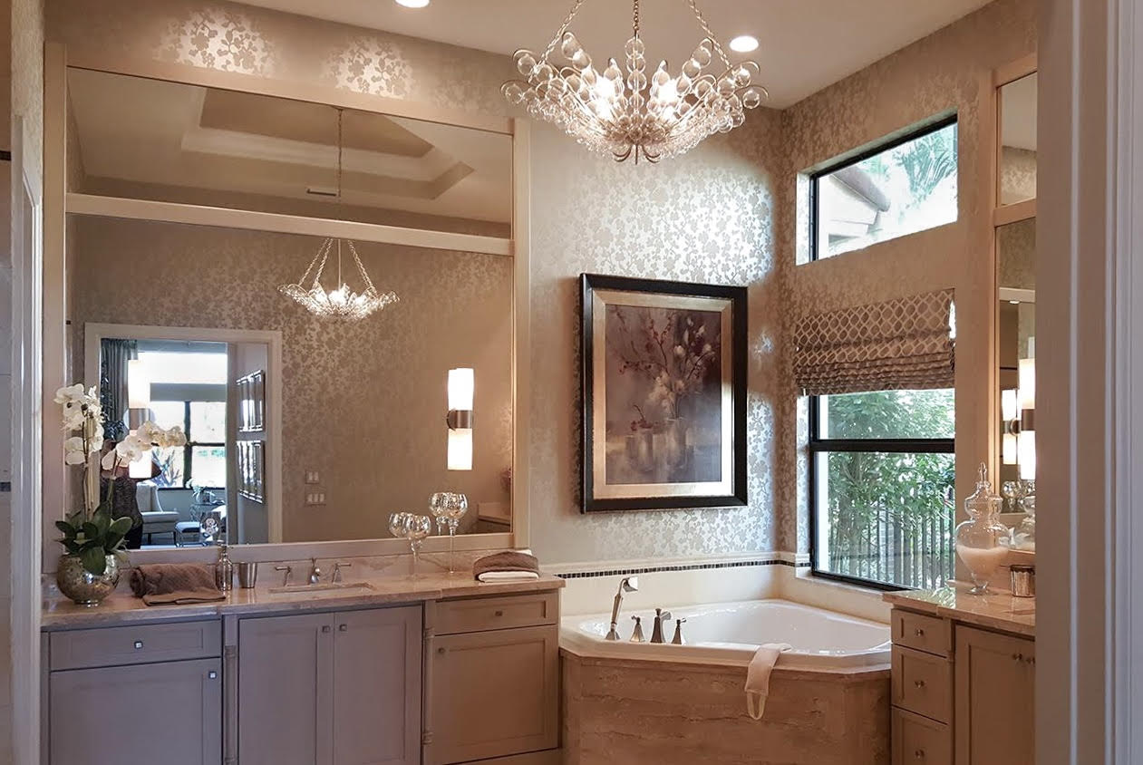
You may notice that a lot of these design fads include appliances set on a 45-degree angle – who can forget the soaking tub set on a 45-degree angle between two sinks? I recall constant conflict on how to finish the sides of the vanities.
- Should there be a half wall?
- What about a gap – was 6” enough?
- Oh wait – the gap required the side of the tub to be finished – could you do that in 6”?
You get the idea. I think the concept looked better on the floorplan than in reality. Attempting to clean the far corner of the tub became a task only Stretch Armstrong could handle.
Glass Block
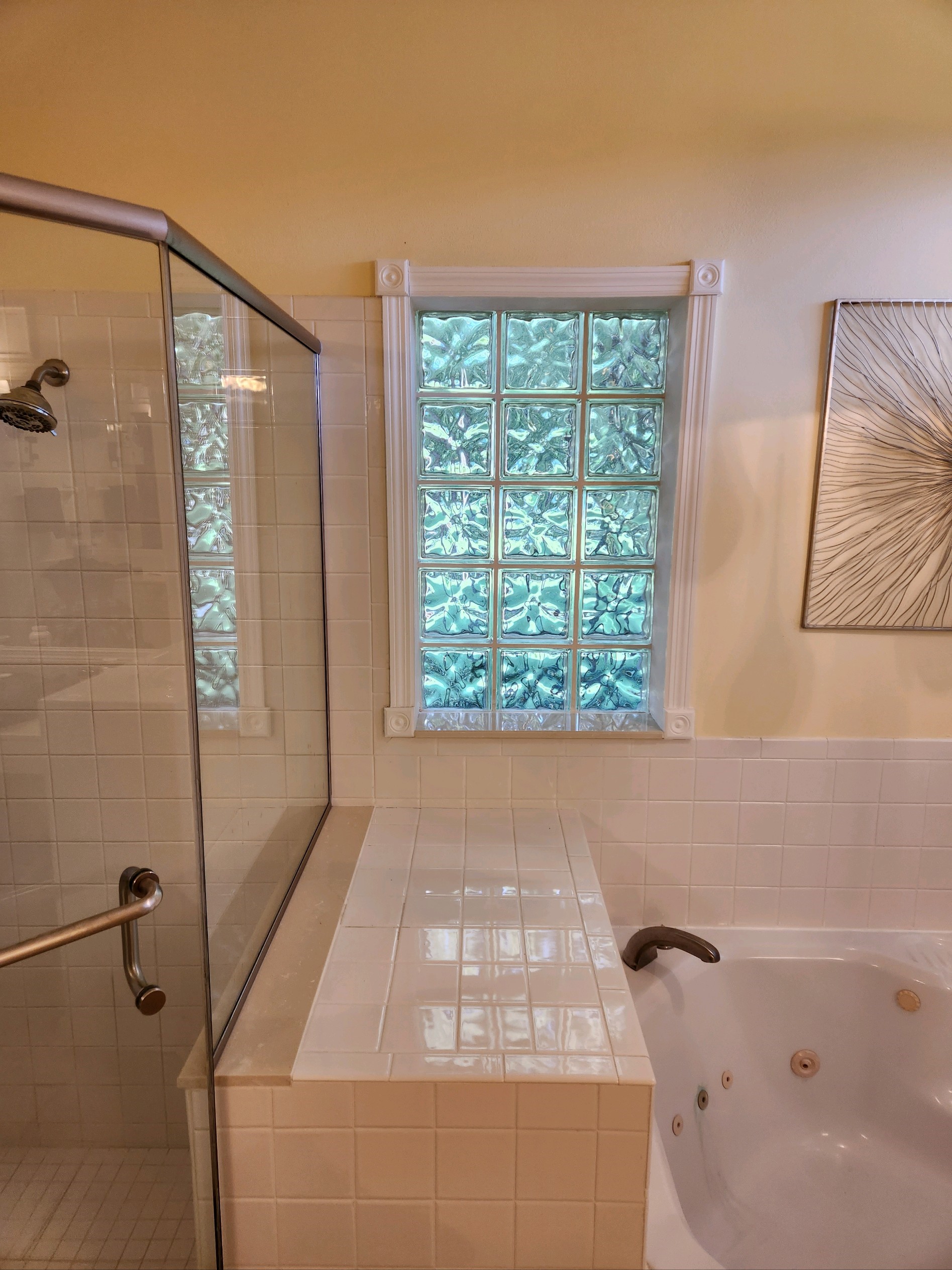
This seemed like the perfect solution in the bathroom, allowing natural light in while maintaining privacy. However, some communities wouldn’t allow it on the front elevation because it looked out of place with the rest of the house or community. It was also used as a shower enclosure because it didn’t show water spots like most shower enclosures at the time. You know what else it had? Grout. And grout in a water environment like a shower becomes gross. Trust me, I had a glass block shower.
Tiny Showers
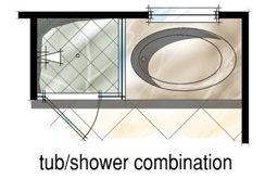
Have you ever showered in the code minimum 3’ by 3’ shower? It’s not easy! Showers can be an amazing way to wake up and become rejuvenated – but not if you have to step outside the shower every time you drop the soap. In another dark age of residential architecture, 3’ by 3’ showers next to a 3’6” by 5’ tub was the norm. This was thought to be an improvement over the tub shower. But the reality was the shower was used far more often than the tub. Homeowners deserve more space to shower than 3×3.
More to come next week.
I’ve received great feedback and hilarious horror stories on these faded design fads. Is there anything that we’ve missed? Next week, we’ll try to fit in another round of fads best left in the past. These include:
- Laundry room entry
- TV built-ins
- Breakfast “nooks”
- Dining rooms in the front “formal” area of the house
- 2 bathroom houses with 4+ bedrooms
- Single home office
- 8′ ceilings on second floor of expensive/larger houses
- Small laundry “rooms” without windows, folding area, or storage.
Did I leave anything out? Perhaps you even disagree that some of these are design fads at all – make your case! I welcome all thoughts!
Categorized in: Uncategorized
This post was written by Housing Design Matters

