Last week, I talked about some common symptoms of outdated floor plans. If you missed it, please see it here.
I received some great responses from folks who read our Matters of Design blog.
“You wrote this blog for me…I know it. I need some guidance on what to do at my house regarding an update to the floor plan,” wrote one builder client. Nice house on a great lot but super dated.”
“You must help me with my house! There is simply not enough storage for me and Frank,” wrote Pam (name changed for privacy). “We love our neighborhood and Frank has a 7-minute commute to work.”
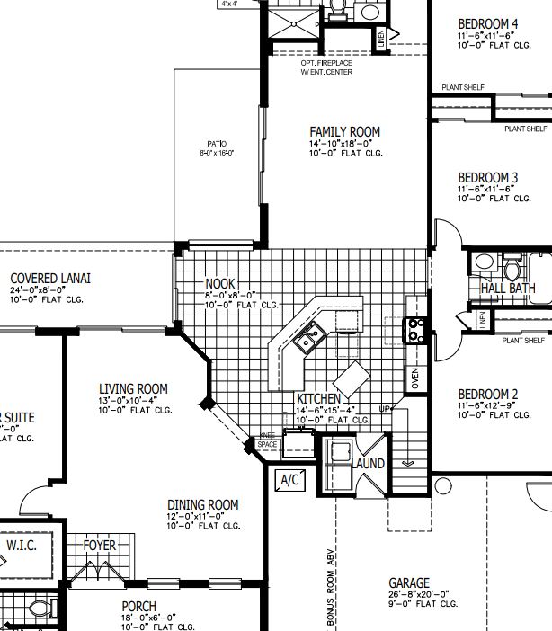
Pam included the original floor plan brochure of her house. Turns out, a lot of people in Florida have a similar floor plan like hers. We call it the Florida L first made popular by Arthur Rutenberg – so named for the L shape the family room and bedroom wing create. The house has many of the features we mentioned last week.
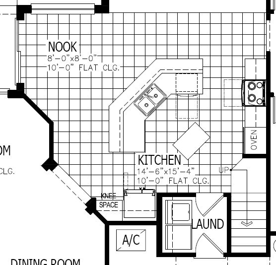
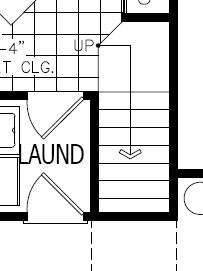
- Tiny walk-through laundry room
- Dated kitchen
- Bat wing island
- No walk-in pantry
- Microwave over the cooktop
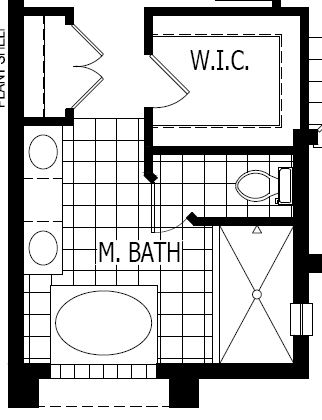
- Giant bathtub in the primary bath
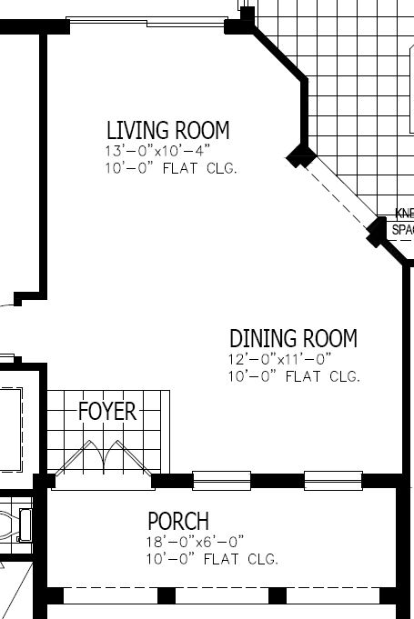
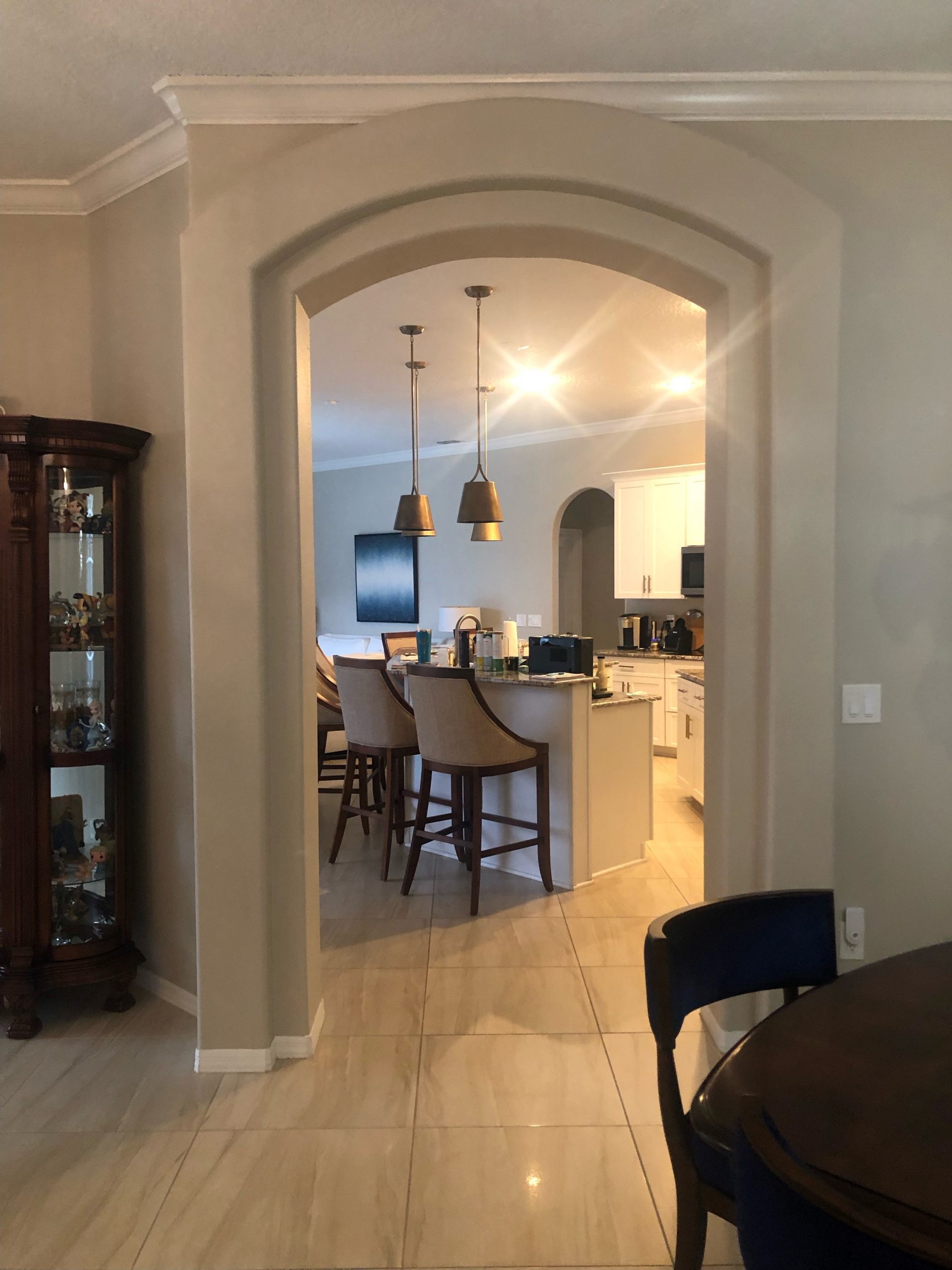
- Formal living and dining room
- Oh – and angles – lots of angles!
You’d think we used her home for the original speech! By far, the biggest problem was the lack of storage throughout the house. Frank keeps his clothes in one of the other bedrooms and Pam is miserable with the storage in her bath. Currently, the back bedroom serves as Pam’s office, which left two guest bedrooms for their daughters when they visited.
By today’s standards, the house has too many rooms. Our solution is to take one of the formal rooms and reorganize the plan. To make this remodel as affordable as possible, we have stayed within the existing walls – at least for now.
One Less Formal Room
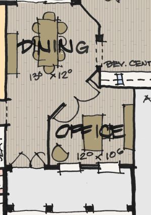
We started by turning the former dining room into Pam’s office. Then we moved the dining room into the former living room. The doors into Pam’s office will allow her to conduct her meetings on Zoom with acoustical privacy. And since her office is always beautiful (a skill I need her to teach me), there still allows a nice view upon entering.
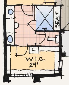
Primary Bath & closet
Moving to the primary bath, we switched the location of the bath and closet – giving us a lot more storage. We also eliminate the tub and its giant platform. The window on the current bath was glass block so no one hesitated to put clothes hanging in front of it. Our biggest challenge is currently there is no natural light in the bathroom. Perhaps one of my readers can tell me how costly it is to add a window in a concrete block wall.
The kitchen
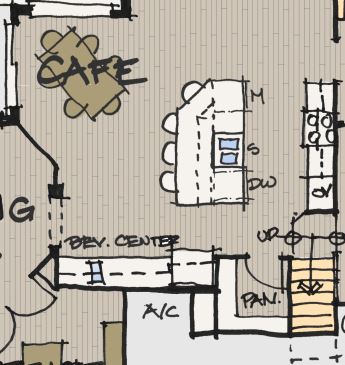
The bat wing island must go! Such a waste of space. Someone had a brilliant idea to add an additional island in the middle of the kitchen – which just gets in the way.
Our idea was a straight island that was long enough to include a dishwasher, sink, pullout trash, and a drawer microwave. This would also allow us to move the microwave from above the cooktop. To increase storage, we added a row of 12” cabinets on the café side of the island.
The former laundry room becomes a walk-in pantry – which still seems small on plan. We tamed one of the angles and added a beverage center next to the refrigerator. It could be for coffee, but I am hoping it is where they store wine for when I come to visit.
Laundry Room and Family Foyer
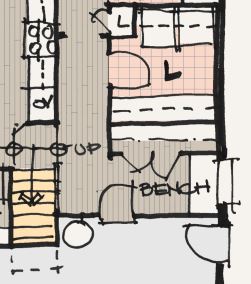
Since we moved Pam’s office to the former dining room, this allows us to use one of the bedrooms to “fix” the plan. We took the bedroom space and made it the laundry room and family foyer. It’s not perfect, as the current water heater is where we wanted the door to the garage. We did add a large closet (hopefully not for Frank) and a bench under the window. The laundry room is now 8’-6” by 8’ and has lots of storage and my favorite – wet hanging.
The bonus room stairs
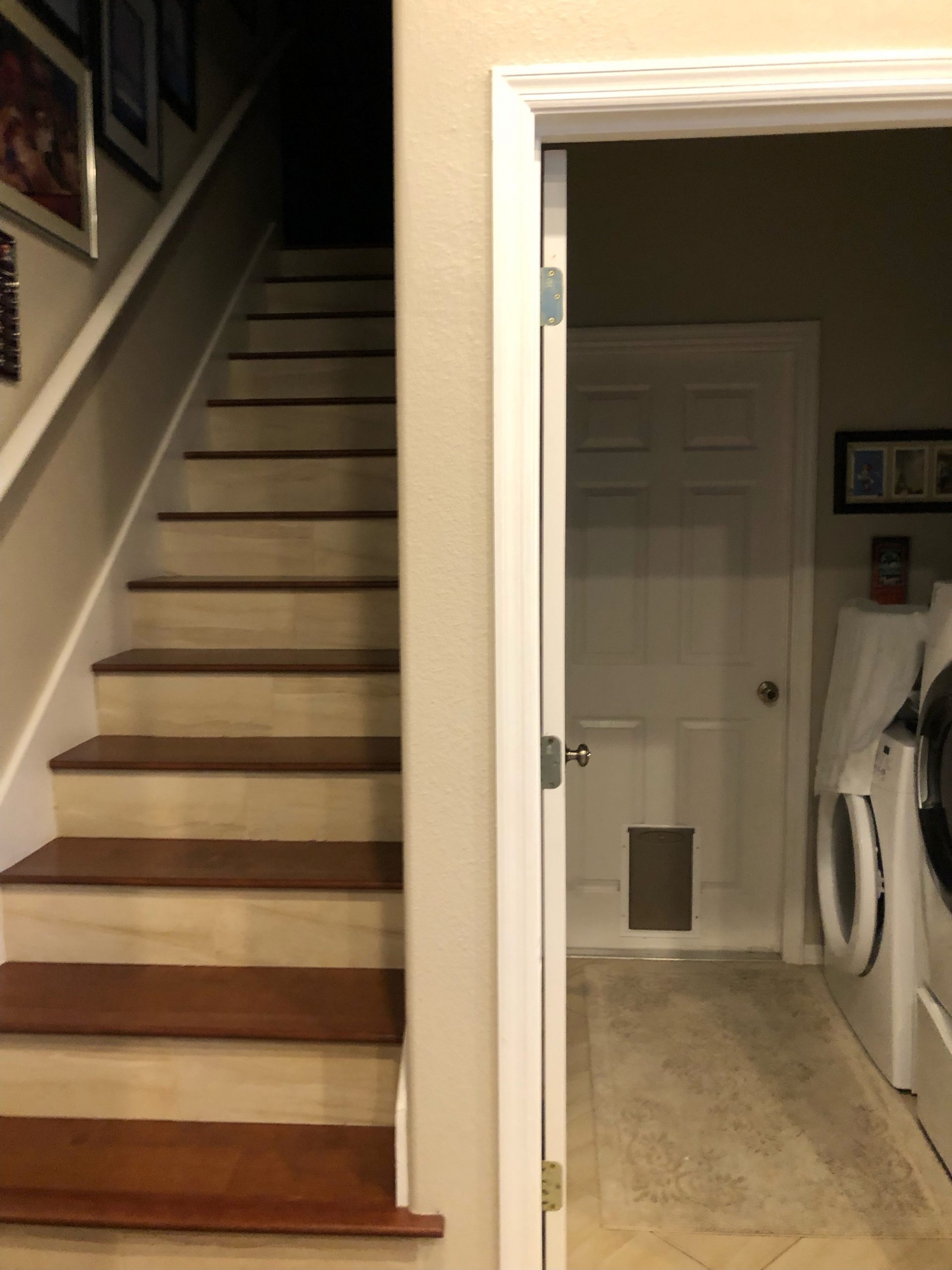
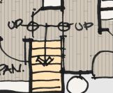
This is by far the most challenging part of the plan. The original design didn’t have a bonus room and had a better kitchen. But in the late 90s, everyone wanted a bonus room over their garage. The current stair is shoehorned in, and it killed the kitchen storage!
The first step extends into the kitchen, making the access from our new family foyer less desirable. Currently, we are showing you can access the stairs from both sides by opening the side of the stairs to the family foyer, so it is less claustrophobic. The dual access stair could either be a shortcut into the kitchen or a terrible tripping hazard. It’s still a work in progress.
Thank you, Pam and Frank, for sharing your house plan with the Matters of Design audience. It is such a great example of how we used to live. If anyone reading this blog remodels homes in the central Florida, give me a call. I have a client for you!
Categorized in: Uncategorized
This post was written by Housing Design Matters

