So, you have the perfect floor plan. You’ve hit your room count and square footage targets and you are ready to see this new home built – or so you think. Slow down, Tex! Before you begin digging the footings, take a moment and see how the plan furnishes. After all, no one lives in an empty house. Is your plan livable? It’s better to discover plan flaws while you’re dealing with lines on paper instead of after the fact when your customer can’t walk around their family room.
Because each room in the house has its own specific use and function, each room has its own unique furniture requirements. Let’s cover some popular spaces and examine the ideal furniture arraignment.
Family Room
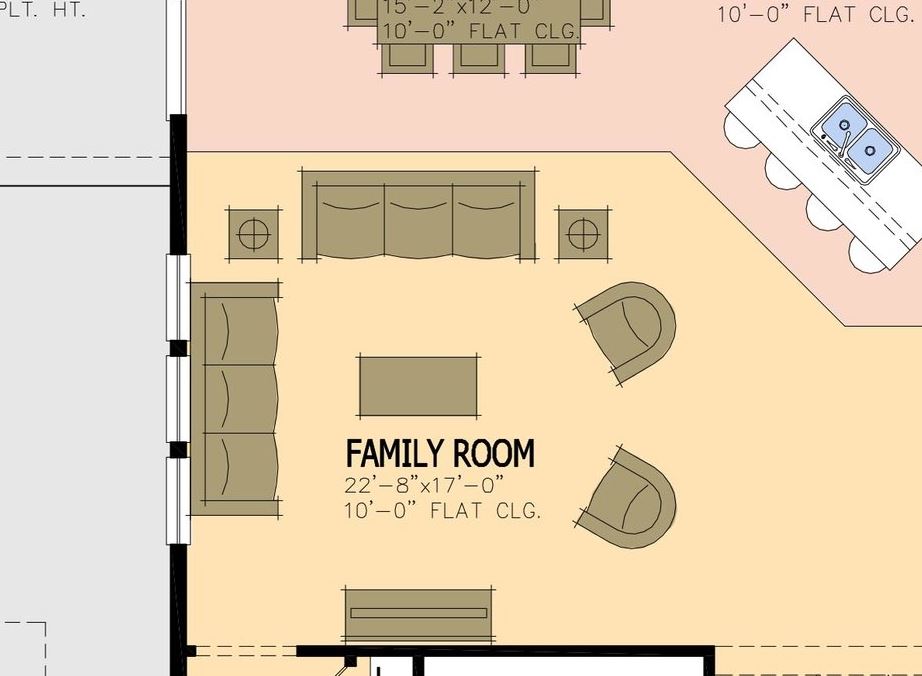
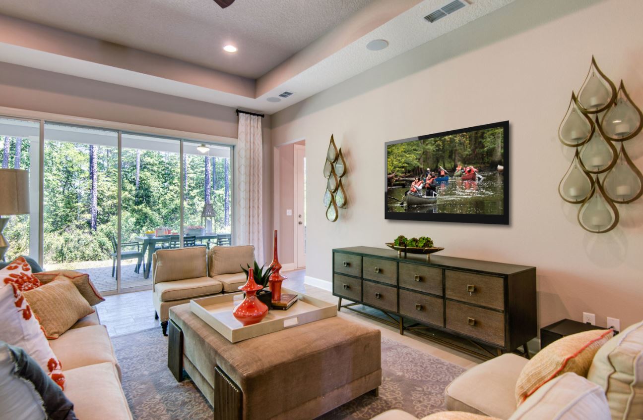
We always try to show two full-size couches in an “L” arrangement. That way, if the buyer has a sectional, we know there won’t be an issue. If only a couch and love seat fit, make sure the TV is directly across from the longest couch.
For rooms with both a TV and a fireplace, I believe the TV should take precedence for placement. After all, we watch TV fairly regularly and only use the fireplace occasionally. It is important to view the TV straight on while a flickering fire adds ambiance to the room without having to stare directly into it. I like the fireplace in the corner and the flat screen TV centered in the wall. I frequently see the TV mounted over the fireplace – but I find this puts the screen too high, straining the neck for viewers. Linear fireplaces are better for this since they are not as tall, though they are often too contemporary for a home buyer’s taste.
Lastly, if you can tuck the furniture into a corner as opposed to floating it in the middle of the room, the space will live and feel larger.
Master Bedroom
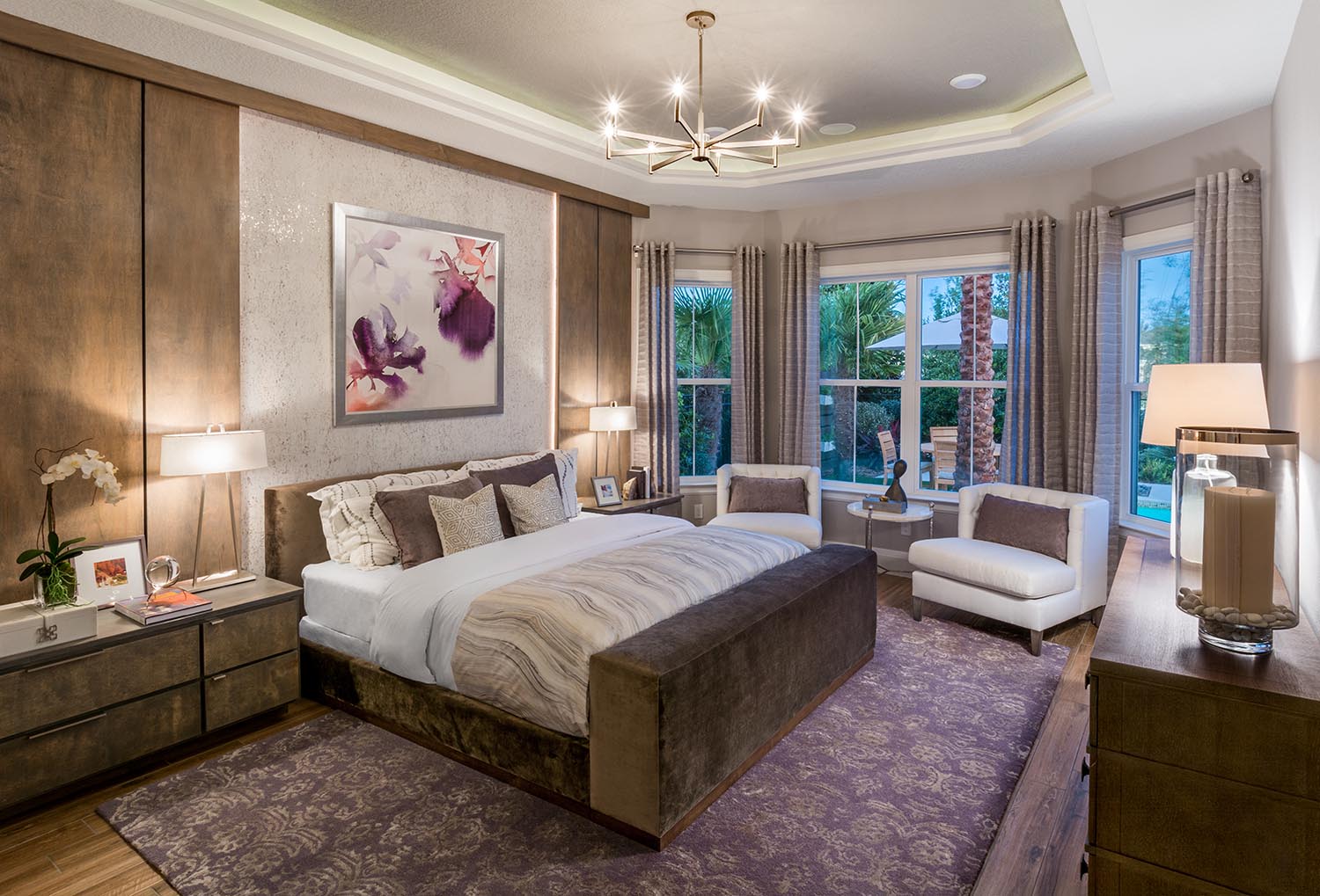
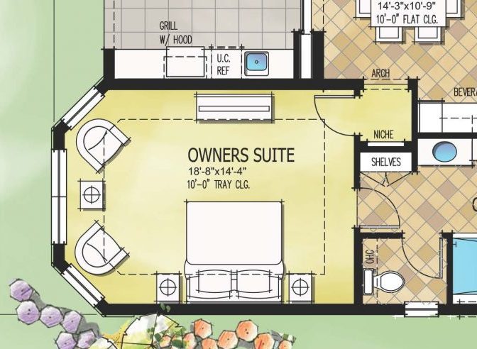
The most importance piece of furniture in the room is the bed – we always show a king-size bed. The bed should be directly across from you as you enter and you shouldn’t have to walk around it just to get into the room. Across from the bed should be a dresser. There used to be a mirror over the dresser but that has been replaced with a flat screen TV there. If there’s room, including a couple of chairs for a sitting area is nice. But even the smallest bedroom needs a place for a chair to sit down and put on your socks.
Secondary Bedrooms
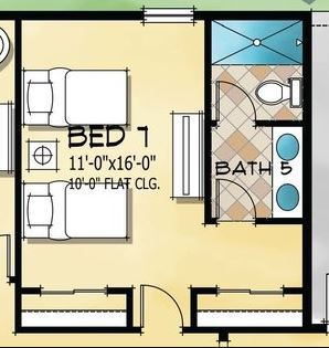
I find most floor plans address the master and the family room well but forget the secondary bedrooms. They also need a place for a bed and a dresser! Too often the strip closet is across from the only bed wall and there’s no dresser wall – oops!
Dining
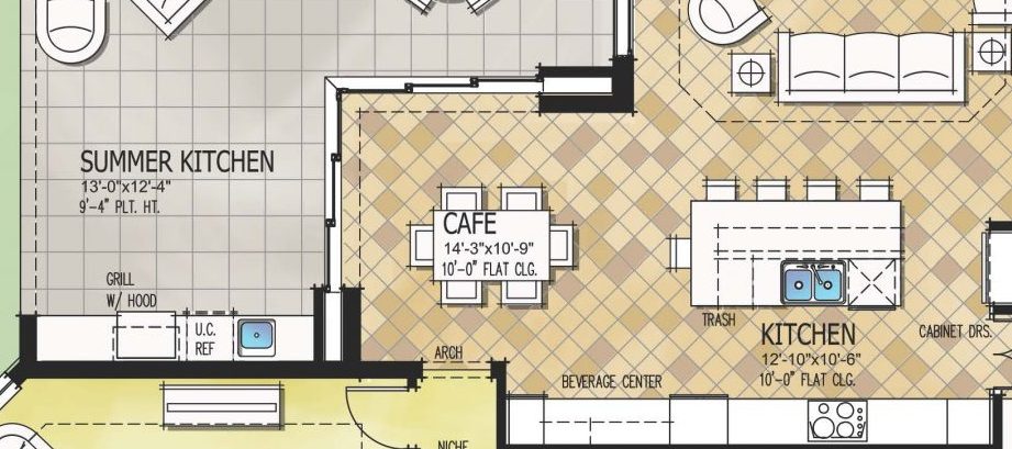
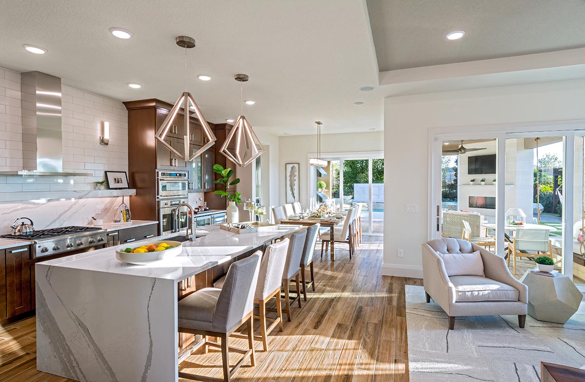
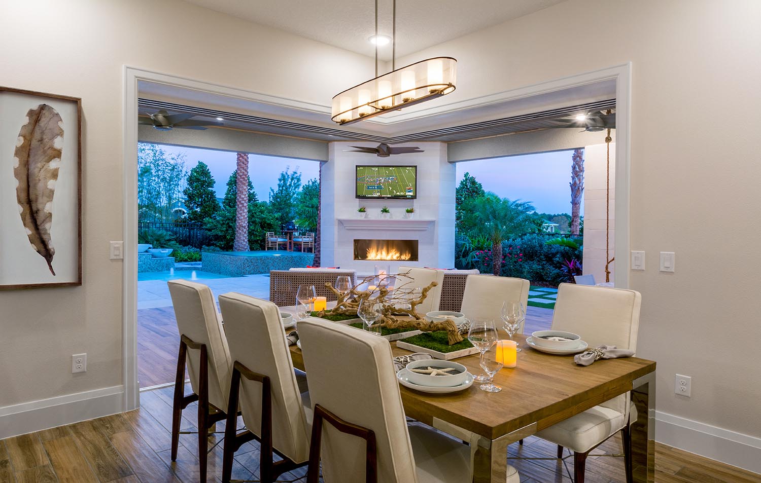
Whether there’s a formal dining room or just casual dining, table placement with chairs is vital. We like to show a table that can seat at least 6. If there is a sideboard or hutch in the room, will it push the table off-center from the light above? Don’t forget to show chairs at the kitchen island and ensure that no conflict exists between the two.
Furnish Your Floor Plan for Marketing
One of the bonuses to showing furniture on a floor plan is it adds scale! Most buyers can’t tell you how big their current bedroom is and therefore cannot be certain what size they want or need. Placing a king bed in the plan allows them to visualize and understand the space around the bedroom and if there is room for a couple of chairs.
Furnishability reveals a plan’s livability. This quick and painless exercise will reduce headaches down the road and result in happier customers.
Categorized in: Selling Floor Plans
This post was written by Housing Design Matters


