Elevation styles are constantly changing. We often find a style originating in one part of the country, then migrating to other regions. In different parts of the country, we also see regional variation to a style. For example, a Craftsman home built in the northern part of the country may have a steeper pitch than its southern counterpart, or use different materials. Certain styles were region-specific like Prairie, Cape Cod, Shingle Style, or Low Country. At least they were ….
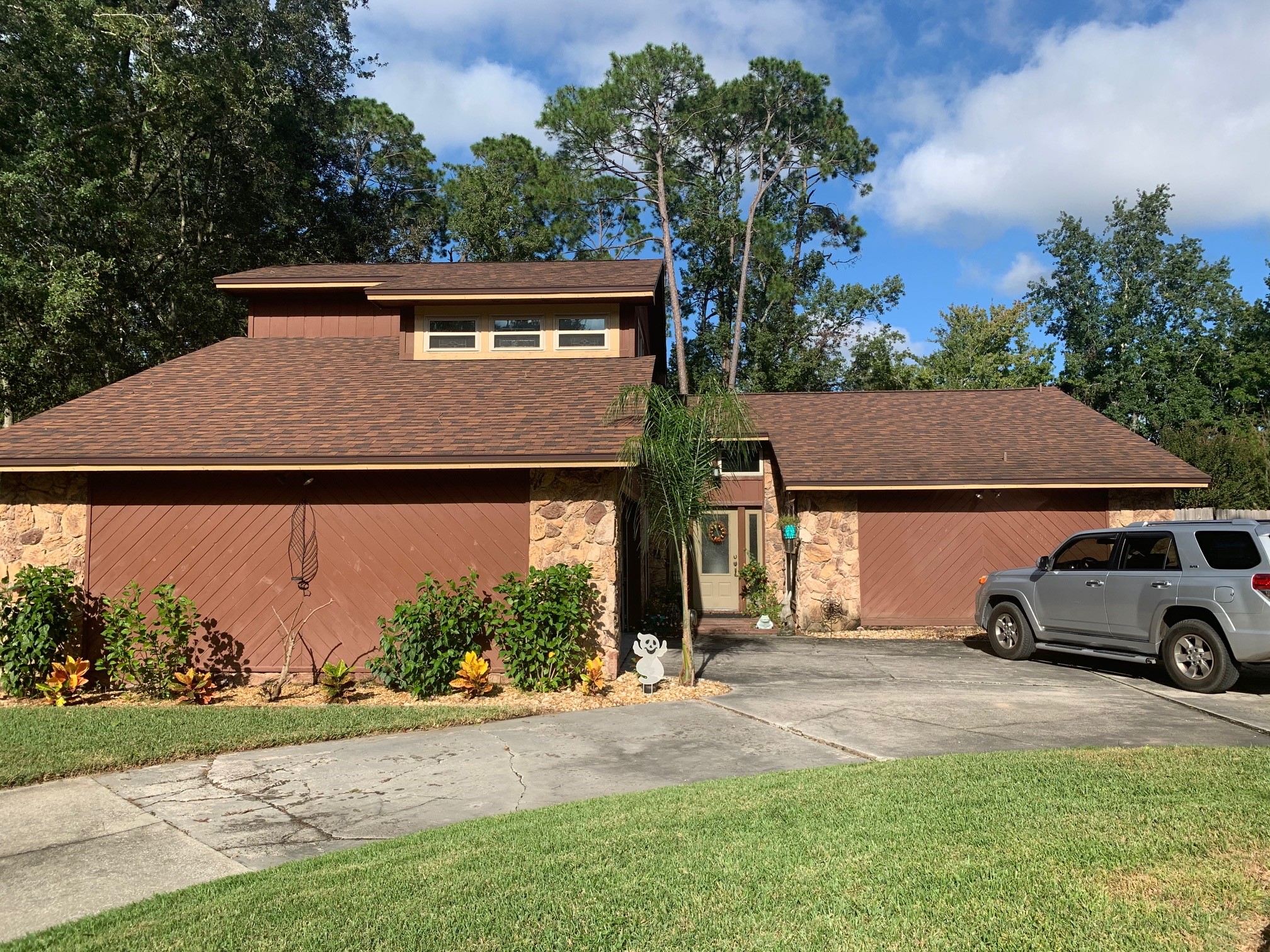
We also find styles are often tied to certain time periods. In the fifties and sixties, we had midcentury modern (probably was just called modern then). This style often featured extremely low-pitched roofs with trapezoidal glass transoms. In some regions of the country, these houses featured diagonal wood siding, shed roofs and clerestory transom windows.
The Sixties
When I first moved to Jacksonville Florida in the eighties, I saw lots of diagonally sided houses that had been built in the late sixties and seventies. They were brown or rust in color. It was not a style I was fond of and many had started to show signs of wood rot and decay.
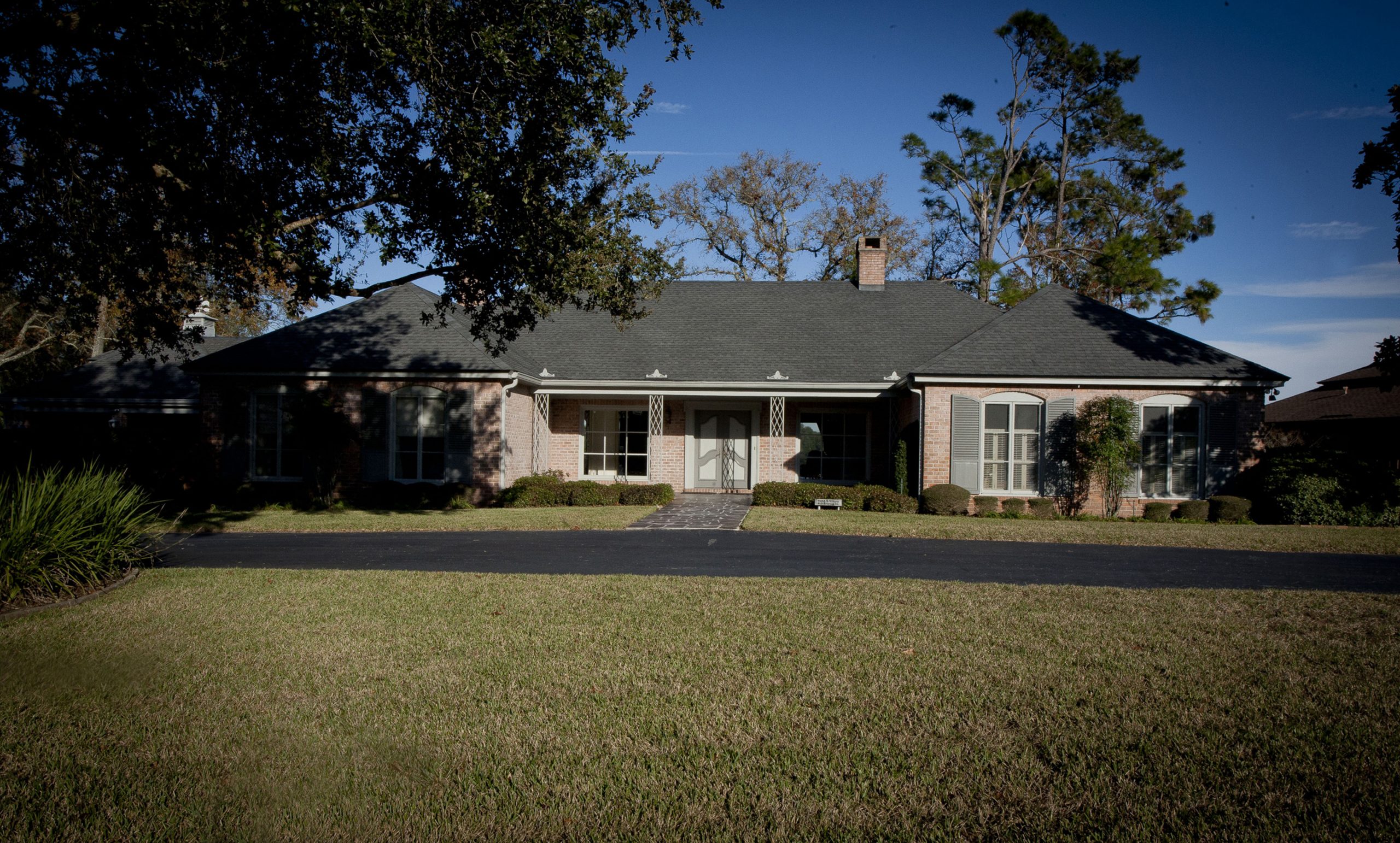
Equally as uninspiring to me, was the very timid style featuring all brick with hip roofs all with the same plate height. These homes didn’t have to worry about wood rot, but they lacked that “ta-dah” factor.
The Eighties
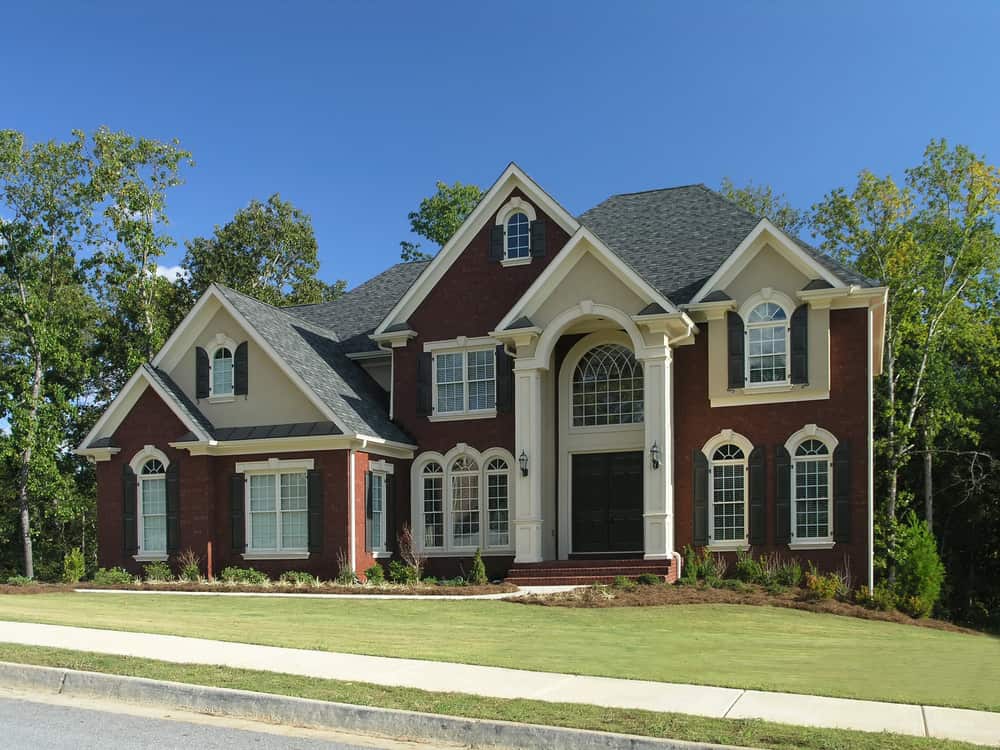
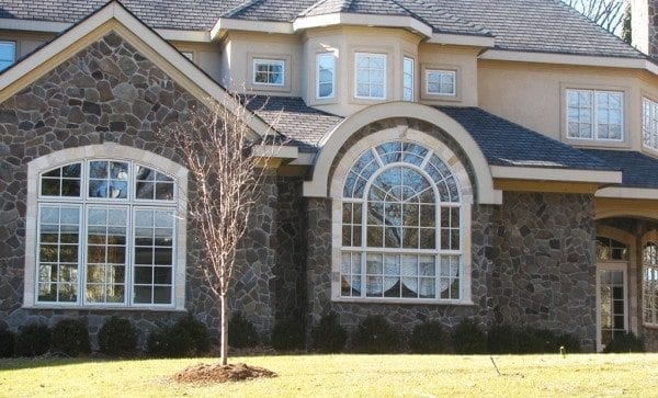
Then came the eighties, a period of big hair and giant half-round windows with two story foyers!
Boy, were these windows were super popular. We saw them in just about every style house, traditional, Mediterranean, and houses with no discernable style at all. The more half round windows you had, the better – apparently. My house built in the late eighties had a 6’ wide half round window in the master bedroom. Wow – was it dramatic! Of course, you could forget about sleeping in and the window leaked like a sieve.
As a designer during that time, we found we had to mix it up, so we started using arched top windows to add diversity to the streetscape. Unfortunately, some designers thought it would be cool to use both half rounds and arched top windows in the same house! Was this the start of the blender style of architecture? You know, throw all your favorite architectural features into the blender and see what come out.
A Cry For Normalcy
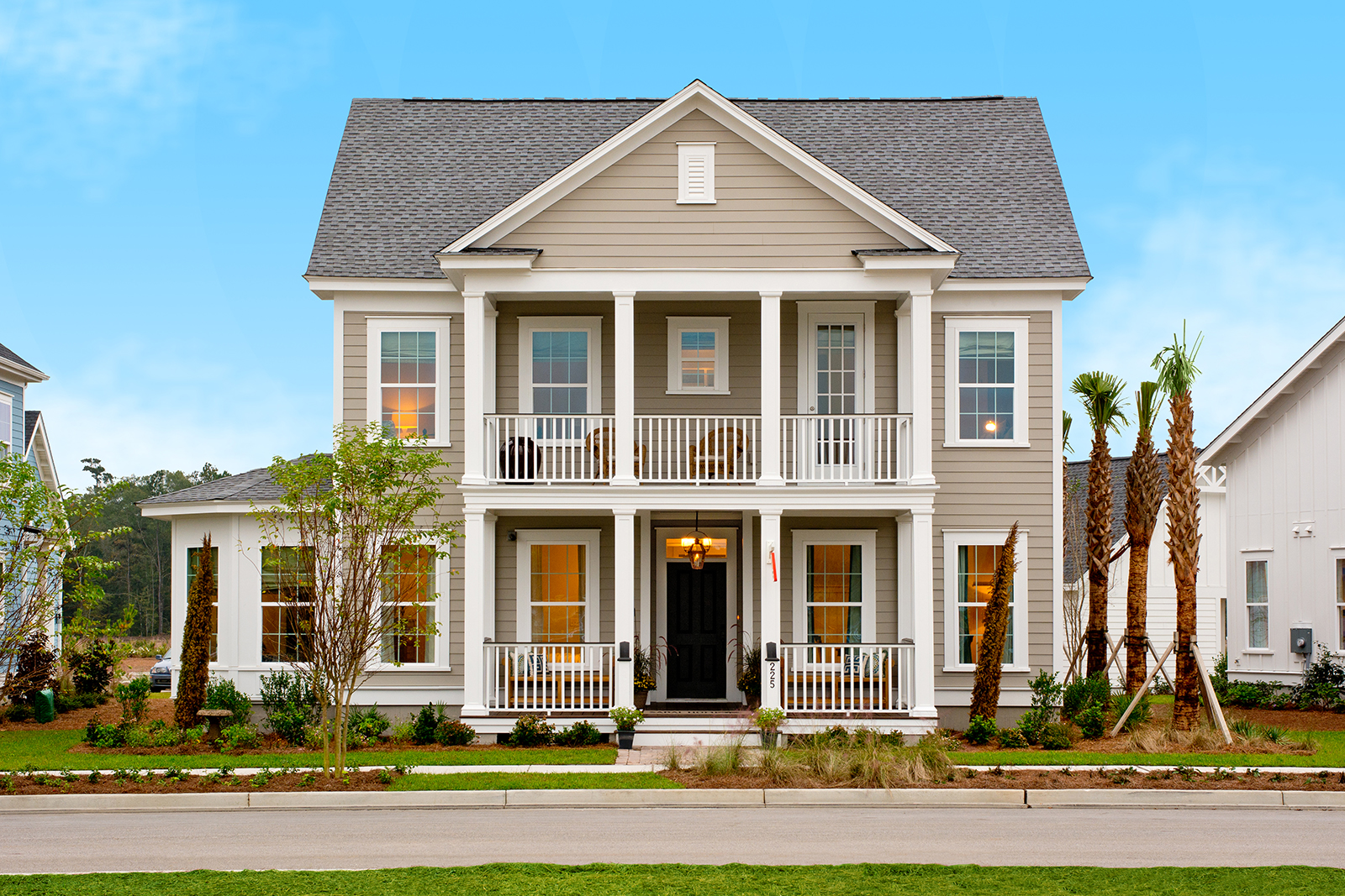
Soon after the half round window and blender style craze, buyers started to notice you could guess the year a home was built based upon the exterior style. No one wanted a “dated” looking house. Enter the period of “timeless” styles. This period also corresponded with traditional neighborhood developments. A nostalgic period of architecture, executed with modern materials. We often duplicated styles of older, legacy neighborhoods that were known for the style and character. Jacksonville has Avondale, Charlotte has Meyers Park, Tampa has Hyde Park, and so-on. This was the perfect blend of regional nostalgia.
The “Fixer Upper” Era
But some buyer, builders, and designers have grown bored with this. Builders are always seeking something new and fresh styles to get an edge on their competition. Buyers too want something new and fresh that doesn’t look cookie cutter or like a “track” home.
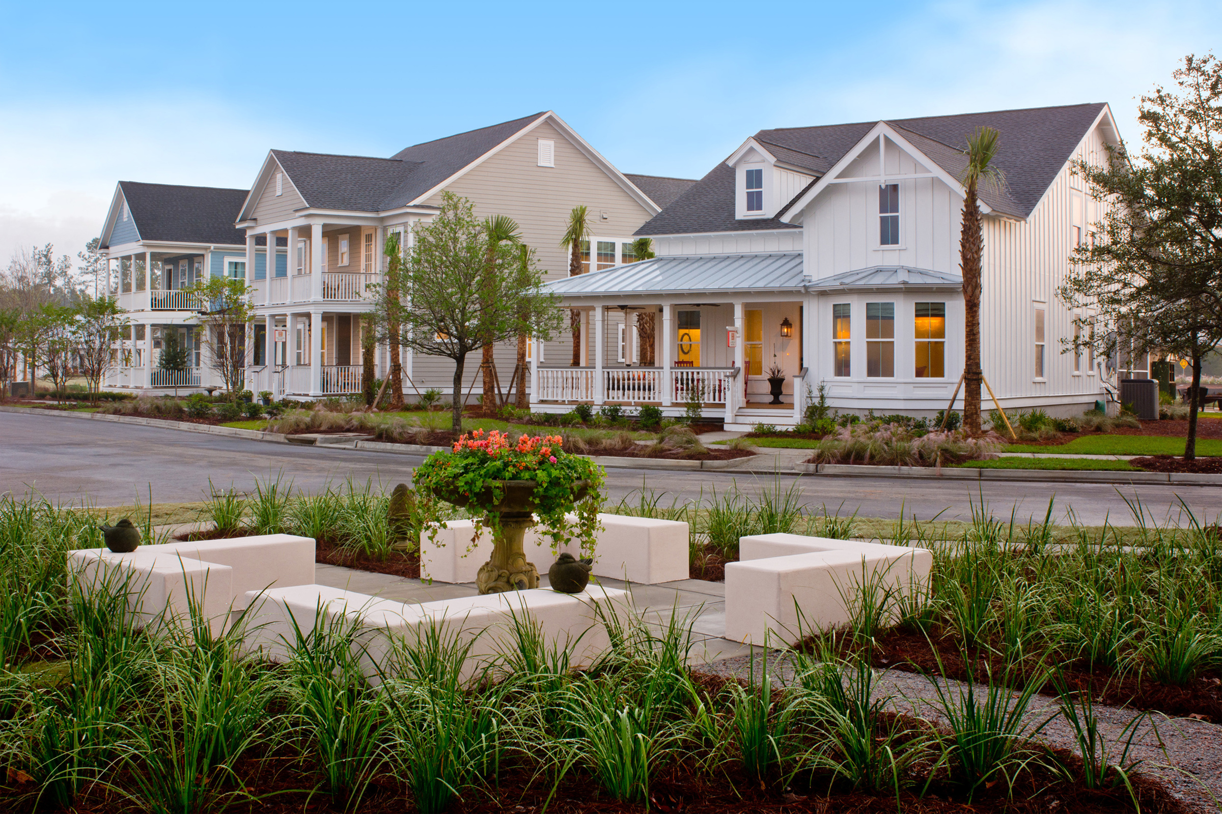
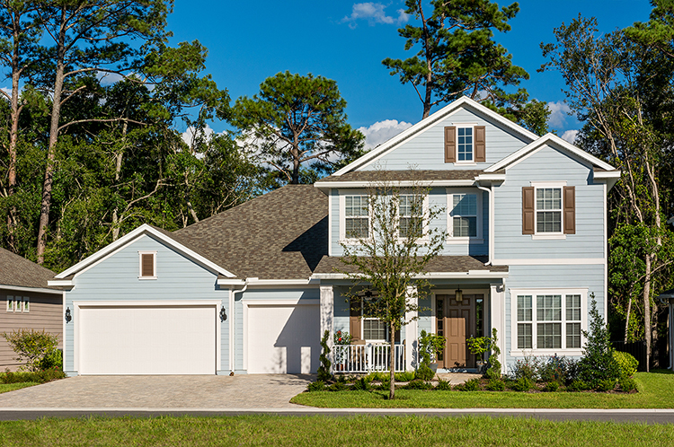
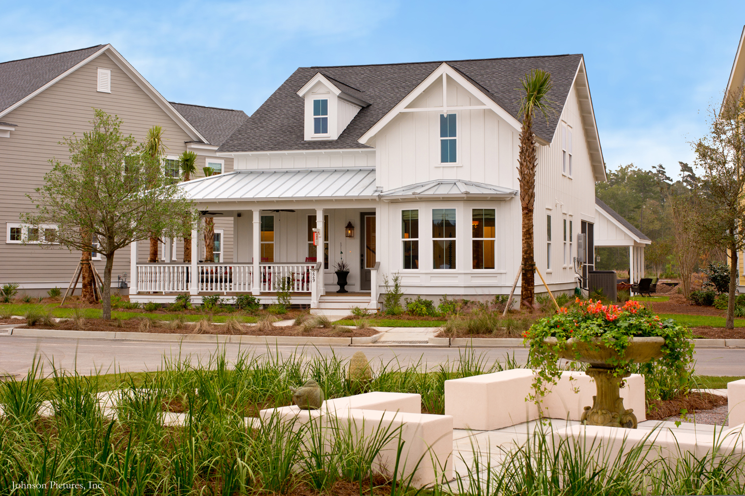
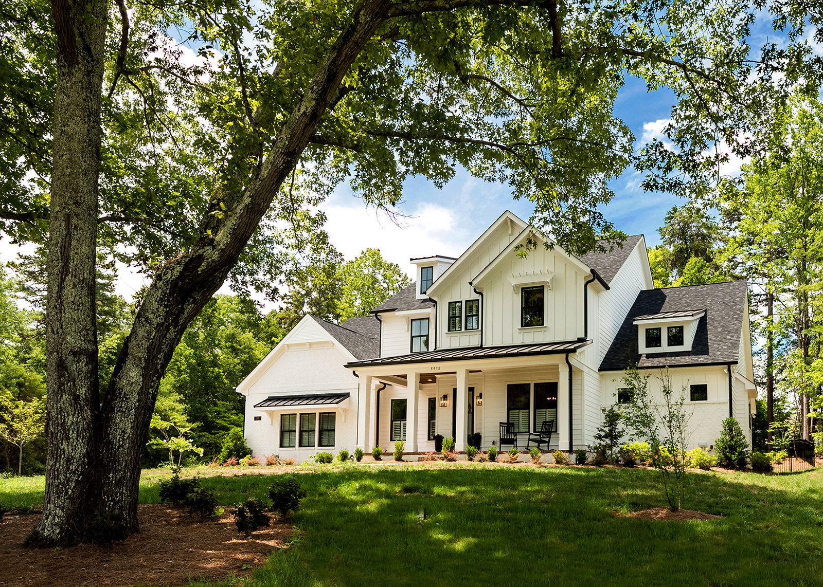
Enter the Modern Farmhouse style. It was the perfect combination of new and nostalgia. How “modern” depending on where you were building – more modern near the urban core, less so in the suburbs. Popularized by HGTV, this style swept through the country like wildfire. Since many assumed that the farmhouse style could only be painted white, we are beginning to see a monochromatic streetscape of white!
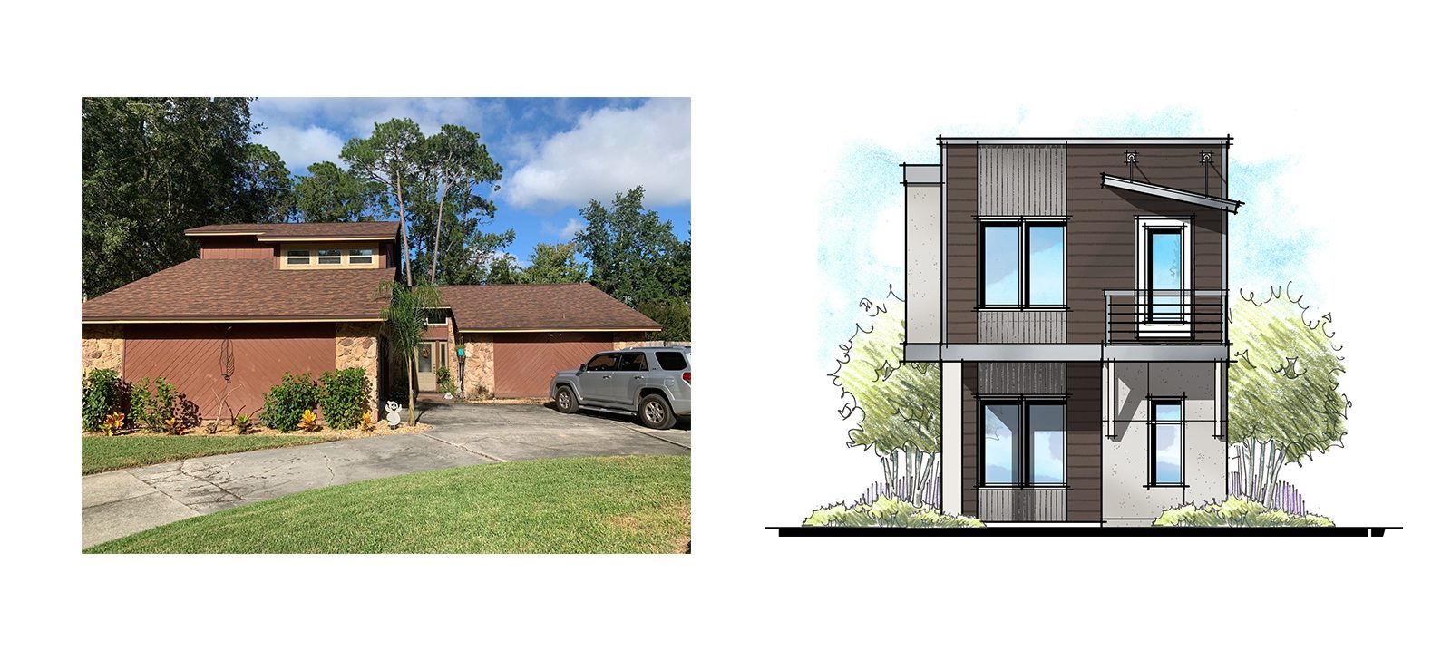
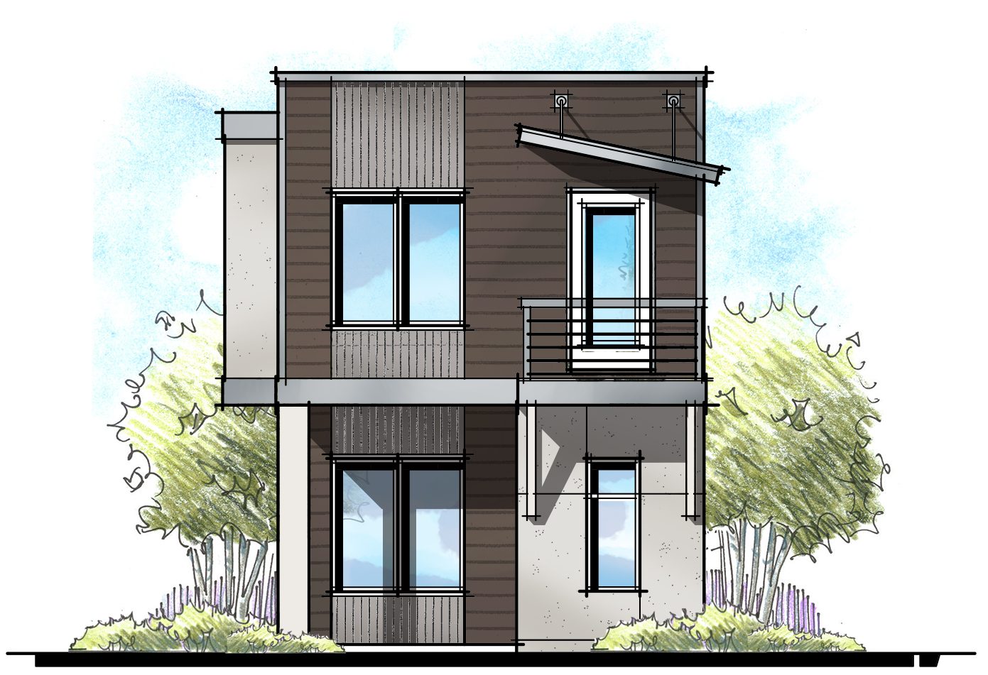
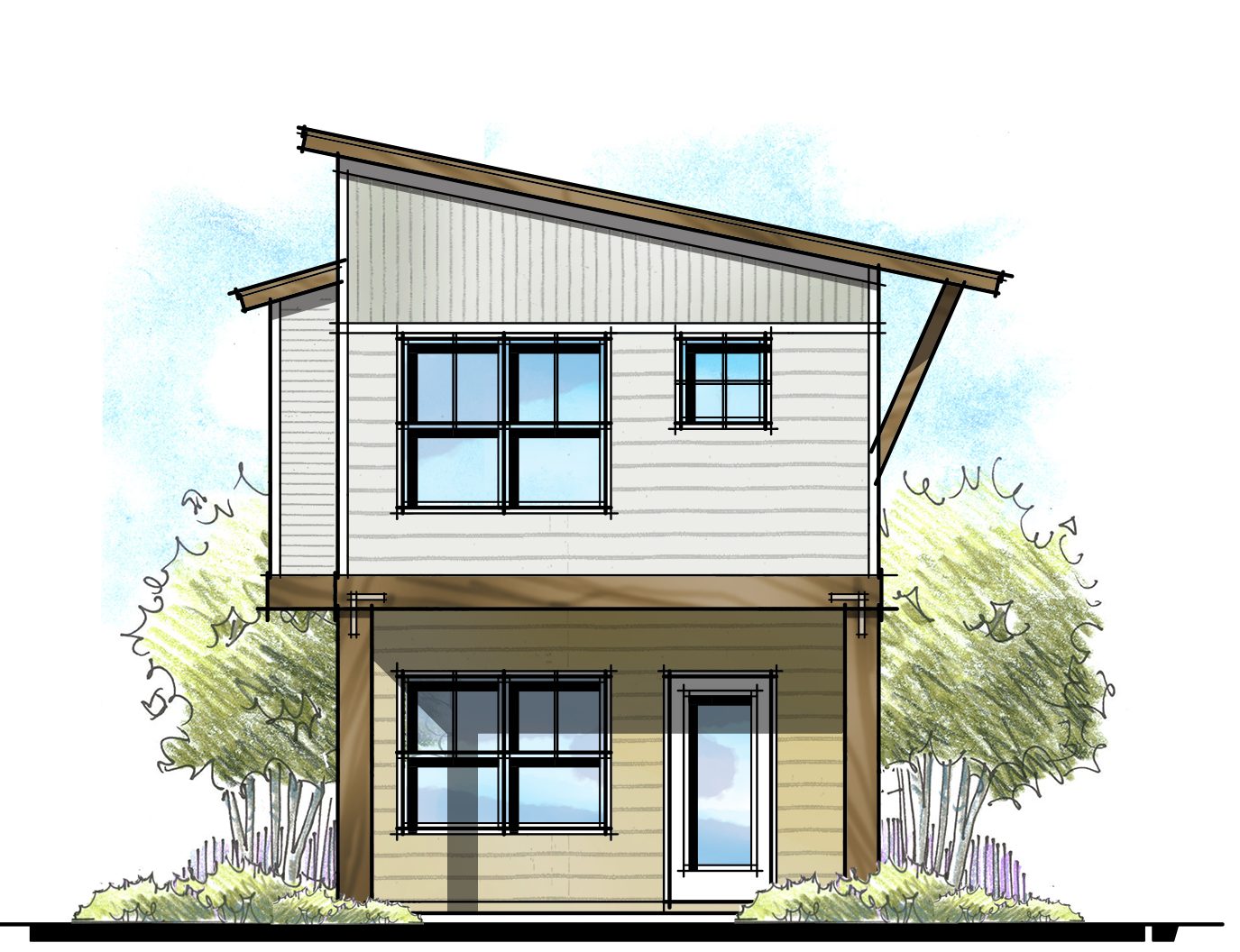
Alas, time stands still for no one. By now, my designer friends in California and Colorado say they’ve moved on from this style and moving on to more modern and daring styles. Will those “new” modern styles be accepted in places like Birmingham AL or Baton Rouge LA? Fast forward ten years from now, will these new modern styles become dated and tied to 2020?
Isn’t that the age-old dilemma? The desire for something that pushes the envelope, but retains a shelf life of longer than 5 years. Walt Disney World struggled with this too. They had an entire section of their theme parked called Tomorrow Land. They discovered that was impossible to keep Tomorrow Land from looking dated after only a few years. Instead, they adopted a Jules Verne vision of tomorrow. Seems like a nice solution – a nostalgic vision of the future. Could we see that in combination in suburbia?
Are you seeing any new and exciting styles emerge? What styles have become overdone or dated in your region? You know I love your input and images!
Categorized in: Exterior Styles
This post was written by Housing Design Matters

