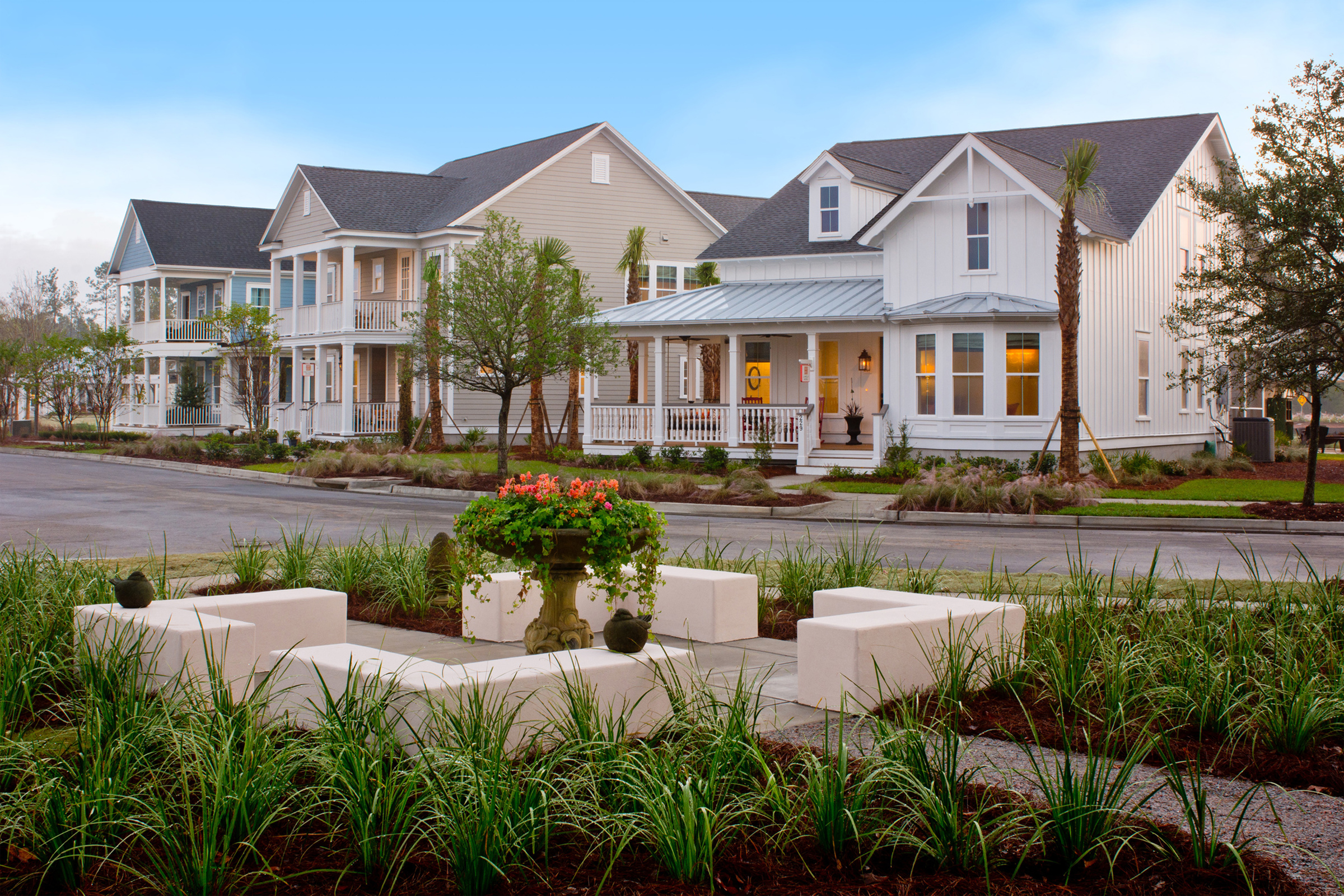
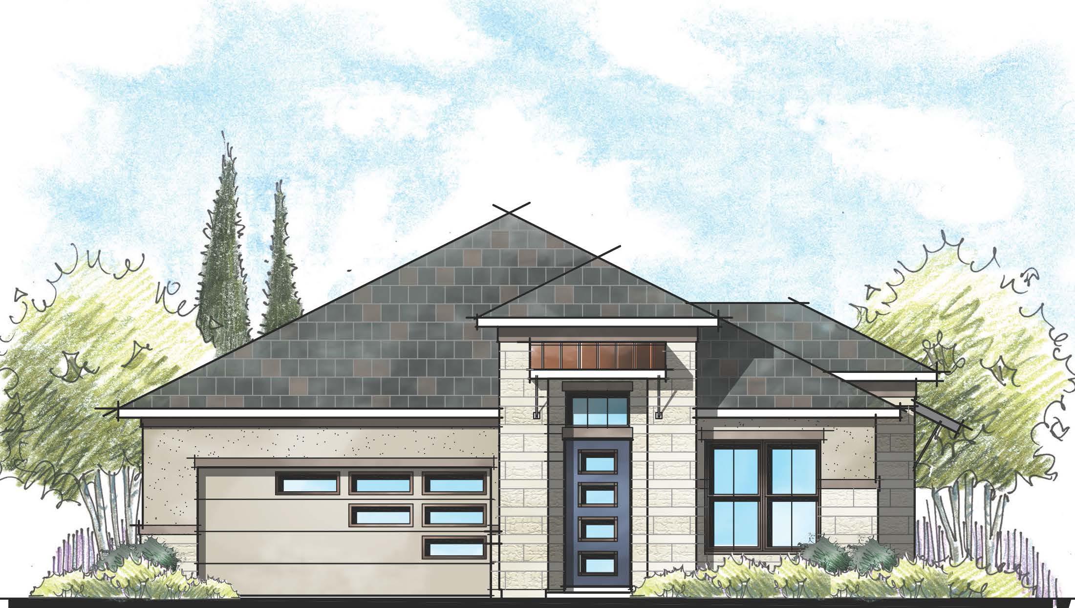
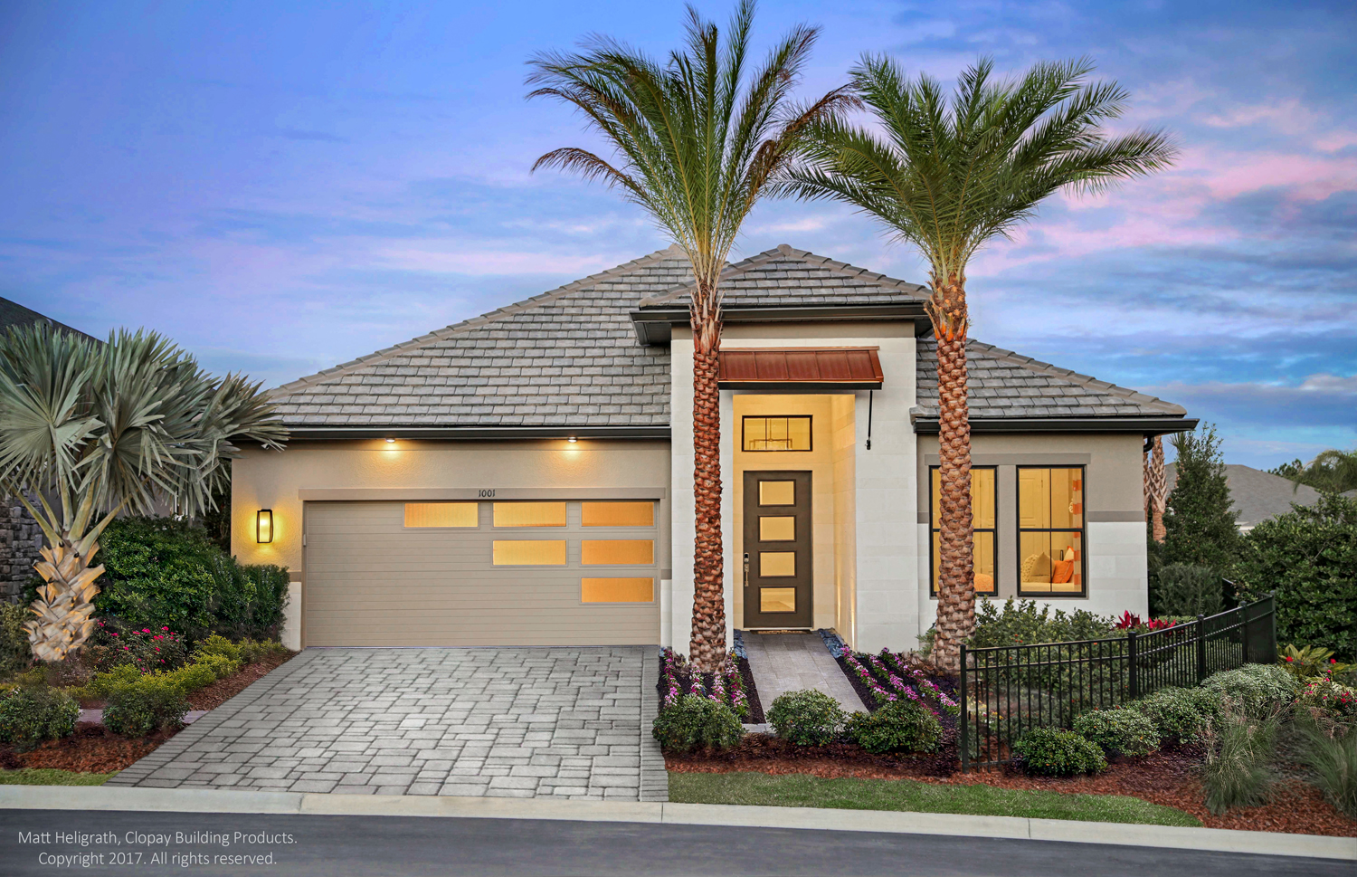
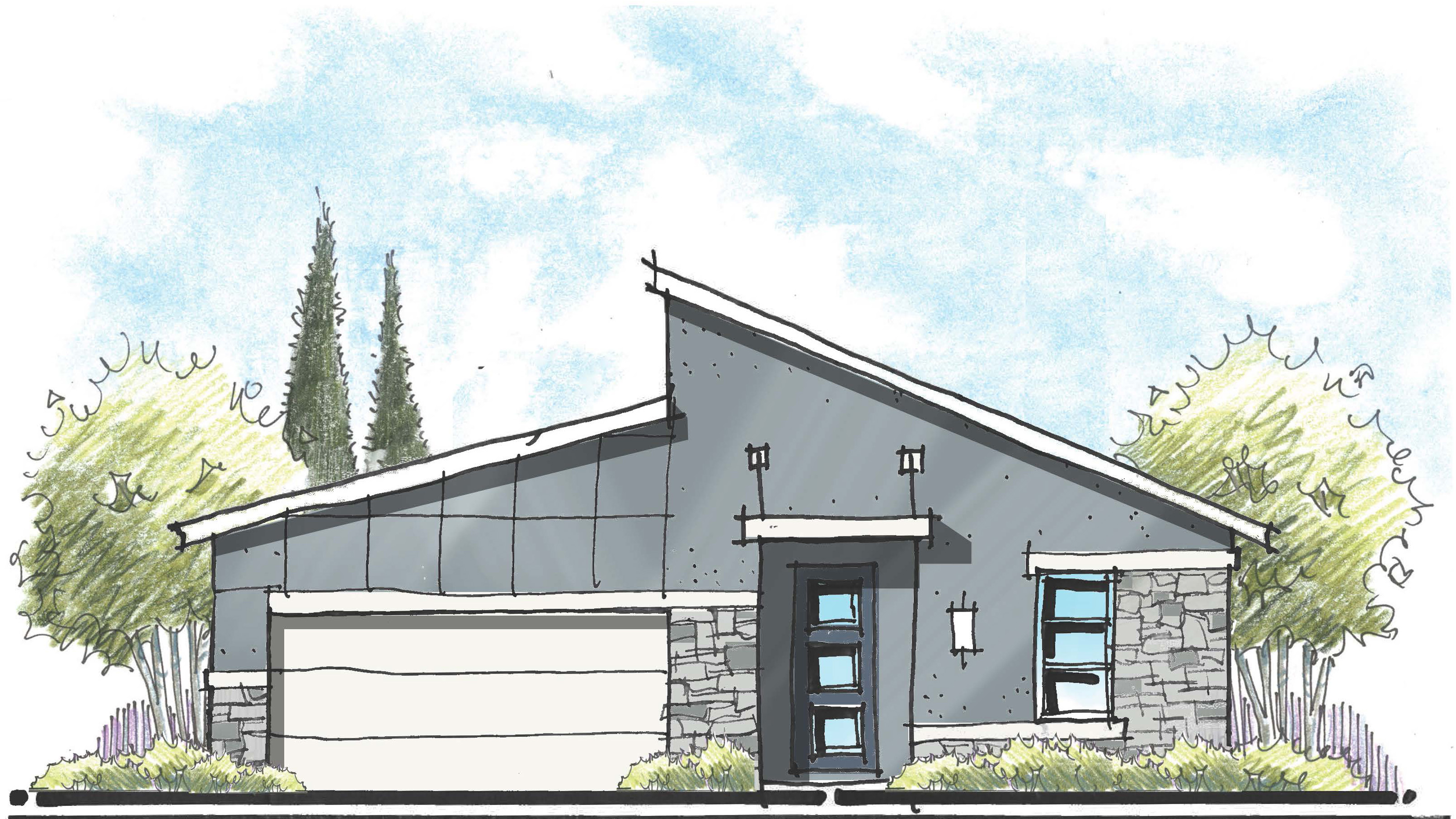
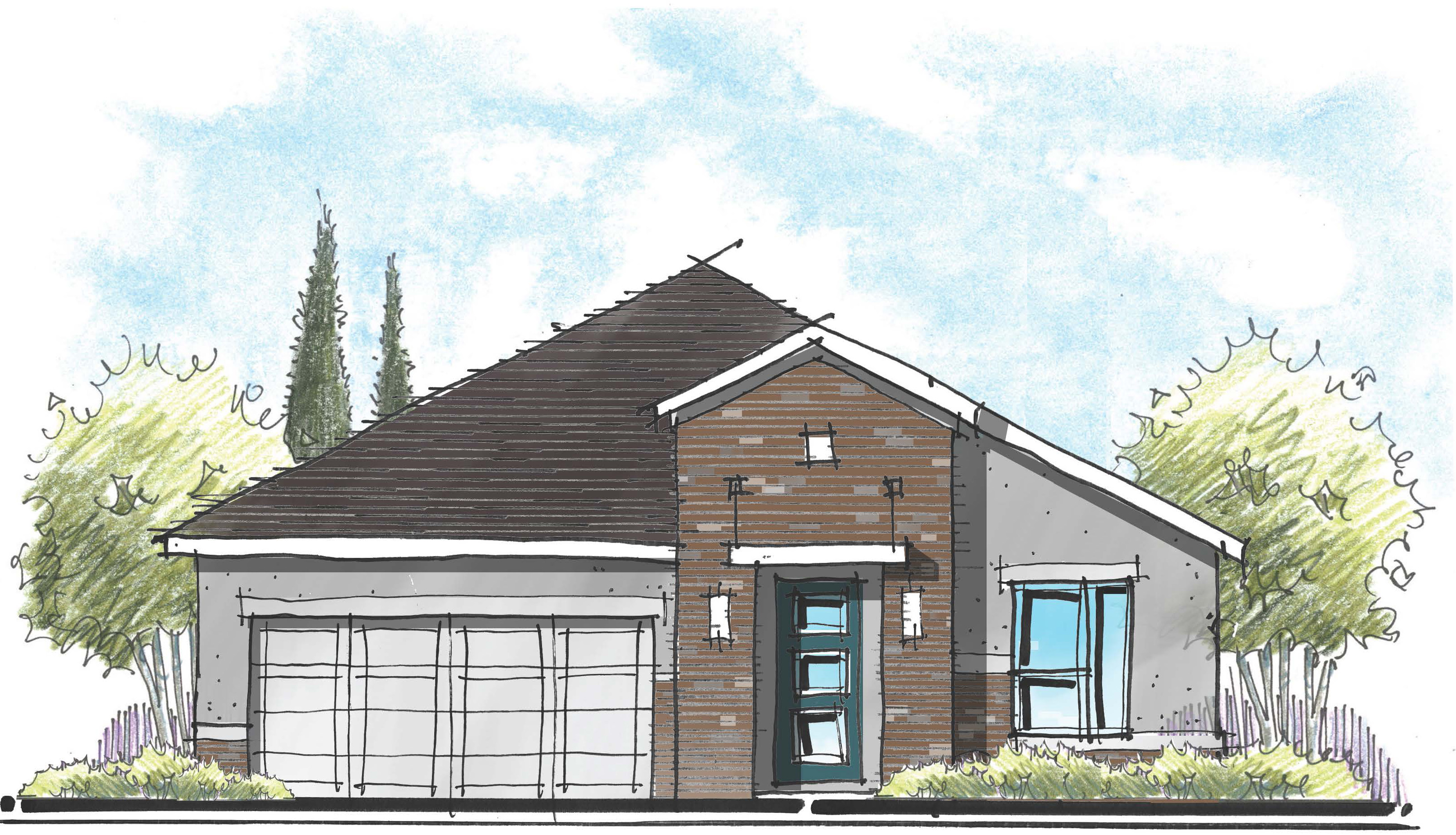
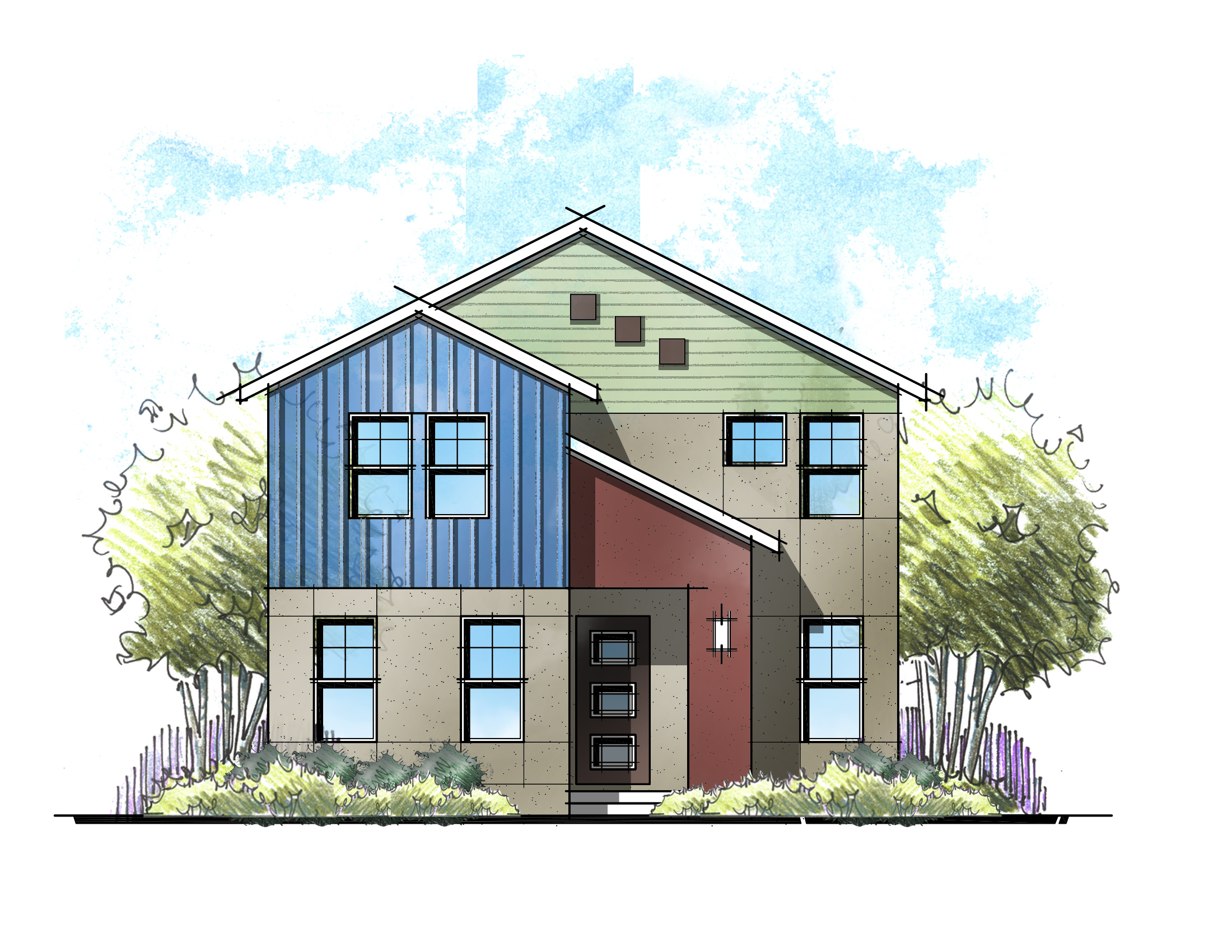
The other day, a client asked me to create a Modern Farmhouse elevation. “Excellent! How modern were you thinking?” His response: “Think Chip and Joanna Gaines modern farmhouse.”
Only being vaguely familiar with their work, we relied on Google to find several Chip and Joanna farmhouse elevations as inspiration. A picture is worth a thousand words, and while charming, “Modern” wasn’t one of those words that came to mind. Regardless, we then created the new elevation, pushing the envelope for a crisp Modern Farmhouse. Turns out, “Modern” wasn’t what they were looking for at all.
“We Want Modern! No Wait – That’s Too Modern”
A few years back, when we partnered with Taylor Morrison on the NEXTadventure Show House, we were on a quest to create an elevation that was “show house” worthy. We explored a variety of styles, from Tuscan to Mediterranean to Santa Barbara.
It was then suggested that we try something modern. We shared a variety of examples before the team landed on a bold design that we affectionately call “Shark Fin.” It featured new metal siding that looked like wood and made a statement.
Somewhat predictably, that statement ended up being too polarizing for some, particularly in the midst of the traditional homes that surrounded it. So we created a moderated modern look that we named Modern Italian – drawing from the classic Italianate style. The end result was a stunning interpretation that drew praise from both modernists and traditionalists. Goldilocks found her house!
Varies by Neighborhood
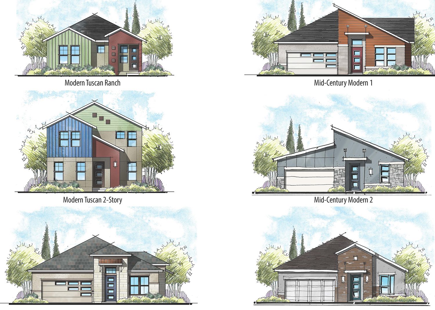
When someone says they want a “Modern” house, the first task is deciphering what they actually mean. The quest for “how modern a style do you want?” seems to be a continuous challenge. Denver and Austin are examples of two cities where modern styles are wholly embraced. But after that, we find that degrees of modern vary based upon the region of the country and even the within cities. Typically, the closer you are to downtown (or also, in Jacksonville’s case – the beach), the more modern edgy and urban the architecture. The same edgy look may be too much for the suburbs just a few miles away.
Multi-Family’s Modern-Friendly Approach
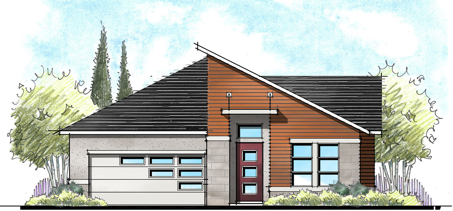
Multifamily architecture tends to be more modern than single family. This is likely due in part to the flat roofs that are often the result of trying to maximize the unit count within the height restriction. Without a pitched roof, we find ourselves adding a flat awning suspended from above with cables to create the sense of entry. Then, we like to use color blocking and a mix of materials to create animation. 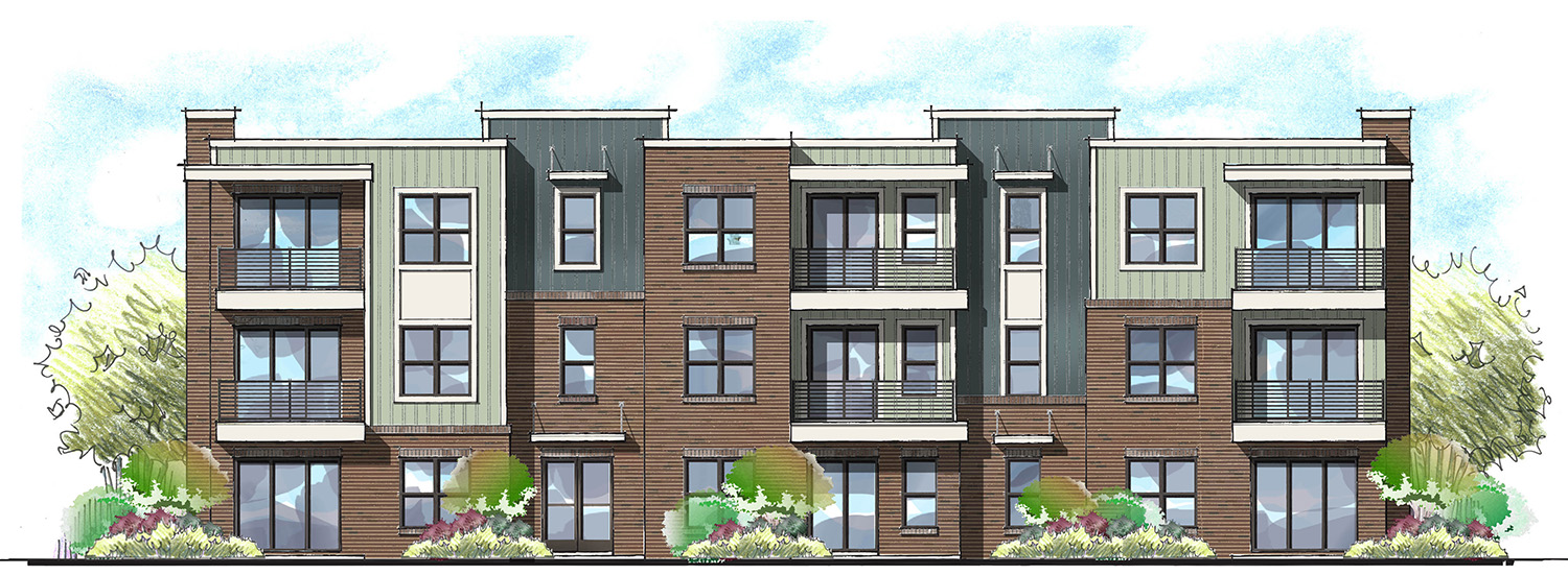
Back to single family, for a variety of reasons (mainly cost), the flat roof is not an option. But what can we apply from multifamily modern to single family modern? The list might include the following:
- Asymmetry vs. symmetry
- Suspended awning at the entry
- Shed roofs – either single or opposing
- New, modern materials or colors
- Window patterns and combination
- Modern front door and garage doors.
It Should Still Look Like a House
Armed with a new palette of shape, forms and materials, we still need to create something that is has good balance and curb appeal. The balance is often a challenge to asymmetrical forms. I find creating good balance and curb appeal starts by focusing on the entry of the homes and downplaying the garage – you know, the same thing we try to do with non-modern styles. Then remember to always make it look like a house. Lastly, don’t forget the role color plays in adding interest and animation.
Designers are always trying to push clients out of their comfort zone for something new and exciting. But at the end of the day, most home buyers outside of downtown just aren’t ready yet for full-blown Modern designs. So, how modern is your modern?
Categorized in: Exterior Styles
This post was written by Housing Design Matters
