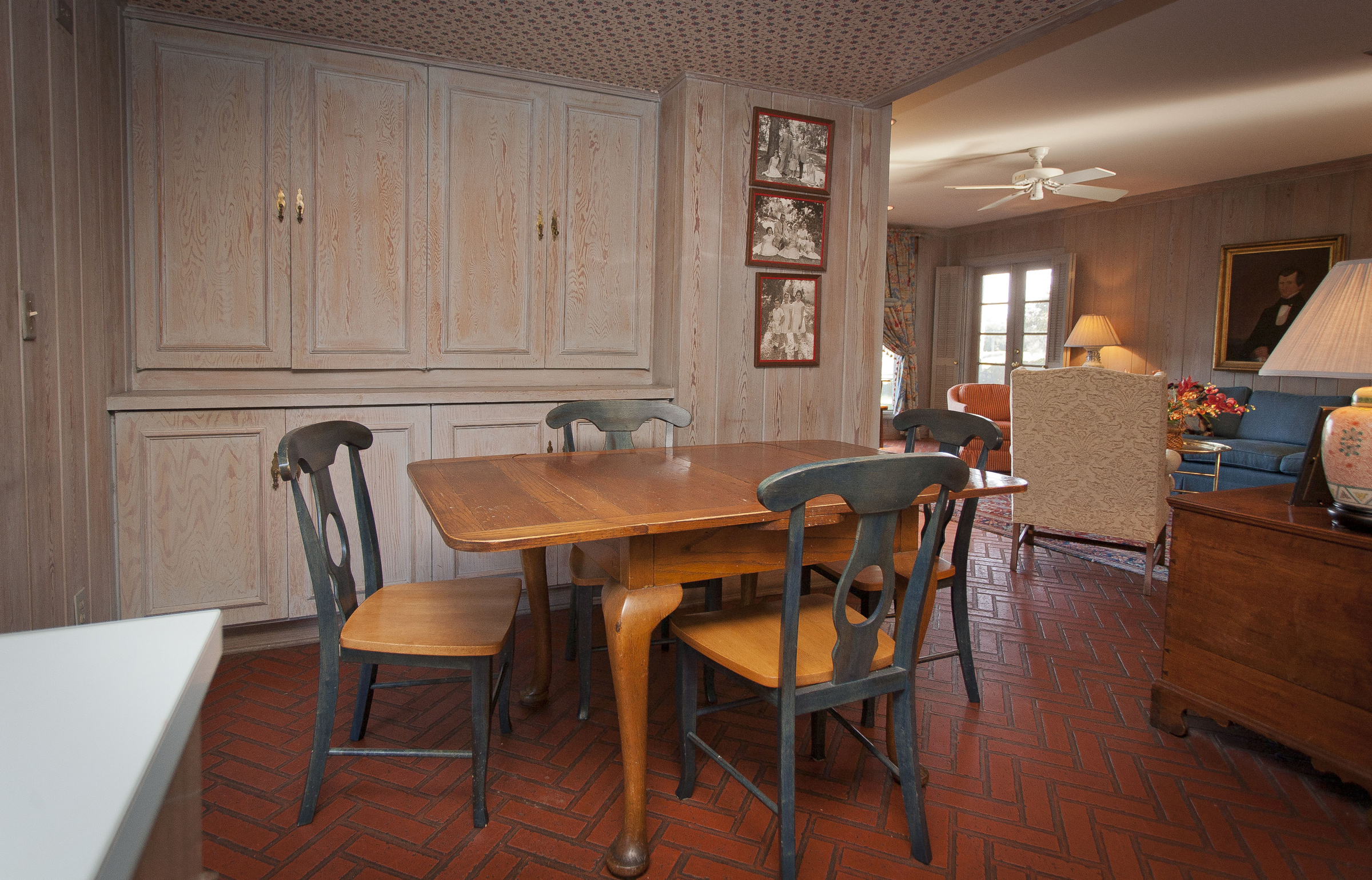
Back in the 80’s, when I first got into residential architecture, every house our firm designed featured an 8’x8’ breakfast nook. It didn’t matter the size of the home – the nook was always small. Too small, in retrospect. The theory was that people had all their meals in the larger formal dining room, except breakfast. However, even in the 80s, few people actually lived like that. That was just how houses were designed back then. Houses at that time followed an outdated plan form.
But why, you ask?
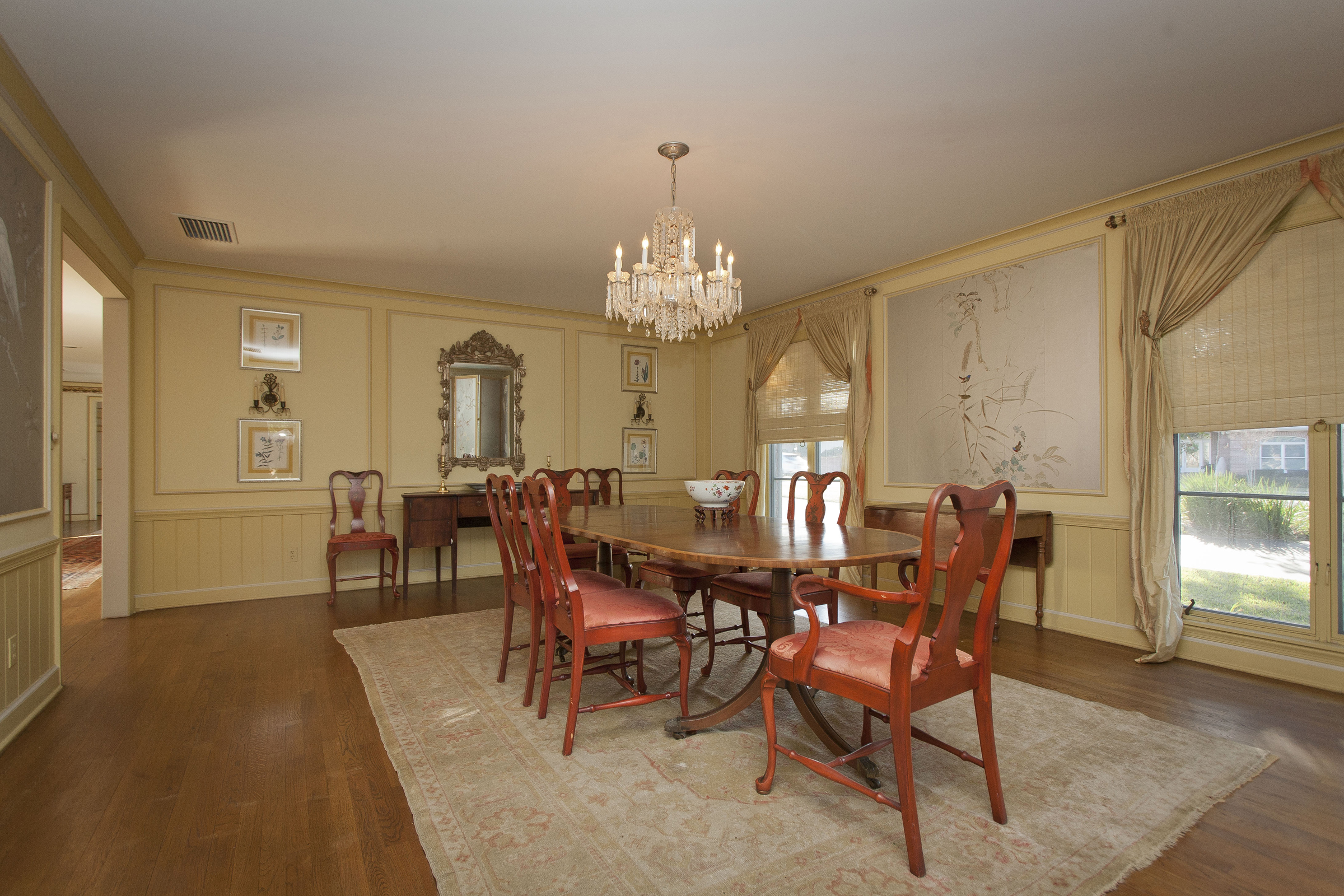
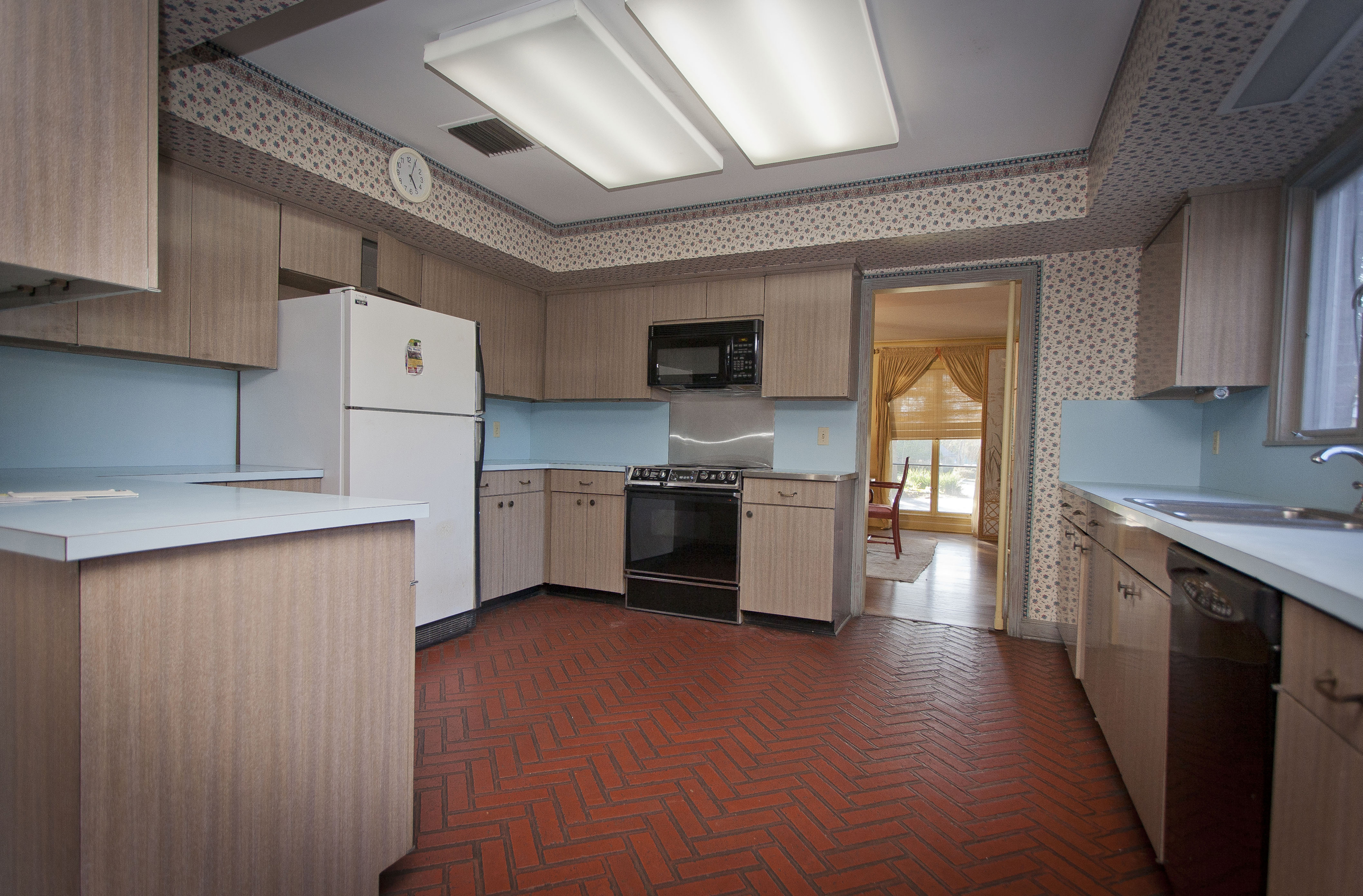
The logic behind the tiny breakfast room became clear to me when I was working on a remodeling job in historic San Marco, an older part of town in Jacksonville. The house was built in the 1920’s with large formal rooms, a grand staircase, not quite Terra but certainly a grand and elegant home. Naturally, the dining room was immense with a large round table and an elegant chandelier. The “nook” was a small table squeezed into the very utilitarian kitchen. The kitchen was closed off from the rest of the home with a swinging door between it and the dining room.
It wasn’t until I discovered the push button in the floor that the house made sense for the original owner back in the 1920s. When you pushed the button with your foot, a bell would ring in the kitchen (a rather clever solution to a problem no one today experiences). This would summon the cook to serve or remove the dishes. That small table in the kitchen was for the cook – or the children when they were too young or rowdy to sit at the big table with the adults. The kitchen was closed off and utilitarian because only the hired help were ever in that room.
So why did we hang on to that old plan form, well beyond the time when most Americans had cooks? Prior to the housing recession, residential architecture was stuck in the past. Change came slowly – much like trying to turn a large ocean freighter. There was little need for change because so few people demanded it. That was then.
A Natural Progression
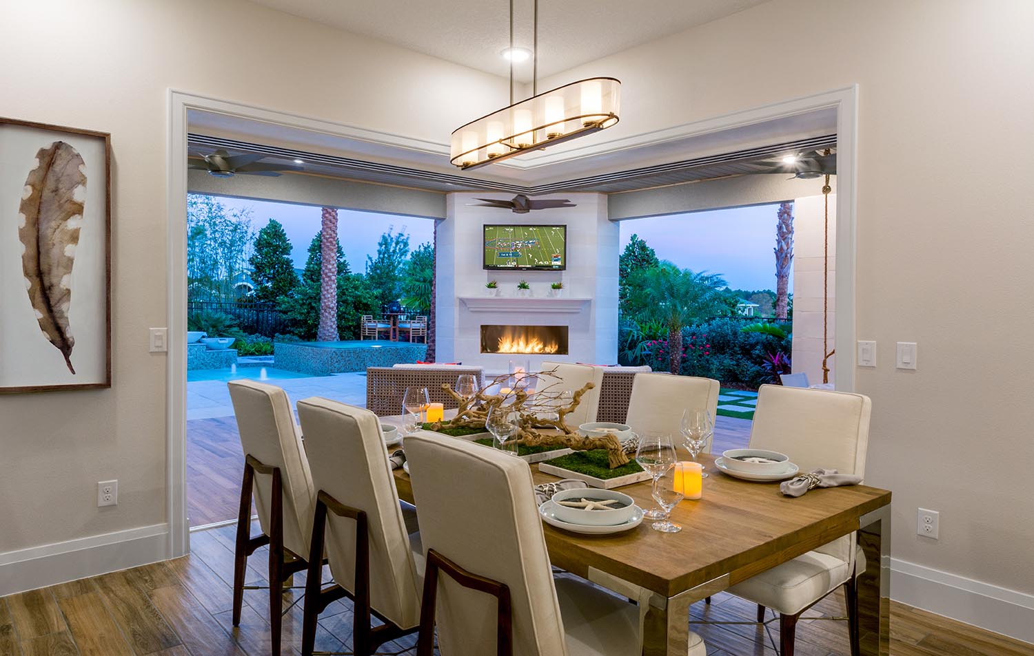
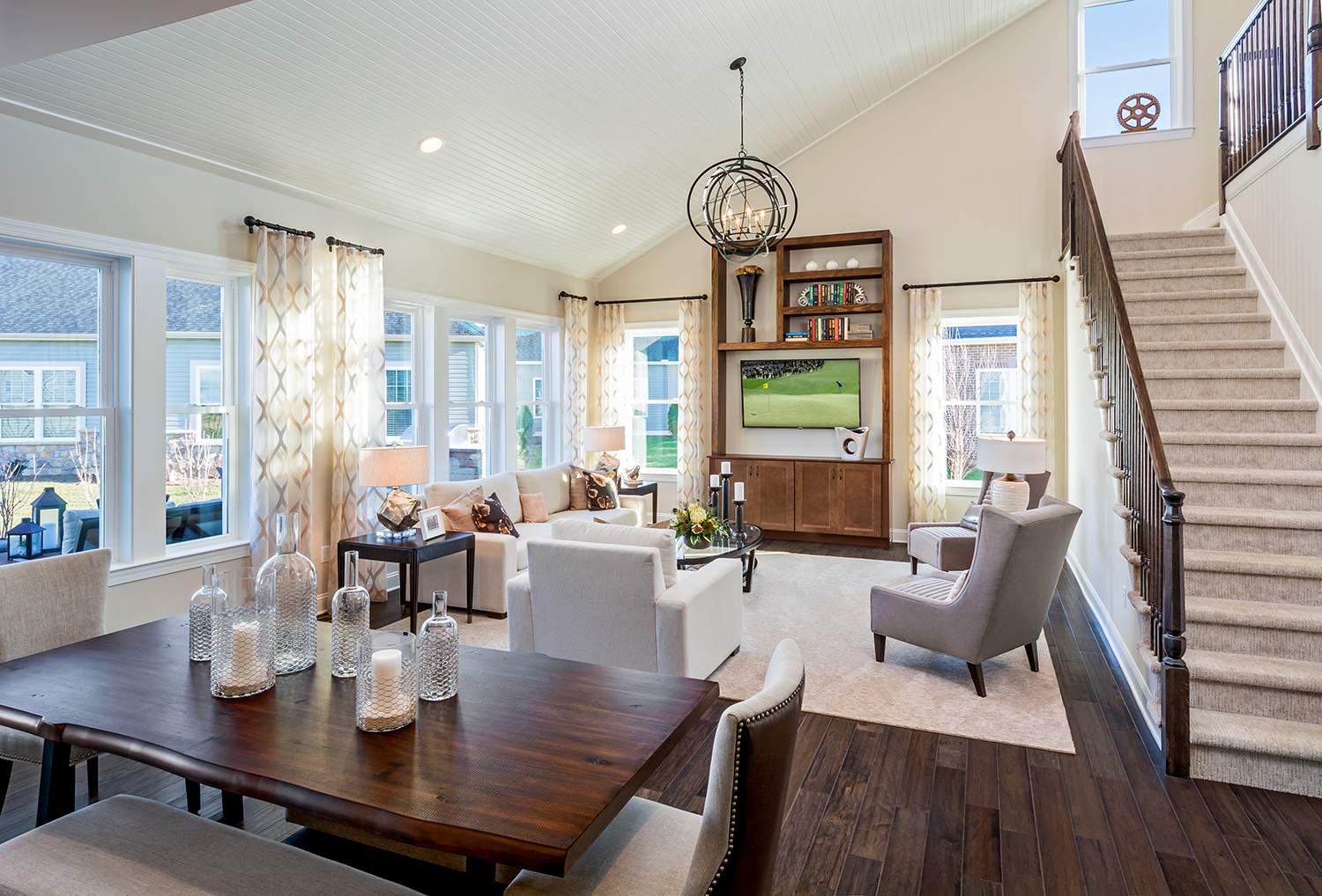
The first thing we started doing was expanding the breakfast nook. If there were four people living in the house, we made it big enough to seat the family and a couple of guests. We still hung on to the large formal dining room – thinking this was still a valid plan form. Eventually, the formal dining room was only used for holidays. The running joke was that the room was too big 11 months of the year and too small the one month of the year when extended family gathered for Thanksgiving and other holidays.
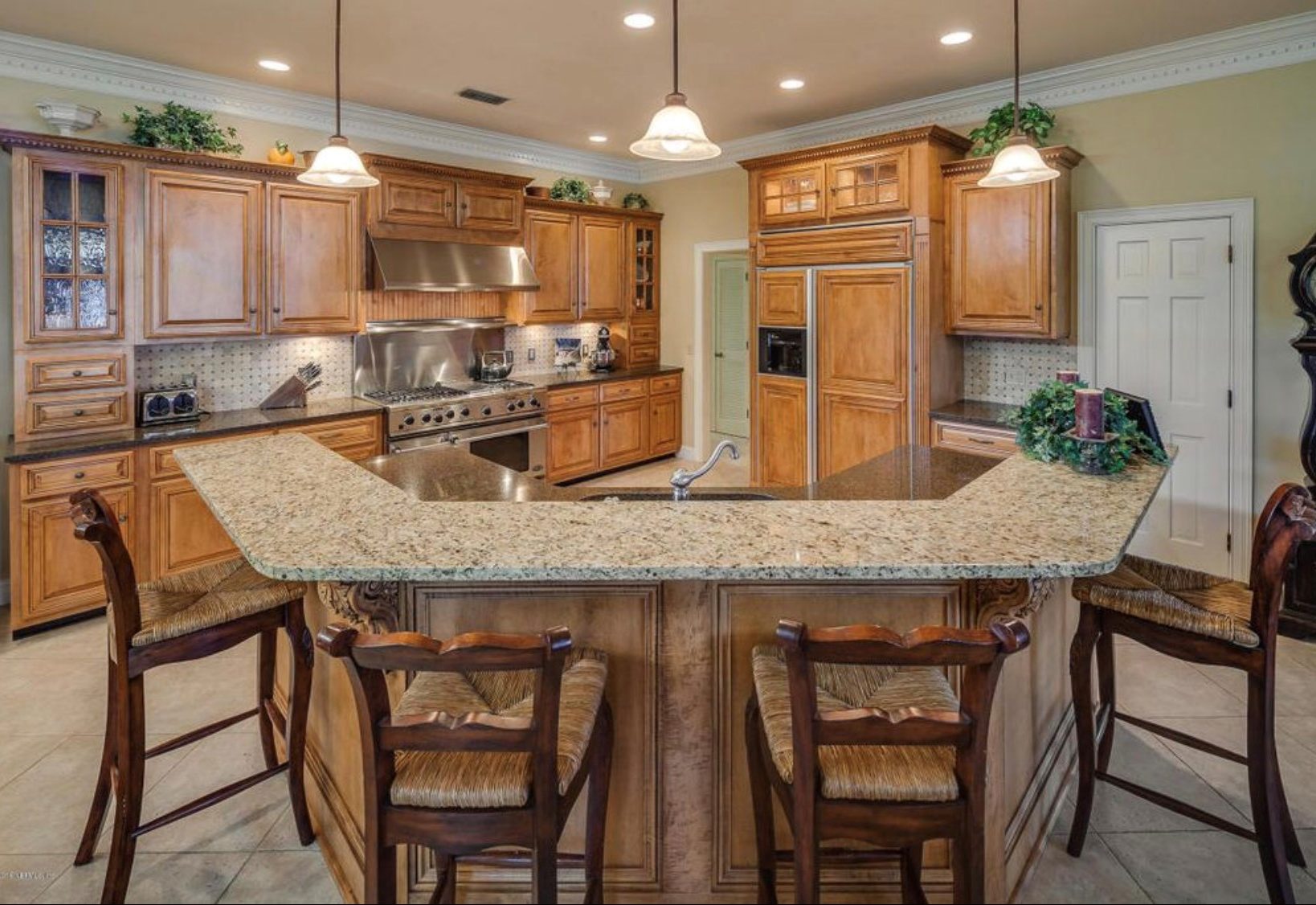
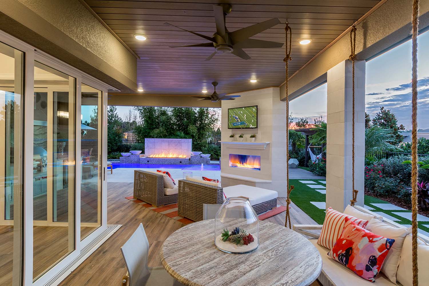
The next thing that drove the breakfast nook/dining room combination out of the house was the breakfast bar. Suddenly there was seating around the raised bat wing configured counter top. That was so cool – for a time. That was quickly replaced by the large single level island we see today with seating for 3 to 4 people. Of course, let’s not forget the outdoor dining.
Something Has to Give!
Suddenly, there were too many rooms devoted to dining; breakfast nook, formal dining room, kitchen island, and outdoor dining. One of the byproducts of the great housing recession is it forced designers, builders and buyers to reexamine what was really needed in the modern house and what no longer made sense.
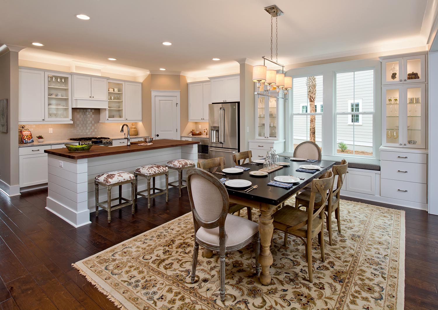
The tiny breakfast nook of the past continued to grow until it finally replaced the formal dining room all together. Not a moment too soon, if you ask me. As far as I’m concerned, we need to abandon this concept of a “Nook” for eating. Personally, I like to call this space the “Café”.
Thriving in a Dynamic Industry
For the past decade, you may have noticed that plans are being updated and changed almost as frequently as iPhones. Why? Not because the designer tells you so, but because buyers demand it! The housing industry is no longer a clumsy ocean freighter, and hasn’t been one for quite some time. Now is the time to be nimble. How convenient that you have me, your friendly architect, on speed-dial! Hey – I had to give myself a plug somewhere, right?
-Deryl Patterson, AIA
Categorized in: KitchenDesign
This post was written by Housing Design Matters

