Last year I wrote a blog suggesting that the maximum number of exterior materials should be limited to three finishes. My “Rule of Three” was in response to the trend of mixing too many exterior finishes, giving the exteriors a hodgepodge appearance. I loved the exuberance of texture and materials, but a little discipline can go a long way.
Recently, I’ve run across a different Rule of Three. Instead of a maximum of three, these communities required a minimum of three exterior materials. My first thought was that this must have been a reaction to Florida’s not-so-distant pastime of beige stucco communities that lacked style and diversity. I can’t say I blame them!
This minimum of three materials wasn’t exclusive to one community either – we encountered the rule in Northern Virginia and South Carolina. One from a zoning department and one from the developer. Low-and-behold, monotony isn’t just a “stucco” thing! In the case of Virginia, it’s not uncommon to receive push back on all-siding exteriors. The problem, of course, is that an all-siding elevation is usually the most cost-effective. With rising interest rates, labor and material costs and millennials struggling to qualify for a mortgage, we’re all fighting an uphill battle to cut cost and add value. Is it worth sticking to a 3 material minimum if it means pricing a house out of the market?
Perhaps we are missing the forest for the trees. I was once told that rules are the obedience of fools and the guidance of wise men. With that as our premise, I like to start with an understanding of the objective of the rule. Then, I can then suggest alternatives that capture the spirit of the rule, if not the letter of the rule.
Focusing on the Streetscape
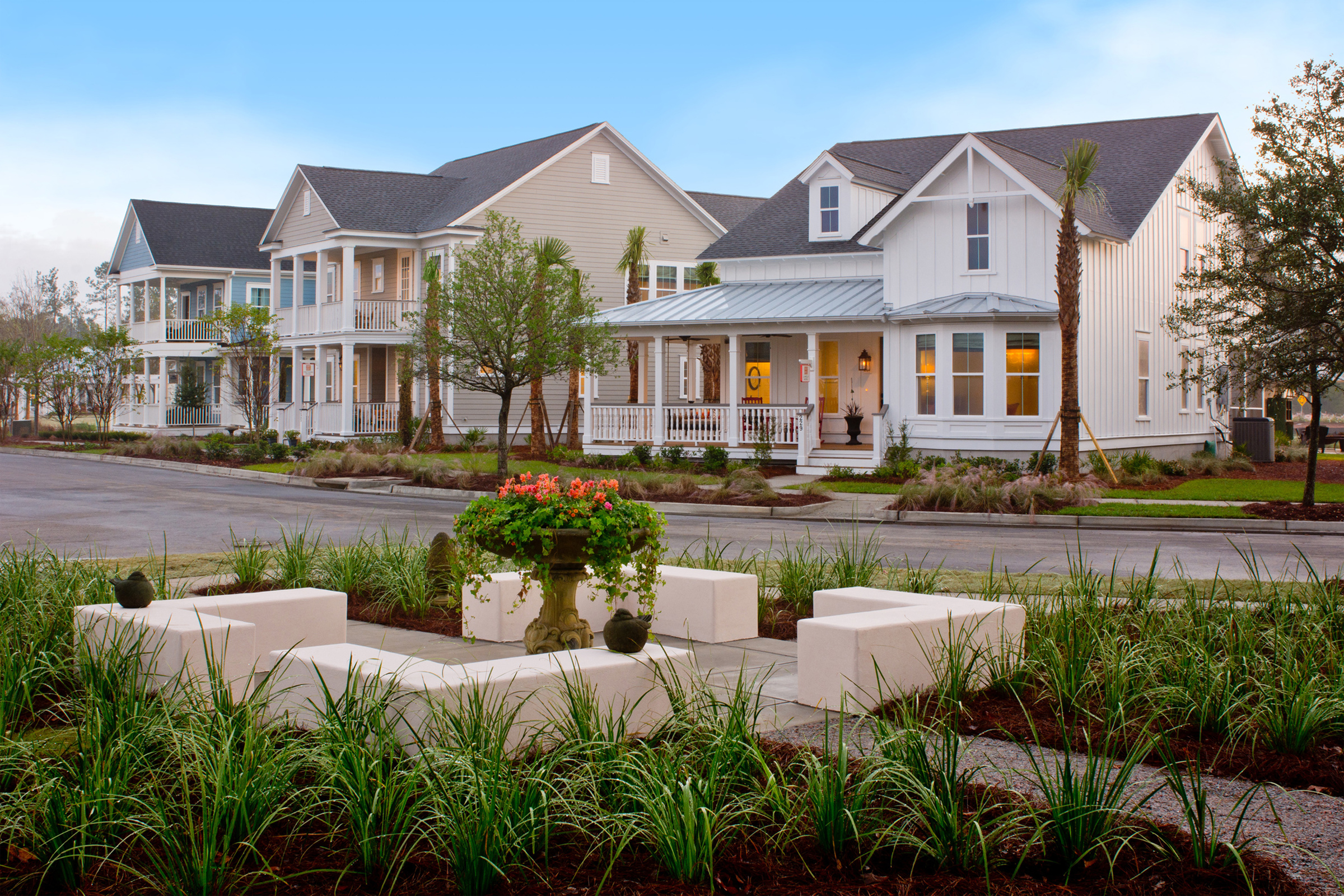
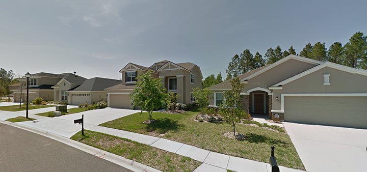
We want to avoid monotony (Whether it’s a street lined with beige banded stucco or white siding houses) by adding variety in colors, texture, and materials. Perhaps we shouldn’t be so singularly focused on one house though. The individual house is important, but how it plays into the entire streetscape and community is where we will really achieve the effect that home buyers (and developers) are looking for. Let’s add animation to the exteriors in a disciplined way that doesn’t just arbitrarily add random materials that are incongruous to the style.
A Case Study
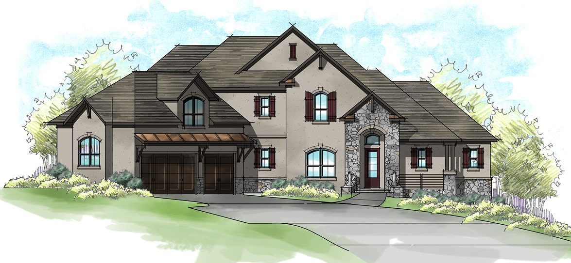
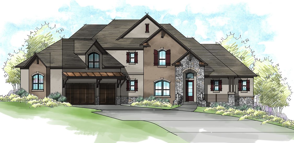
Understanding the role color plays in adding animation to the exterior is also worth exploring. For one house, we designed a French Country elevation with stucco and stone in keeping with the style. The construction documents were submitted to the architectural review board without a color rendering. What the ARB envisioned in the black and white drawing was too much stucco, likely something like this:
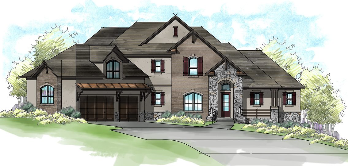
I’m sure they had painful flashbacks to the “Florida banded stucco” days and were immediately repulsed. The thing is, we always intended to use two body colors, like below.
The second body color gave the house more animation and depth. Alas, this concept wasn’t fully understood by the developer’s board, so the compromise was to add a third material: Brick. That brick was then painted to the second body color.
The good news: The exterior was approved! The bad news: That beautiful brick and brick ledge significantly increased the cost. Ouch!
Style-Specific
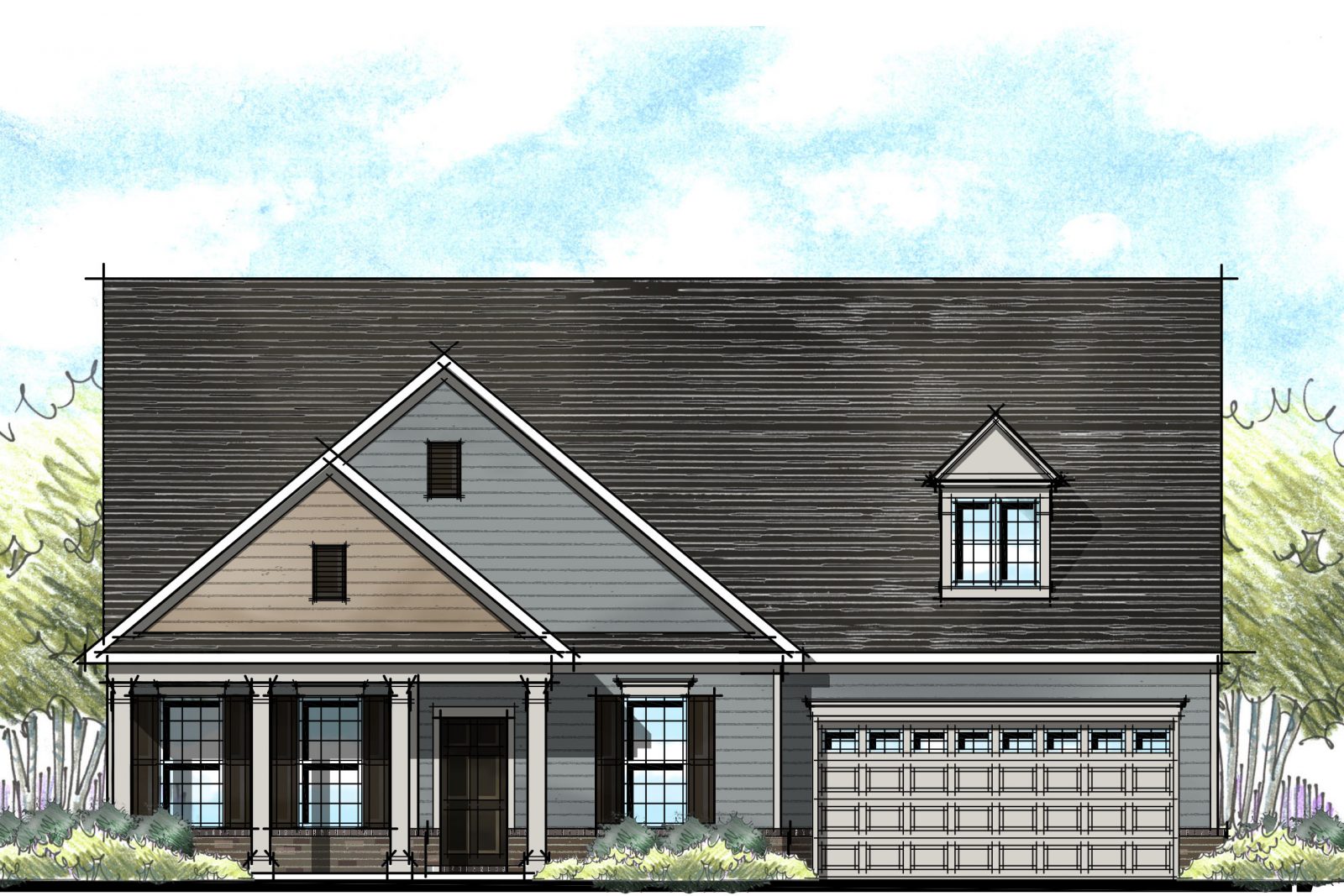
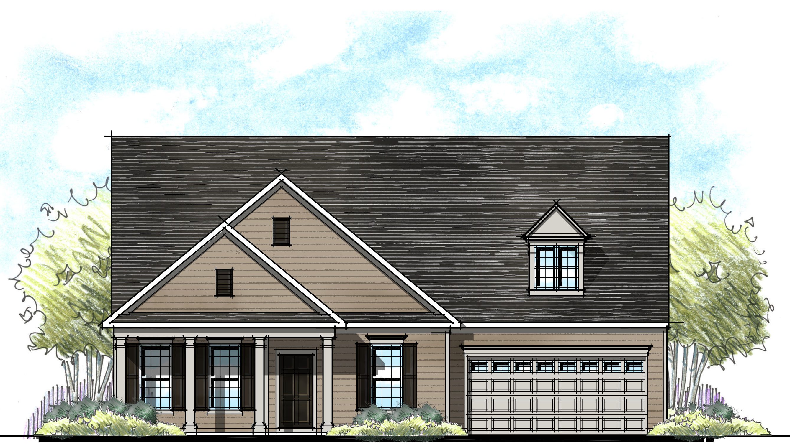
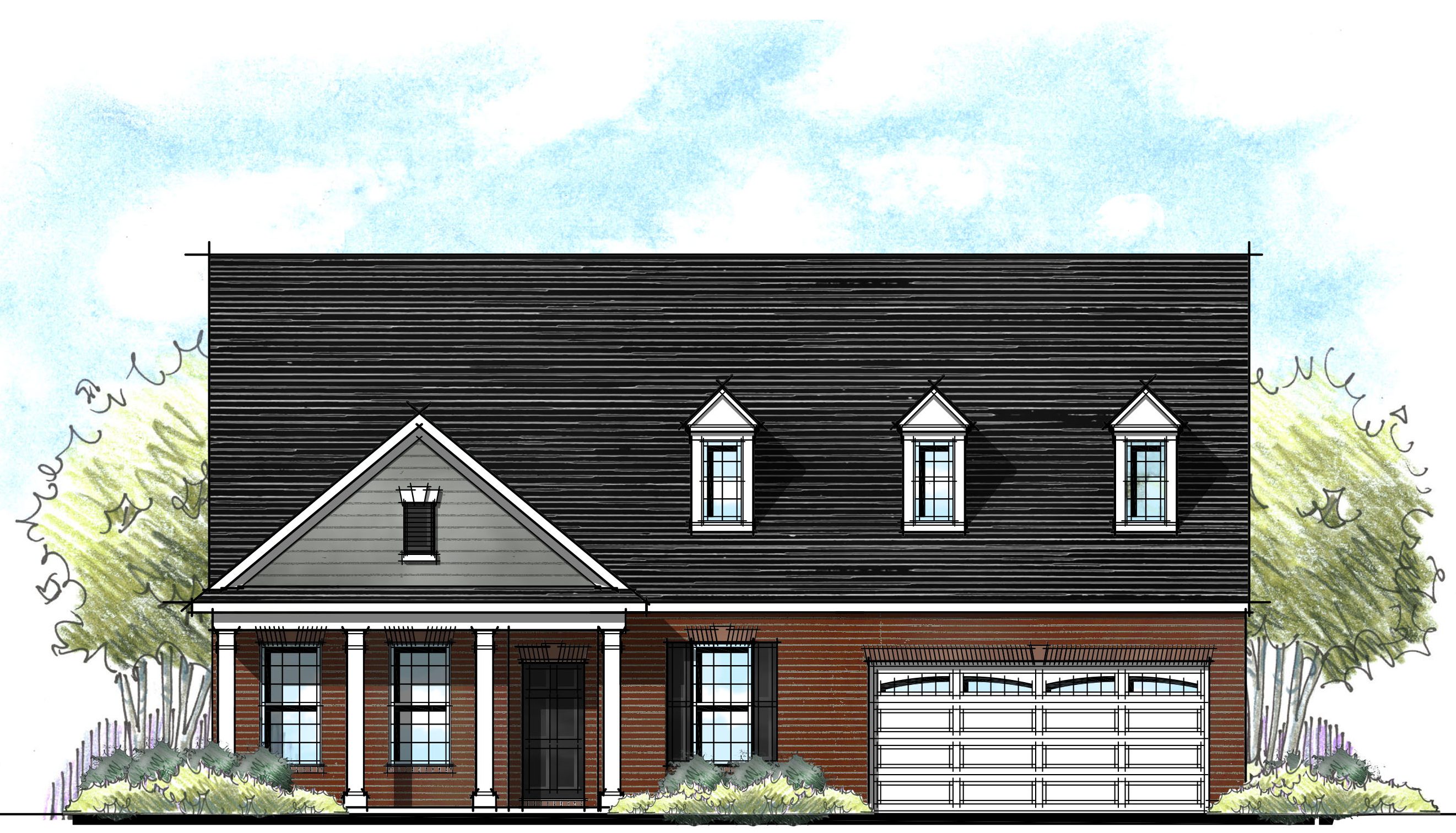
Take a look at this all-siding house. While it is in keeping with the style, it is clearly missing out on its potential.
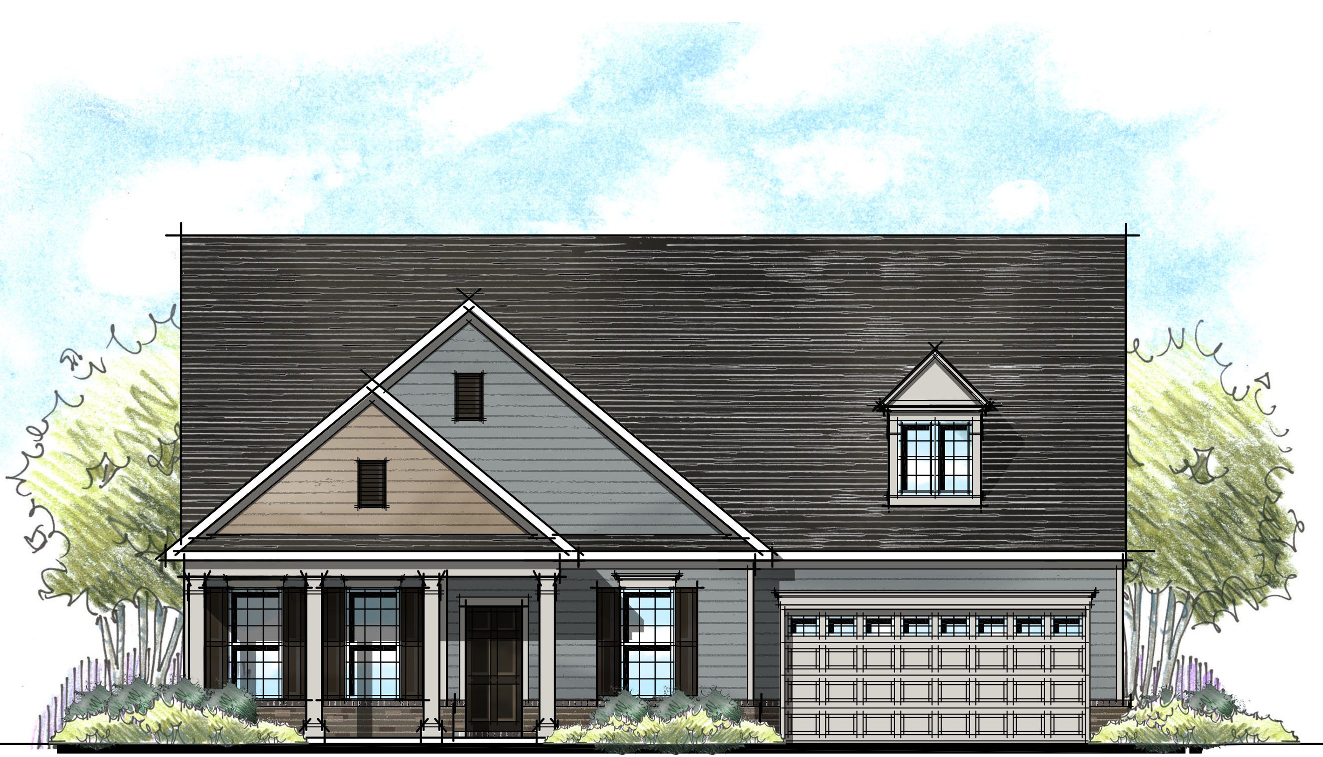
Now let’s look at the same house below: A second body color can highlight the front porch while adding brick at the bottom brings it to life without going overboard – see the difference that color can make?!?
Now look at the house below and imagine if we were forced to add stone as a “third material”… It would just look silly!
The Big Picture
There are certainly instances where 3 materials enhance a house’s architectural style. However, the real moral of the story is less focused on having a variety of materials and more having a variety of styles. A Craftsman elevation with stone, siding and shakes next to a farm house with brick, siding, and board and batten next to a brick and siding house makes for a wonderfully rich streetscape, even if not every house uses three materials!
Categorized in: Exterior Colors
This post was written by Housing Design Matters

