Last week, we talked about reading and understanding the artificial construct that is the floor plan. We had a great response and even conducted a Zoom seminar on Mastering the Art of Selling from Floor Plans to new home sales consultants. Based upon the questions we received, there was a great deal to be learned and a lot of misconceptions.
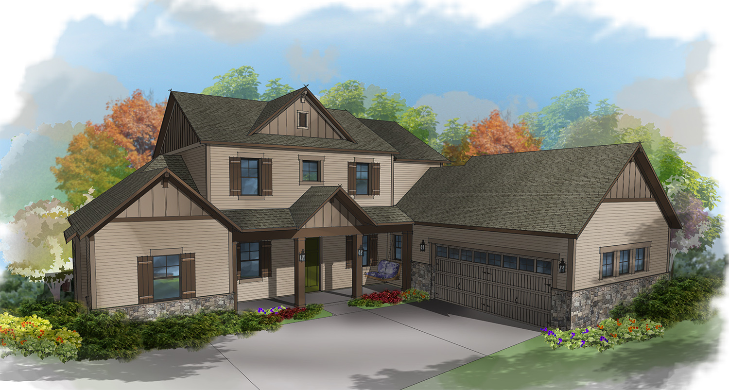
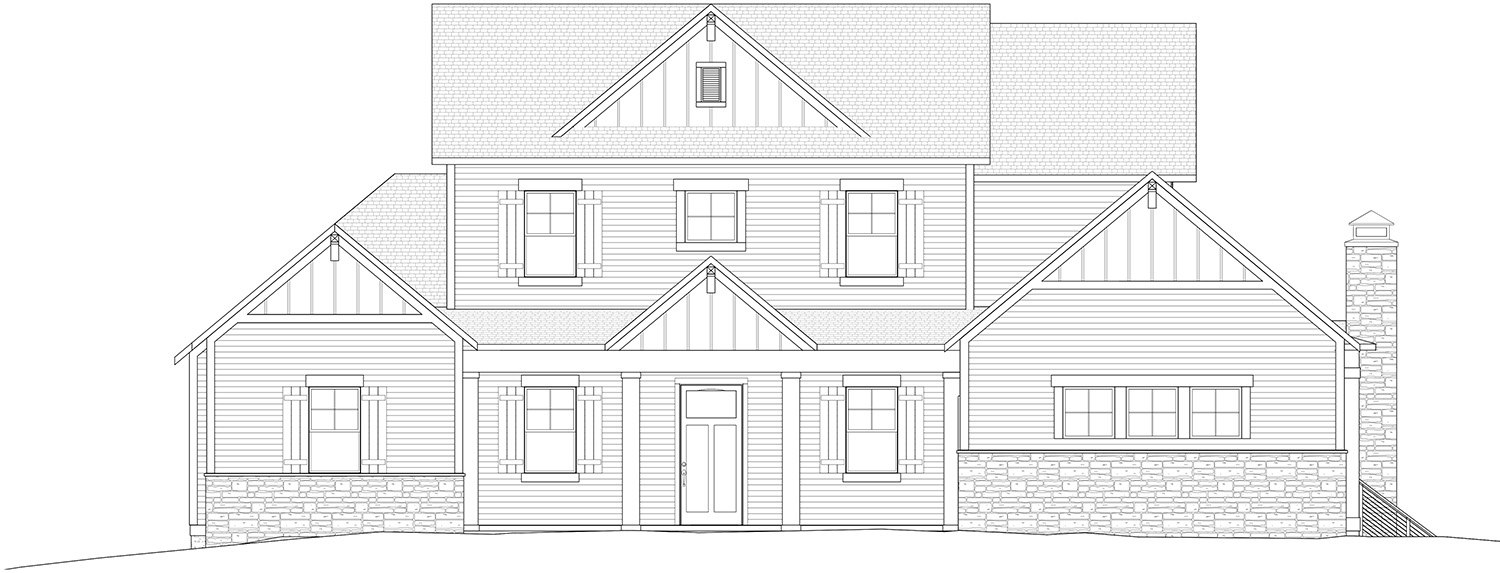
This week, I want to talk about elevations – specifically the front elevation. This can be a very powerful, emotionally laden view of someone’s future home. Many times, this is where I have seen a customer’s eyes light up when we show them how their house or collection of houses will look. Oh – it is so cute or wow, that looks like a mansion, or what a great streetscape this collection of houses will create.
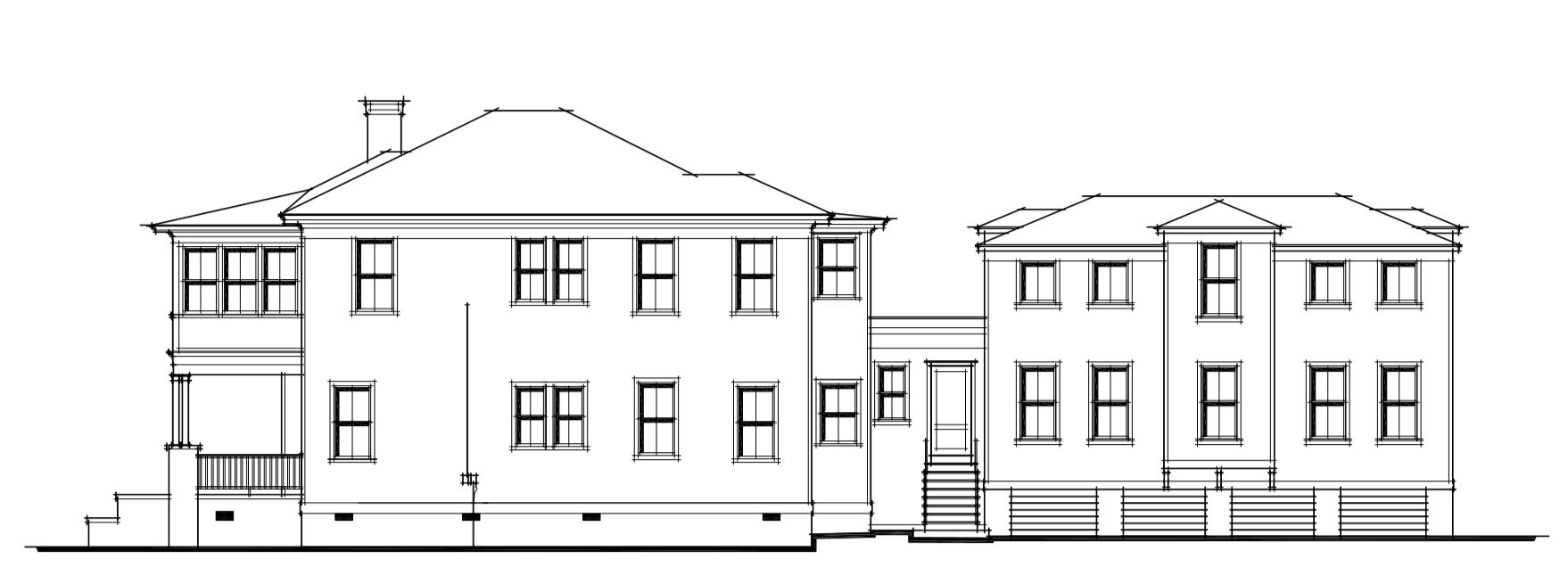
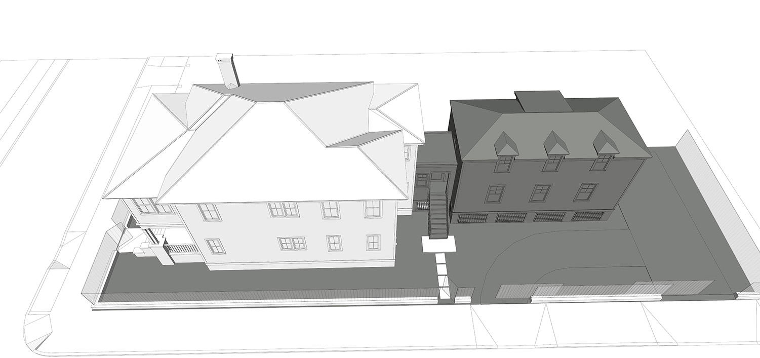
But like the floor plan, an elevation is an artificial construct. It is not three dimensional and has no depth. The floor plan describes the space on a horizontal plane, the elevation describes the structure in the vertical plane. If the garage is side-loaded, there is no way to determine if it is a two-car garage or a three-car garage using only the front elevation as your guide. That would need to be determined from the side elevation.
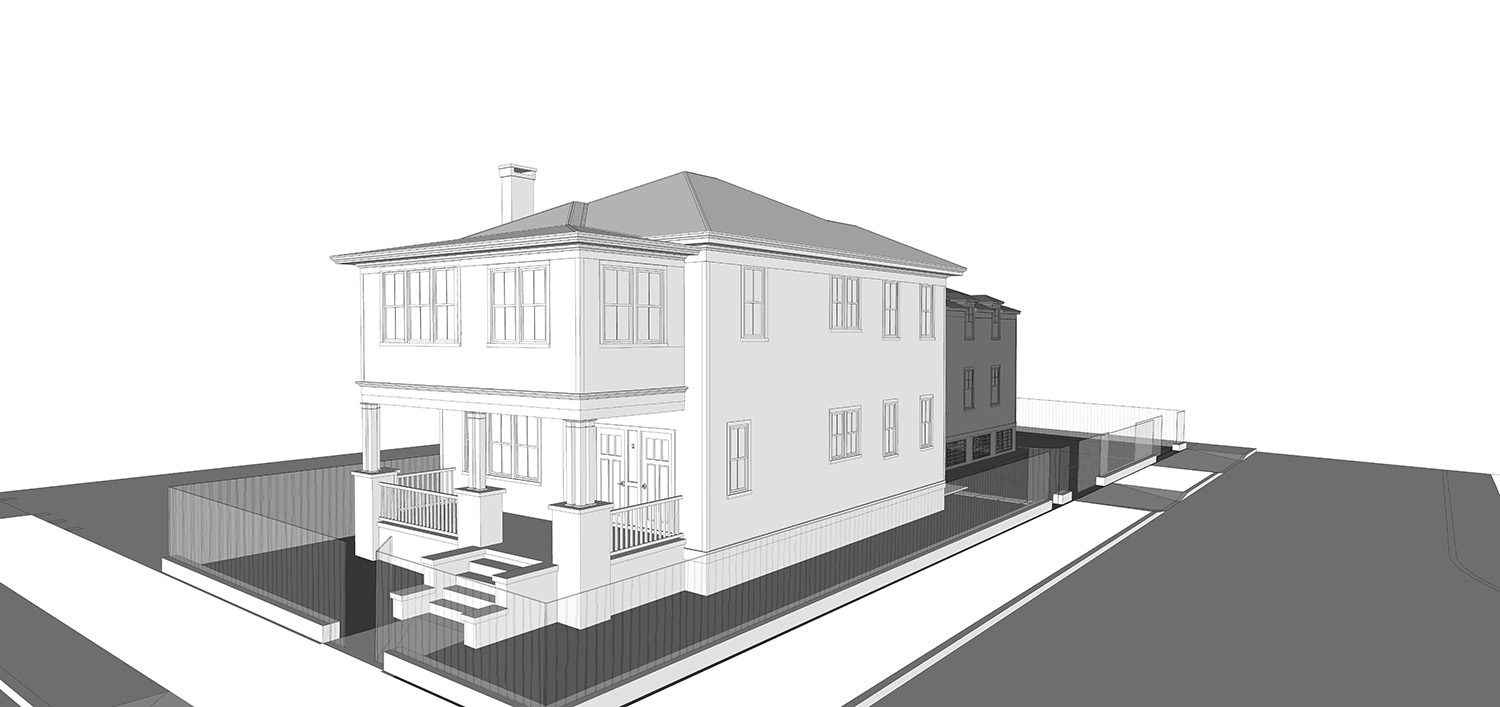
Another misunderstood aspect of elevations is when the roof is sloping away from you. You can’t tell from a single elevation view how steep or shallow a front to back roof pitch is, just the ridge (top) and eave (bottom) of the roof. A low pitch roof at 5/12 with the same ridge height will look the same as a 12/12 roof when viewed only from one side. In reality, a steeply pitched roof will be more visible from the ground than if it has a low pitch one. This may create a challenge for potential customers who are only viewing your 2-D elevation drawings on your website.
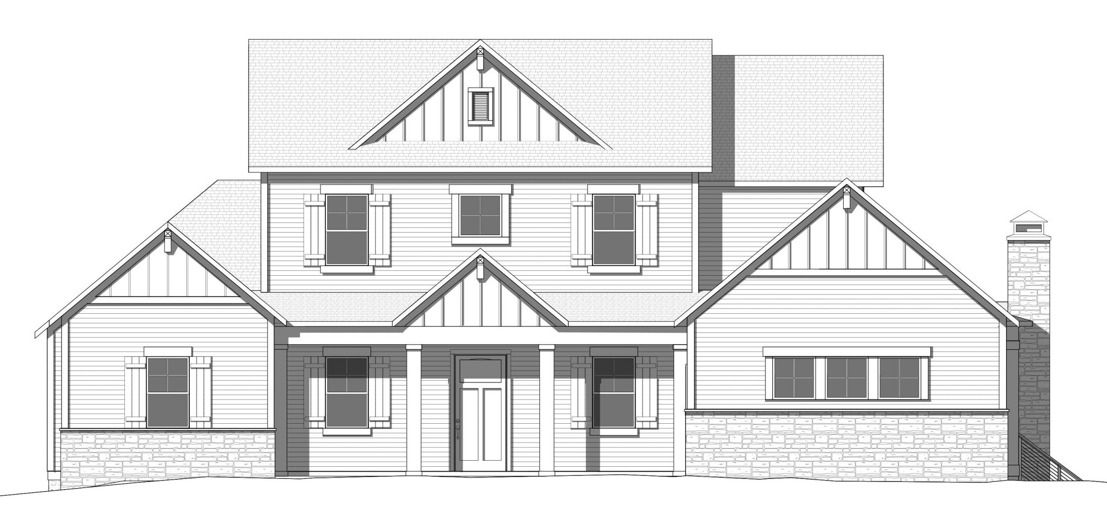
Shade and Shadow
Whether you’re looking at a drawing, how the building looks under sunlight can completely change how you perceive it. Just adding shadows on a 2-D drawing gives the illusion of depth. Suddenly you understand there is a front porch on the front of the house. Even just the shadows below the roof or shutters makes the drawing feel more realistic. Adding shadows to the 3-D perspective drawing will make it even more clear.
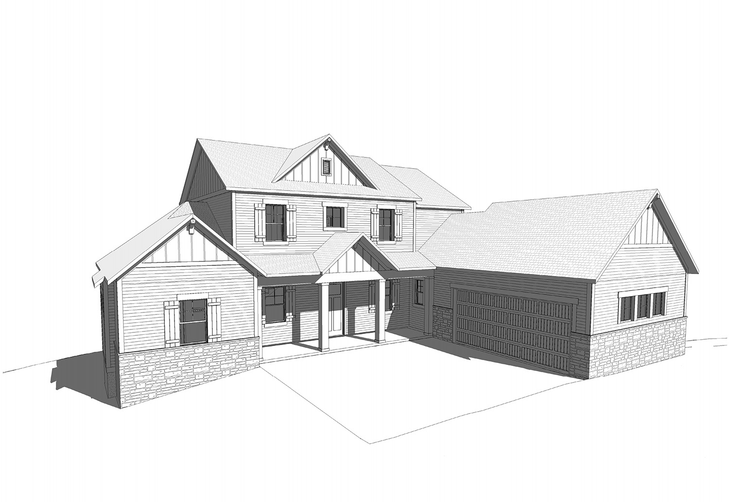 Color Changes Everything
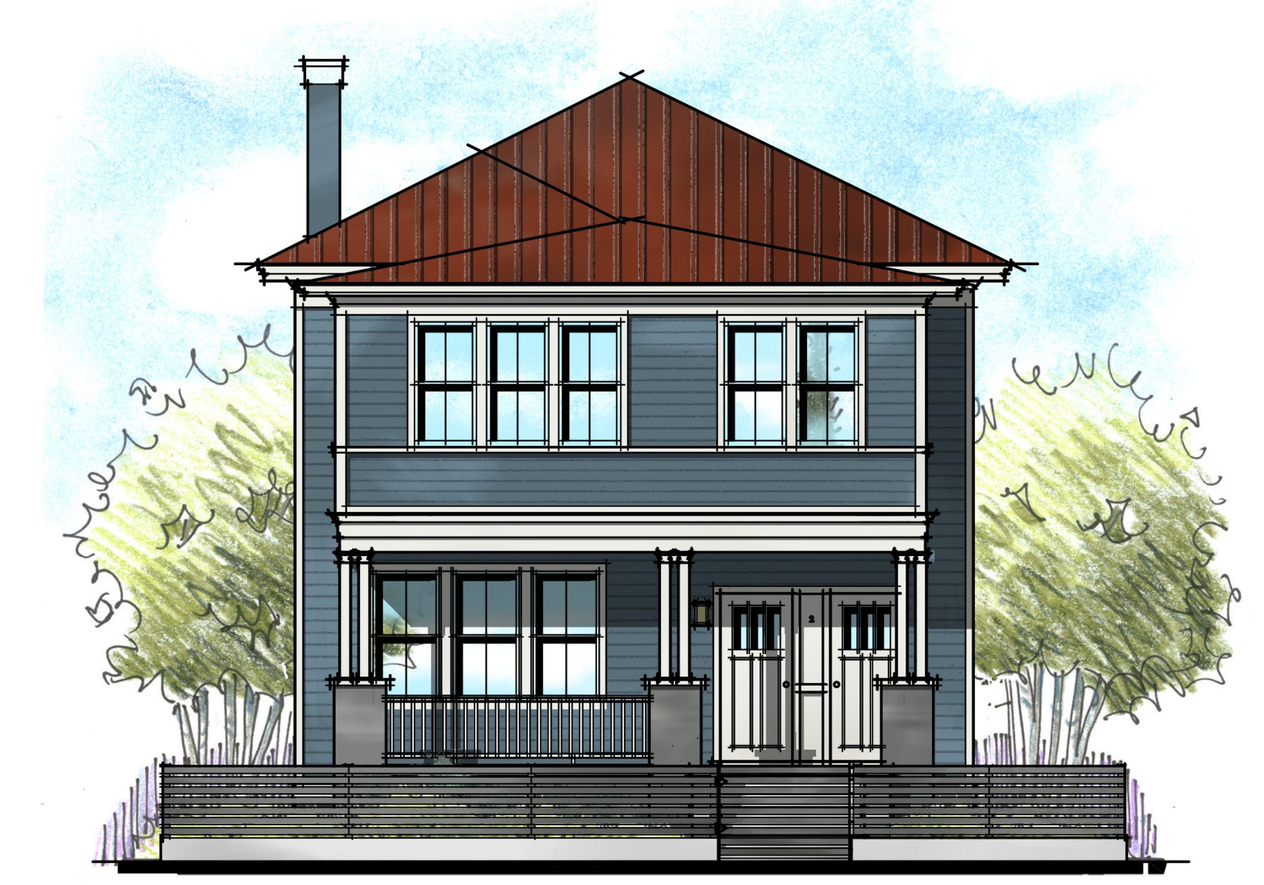
The last element that can be added to our drawings is color. Whether it’s a 2-D or 3-D drawing, color makes the structure come alive – especially when using colors beyond builder beige. Is the siding light and playful? The brick red and traditional? The shakes brown and earthy? Adding actual paint tones to a rendering is possible using the RGB color formula in Photoshop. This can be a powerful tool in helping buyers deciding which color scheme they like the best. But a word of caution! Even using the exact color formula won’t guarantee a true representation of color. Every monitor, laptop and printer renders color differently – some very dramatically.
So in these crazy times of working from home, sheltering in place, and social distancing, the role of the graphics on your website have gained in importance. Long after we return to “normal”, these lessons will prove invaluable to how we conduct business going forward. Can you make your elevations and streetscape compelling enough to make a potential buyer pick up the phone or click on the chat button? That’s what we do!
Categorized in: Housing in the Pandemic, Selling Floor Plans
This post was written by Housing Design Matters
