In today’s crazy pandemic world, selling new homes is rapidly changing. Suddenly, every sales consultant must be good at selling online from floor plans. And let’s be honest, reading floor plans is a developed skill – not acquired at birth. And while sales consultants may think they’re good at reading and understanding floor plans – selling from them is an entirely new expertise. The next tricky part is helping buyers read and understand floor plans. You must assume they can’t read your floor plans without making them feel stupid. It is important for buyers understand your floor plans, but ultimately you want them to envision themselves living in them. That’s powerful stuff.
Reading Floor Plans
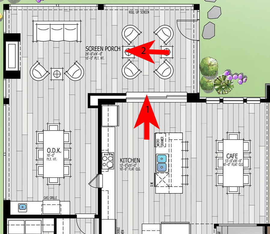
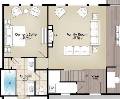
First and foremost, a floor plan is an artificial construction. No one ever views a home from a drone with its roof torn. It is a paradigm shift to look at plan and imagine how the space will live or function. And since architects are in the business of “selling” our designs in 2-d, we’ve developed a few tricks that I’d like to pass along. We focus on room relationships – how we flow from one room to another; how close the bathrooms are to the bedroom; the view from the front door all the way through the house to the view beyond. Focusing on relationships allows the client to make the cerebral shift from 2-D to 3-D.
A quick tour of builders’ websites will reveal a wide range of floor plan graphics, often with too much or too little information. This was less of an issue when the buyer was standing inside the house looking at the plan, but now it is all they have to go by. More than ever, salespeople need to be compelling enough to get on the phone or online with a stranger and understand what they are looking for in their next home.
The Problem of Scale
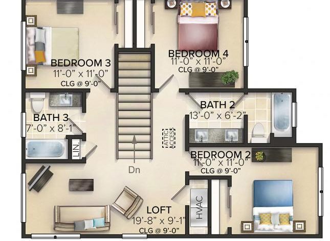
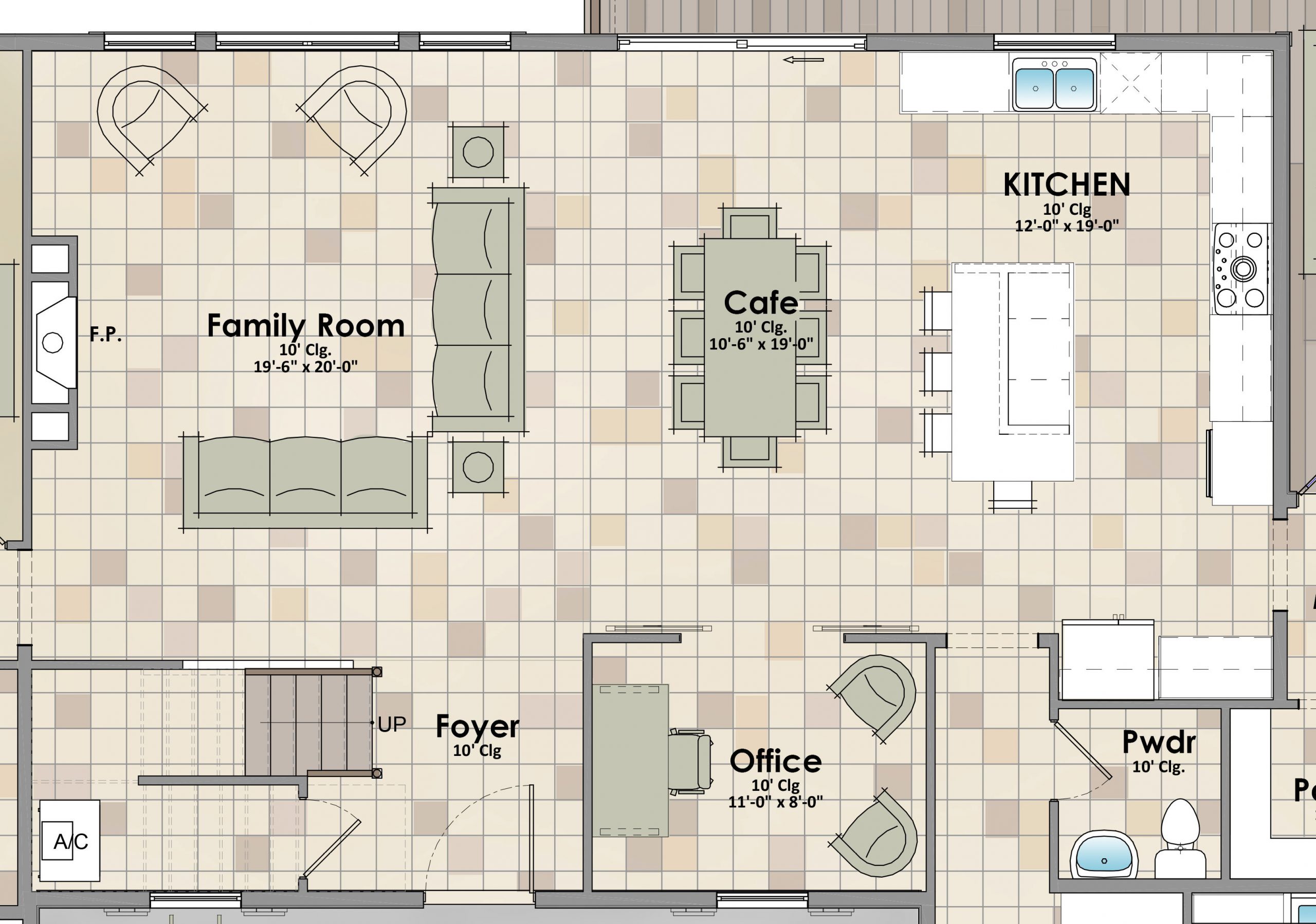
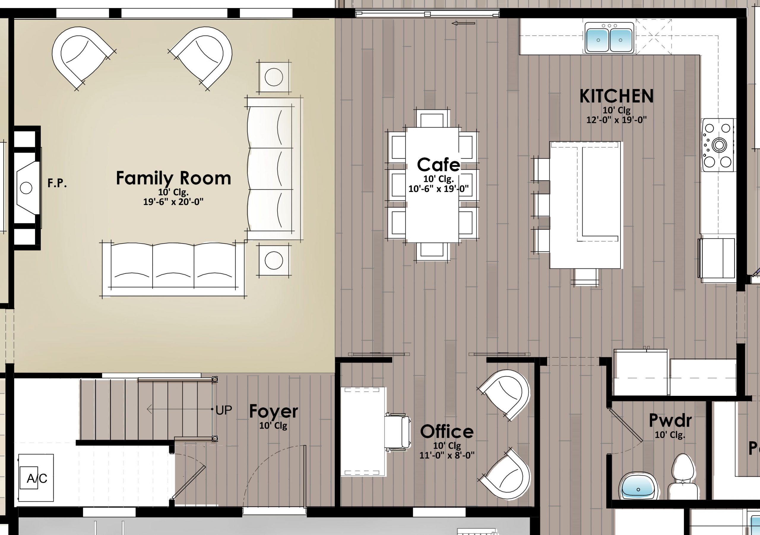
Perhaps the greatest challenge is that of scale, understanding the size of things from a floor plan. How big is that master bedroom? Even when dimensions are given, the next question might be, “I wonder how big my current master bedroom is?”. This is where the furniture comes into play – it’s not just there for decoration! When you put the king size bed in the master bedroom, suddenly the space is presented in a scale we understand. Now buyers can see if there is room to walk around the bed or for chairs by the windows. Furniture can also reveal floor plan flaws like a lack of a dresser wall in a bedroom or “Is the largest sofa across from the TV in the family room?” It should be.
you’re selling space, not furniture or floor finishes
Keep in mind, when showcasing your floor plan with furniture, your goals should be to demonstrate how the space works and the scale of the plan. It should not be to sell furniture. So be careful not to over-decorate the floor plan with distracting colors or make the plan too busy. While it is tempting to try to duplicate the model furniture down to the pattern on the couches, I caution against it.
I recommend the squint test when viewing a floor plan. Squint your eyes until the plan is blurry and what do you see? Is it a busy tile pattern or a brightly colored pool table?
If so, you need to start over and simplify.
Three-dimensional floor plans
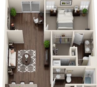
There has been a trend lately to use an isometric or three-dimensional floor plan, then make it hyper-realistic down to the hangers in the closet. Personally, I find these hard to read and understand because the walls often block critical information like the location of the washer and dryer. Is it below that shelf or behind that wall? The floor plan is already an artificial construct, I’m not sure making it look 3-D is helpful.
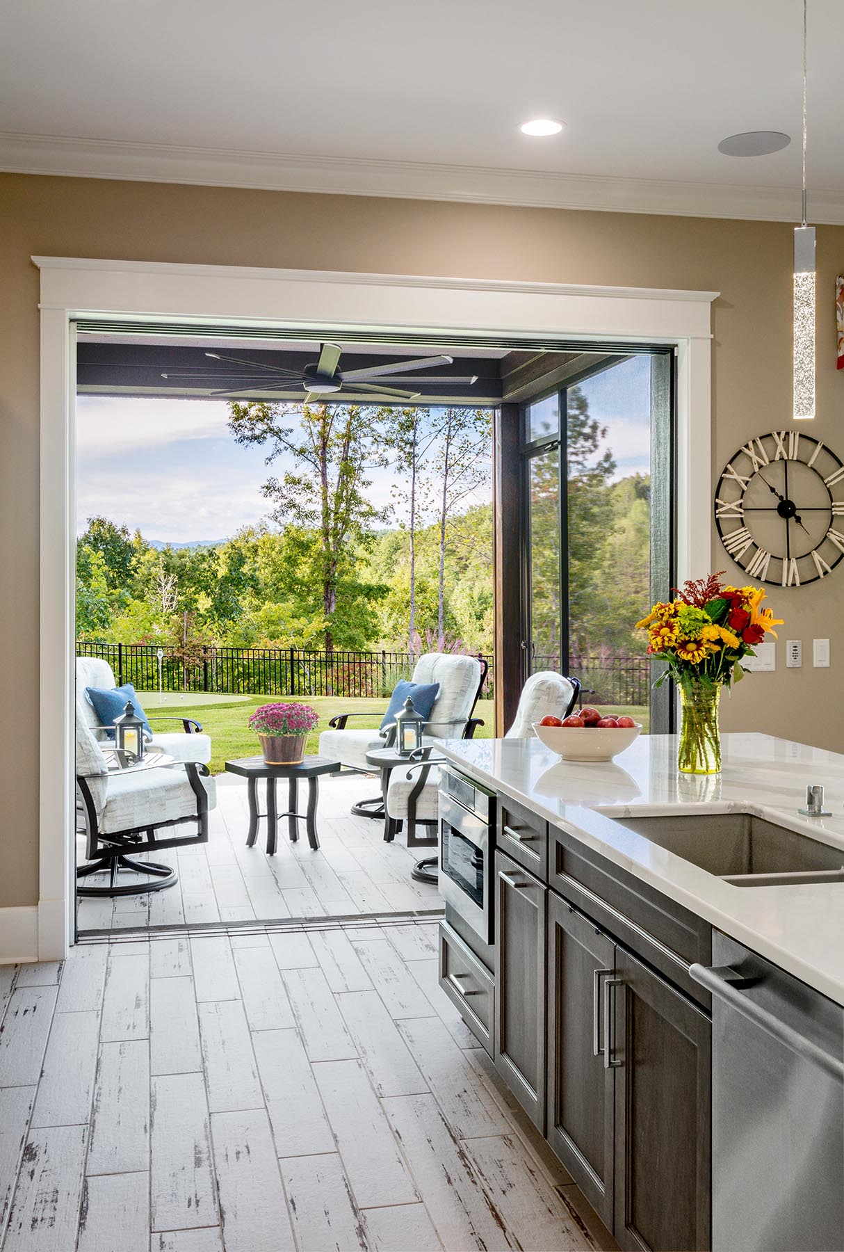
Instead, what would be more helpful is creating a 3-D view of the house from eye level – an interior perspective. We will discuss the role of Revit and 3-D modeling in a follow up blog.
Floor Plan Options
One thing I have observed lately is how effortlessly builders have enabled online buyers to toggle from base plan to the options. This is a great interactive online tool that has found its way into the “live” sales office replacing the old framed, static floor plans of the past. Of course, I read floor plans for a living, so I think that works great. I wonder what kind of misconceptions buyers get when trying to do it on their own, if any. What kind of feedback have you been receiving from customers?
From the Architect’s perspective
Back in the dark days of the housing recession, I was working with a cutting-edge builder to create floor plan “bubbles” that online buyers could click on to hear the voice of the architect. This allowed me to vocalize plan features, like the view from the front door to the backyard or the privacy the vestibule leading to the master created. We were trying to recreate that initial conversation the architect had with the builder when “selling” our floor plan concept. Too often, the wisdom and the “why things are where they are” is never shared with the new home sales team and thus, the buyers. Could embedding the words of the creator be a powerful, untapped sales tool to use in these uncertain times? Call me and let’s talk!
Selling Now
Regardless of how your floor plans appear on your website, Housing Design Matters can help online sales consultants improve at selling them. We have helpful tips and tricks to help buyers projecting themselves into your houses. We are currently taking reservations for online classes with our builder clients. We want you to sell more homes – regardless of the current shelter in place rules.
Next week, let’s talk about the exterior of the homes, elevations verses 3-D renderings and the role color plans in communicating the look and feel of the home. Thank you so much for following along and hope you are well!
Categorized in: Housing in the Pandemic, Selling Floor Plans
This post was written by Housing Design Matters


