How do we combat The Big Squeeze in housing?
Home buyers want more but have less to spend. On the other hand, costs ranging from regulations, land, and labor, are rising. Last week, we laid out compelling features and layouts that buyers are looking for. But to deliver that knockout kitchen, we need to examine where we can save on unnecessary costs.
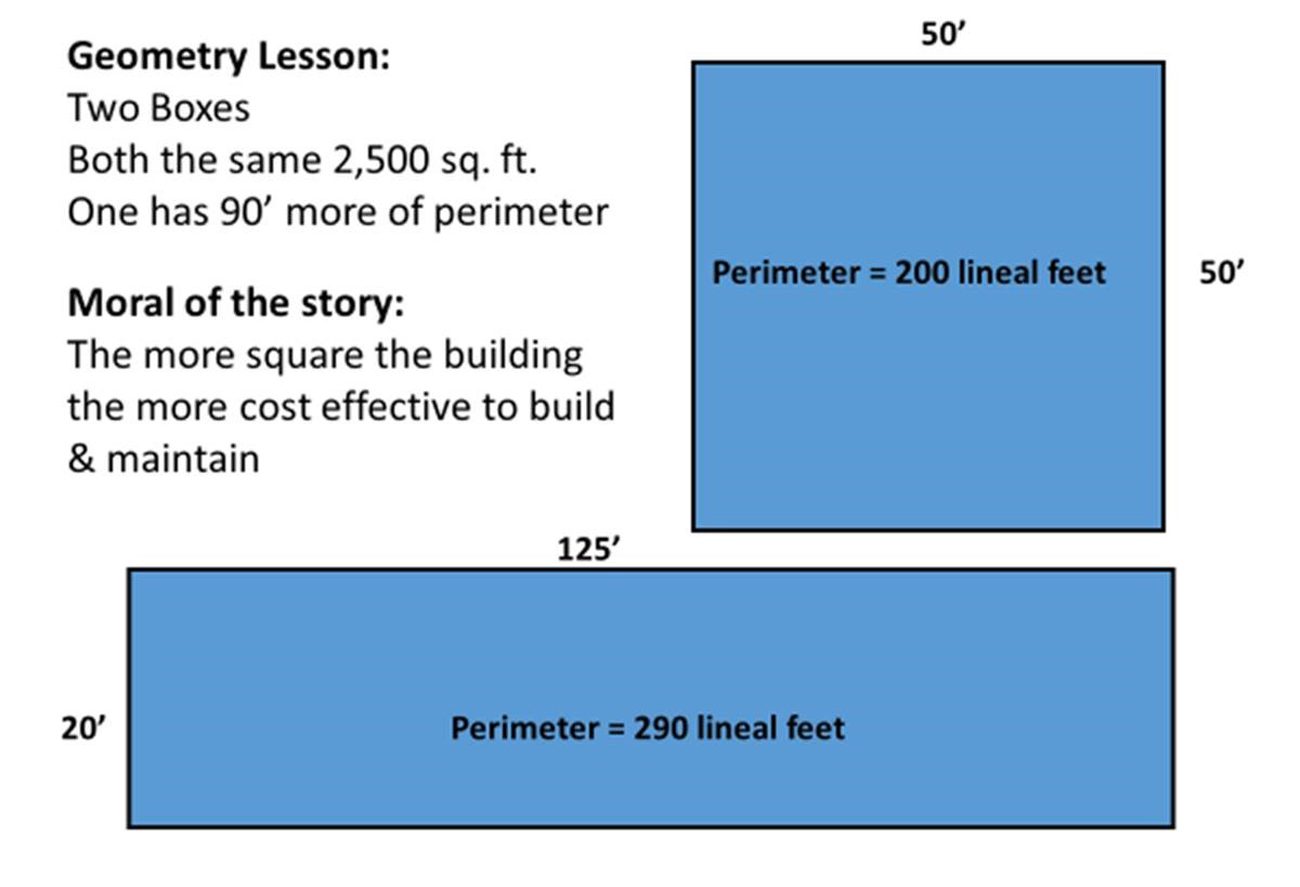
It’s Hip to Be Square
Want to see that bill of material purchasing go down? Simple geometry can be your best friend! Allow me to demonstrate below:
Avoid Snout Garages
Builders have been using ugly, inefficient snout garages for so long that you’d be forgiven if you thought there wasn’t another way…
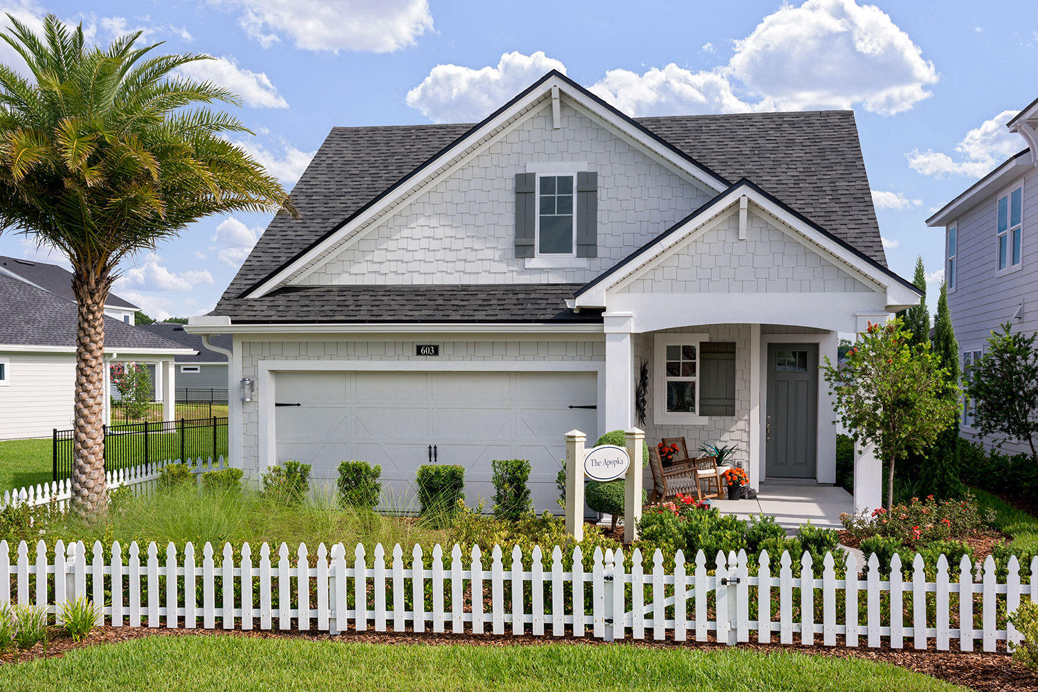
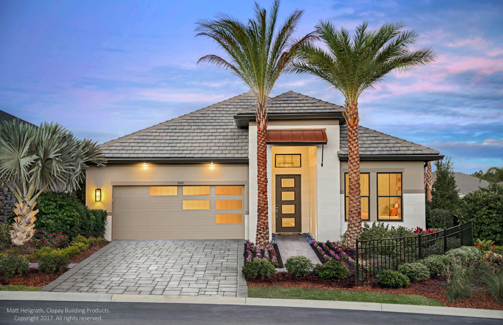
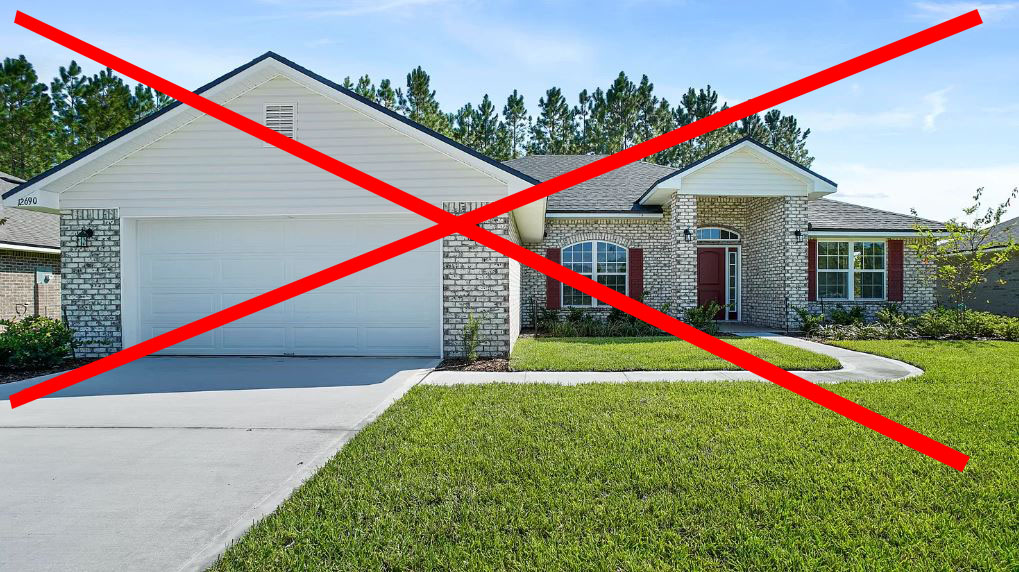 But there is! Again, allow me to use a handy graphic to demonstrate the power of geometry. Take these two 2000 sq ft homes:
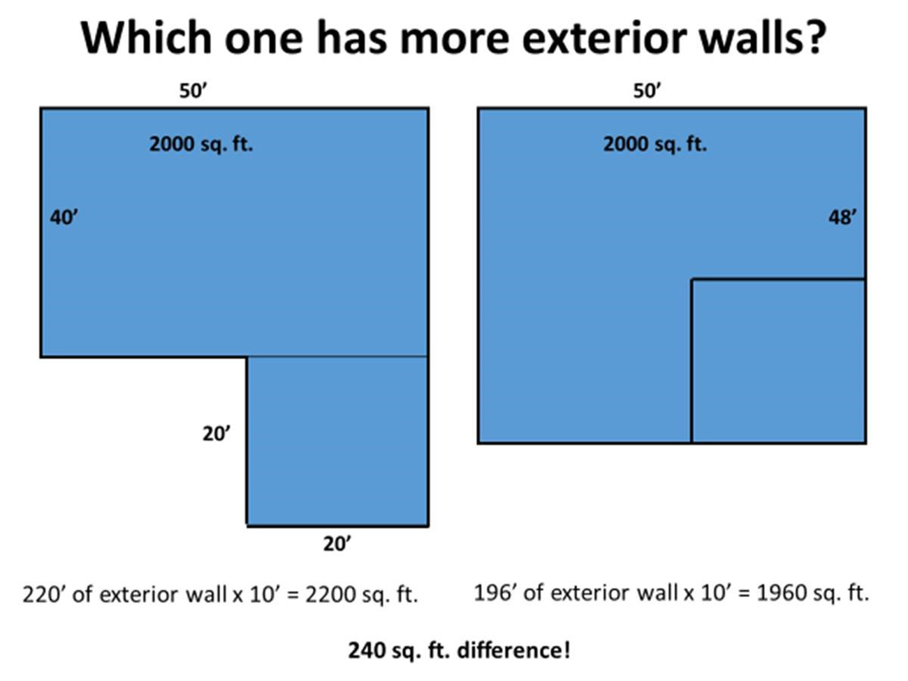 Not only is the snout example less attractive, it also has 240 sq ft of additional exterior walls to pay for (not to mention it eats into precious yard space)! Stick to the tried-and-true square and you will come out with a home that is more attractive, more cost-effective, AND more space efficient. No catch!
Be Smart With Window Placement
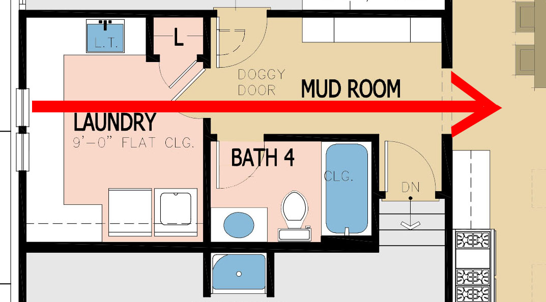
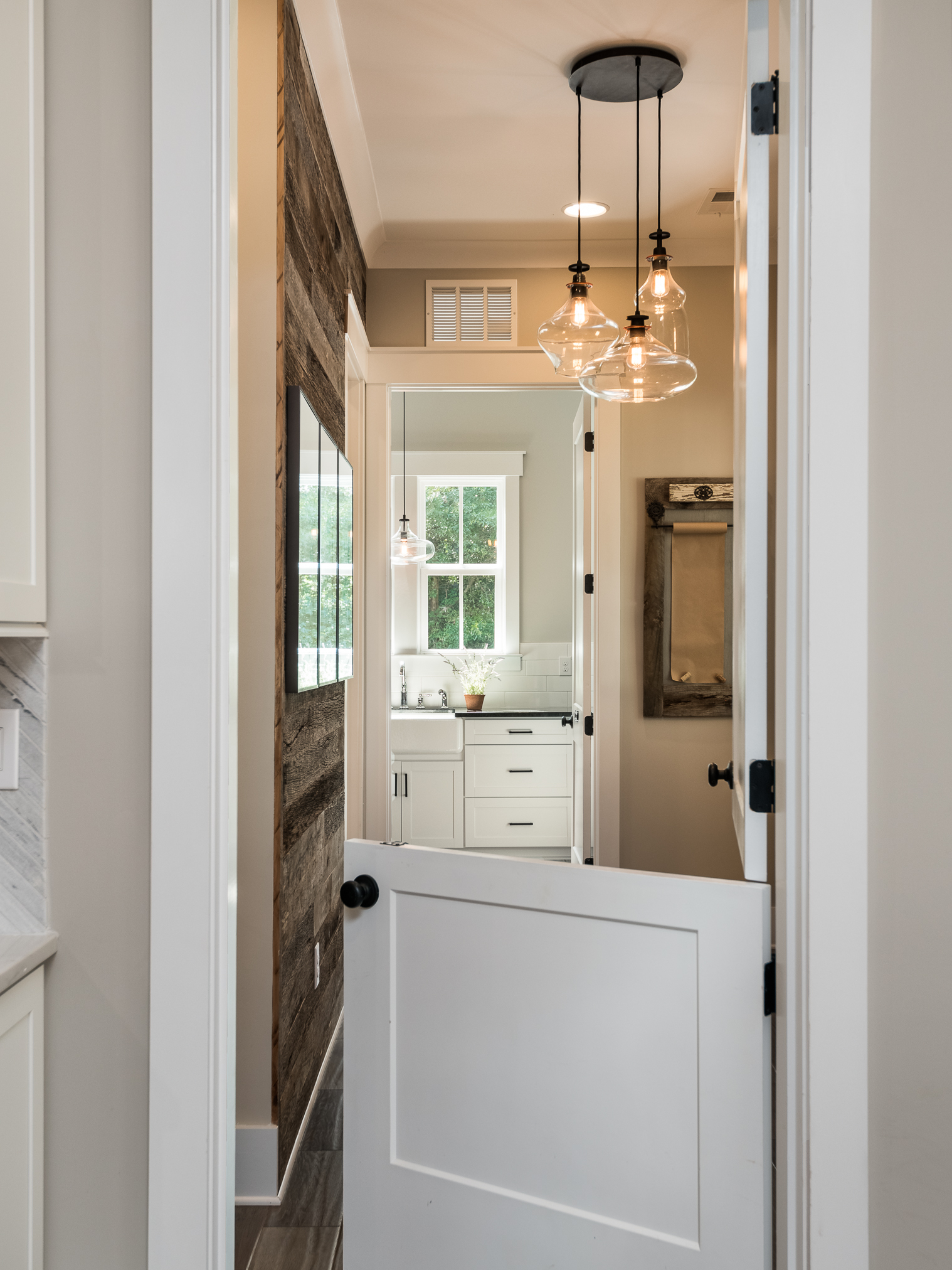
Designers are obsessed with natural light (guilty…), but excessive windows can start adding up quickly. Place windows where they can also serve adjacent spaces in the home.
 Keep it Simple
At the end of the day, to give home buyers what they want at a price that is within reach, we have to simplify. Don’t go crazy with roof-lines and excessive beams if you can avoid it. Additionally, centrally located HVAC reduces duct runs. These strategies add up to significant cost savings that can even the playing field against resales, or even skew the odds in your favor!
Whew! That was a lot of information. I hope you learned something new – or at least validated what you already knew! Next week, we’ll expand on the bigger picture even further by looking at how we can improve our streetscapes.
Categorized in: Affordability, The Big Squeeze
This post was written by Housing Design Matters
