Over the Thanksgiving holiday, we flew to New York City to celebrate with family. We stayed in a boutique hotel in Williamsburg, a Brooklyn neighborhood. On the website, the hotel looked super hip and chic.
All the cool stuff
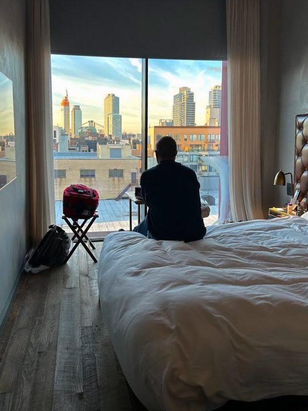
When you stepped into the room, you felt like you stepped onto the set of some HGTV special showcasing the latest trends in flooring, tile, finishes, and fixtures. It had high ceilings and reclaimed wood flooring. The walls looked like a scratch coat of plaster.
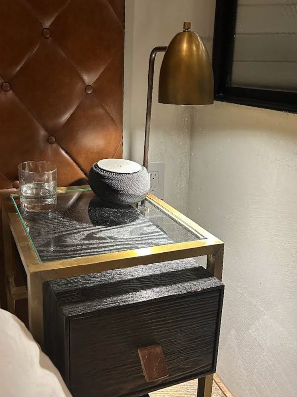
Adjacent to the bed was a cool-looking sound machine to drown out the noise from the hall or street below (which was so needed).
The see-thru shower
Instead of a fully enclosed bathroom, the glass wall of the shower created a dramatic see-thru vista as you entered the room. The very small bath and bedroom both looked larger because of this visual trick. Talk about blurring the lines!
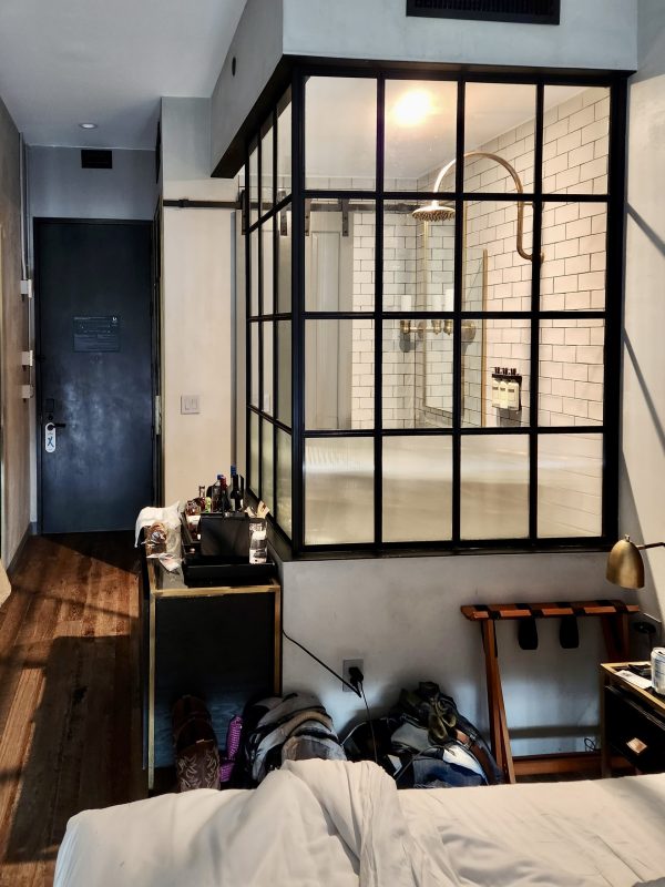
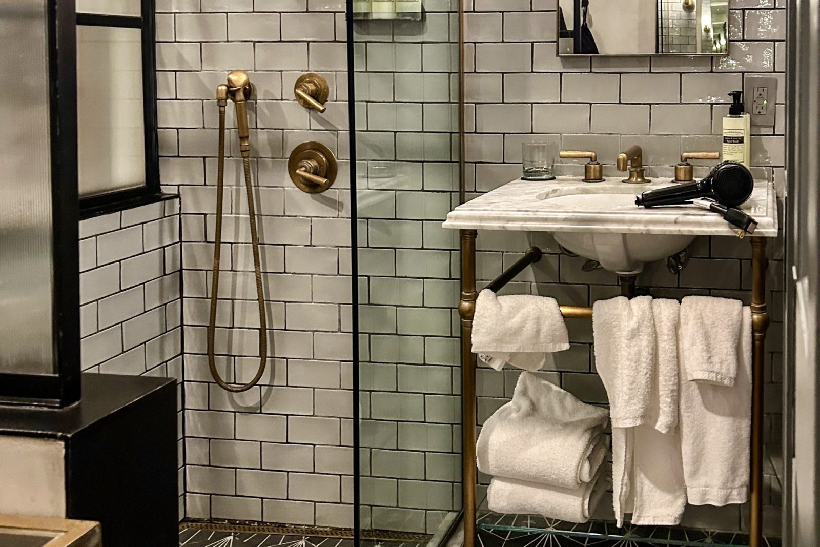
The top half of the shower was clear with opaque glass where privacy was called for. The glass frame sported an industrial chic with a black metal frame. Of course, the shower walls were clad in subway tile (this is New York) and the floor had a fun, contrasting tile. The coolness continues with a lineal drain, rain head, and handheld shower heads in brushed gold.
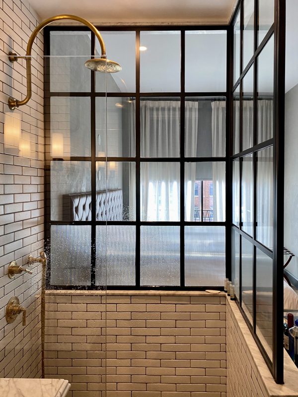
There was one fairly significant problem with the shower: It didn’t have a door. This became a problem when you added a person to the shower, the water from either shower head bounced onto the adjacent floor. It was cold that weekend in New York and I didn’t appreciate the cold wet floor from the water that landed in front of the vanity. And since the bathroom was open to the room, the steam from the shower filled the entire room.
The Vanity
Upon first impressions, the vanity is small but cool. It had dual sconce light fixtures on either side of the tall, elegant mirror. The chic metal frame held the towels – how efficient! But then you try to dry your hair.
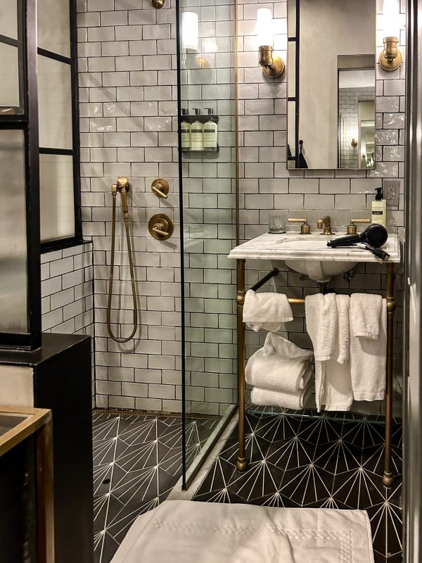
There is virtually no room for the blow dryer, or all the stuff consumers today use to make themselves presentable. Of course, there were two of us in this hotel room. Not only did we have to find a place for both of our travel kits, but if one person were standing at the vanity, access to the shower and the toilet room was blocked.
Toilet Room
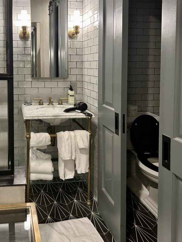
The only privacy in the entire room was from the toilet room which sported a pair of barn doors. These were amazing space savers in such a small room. Ah – but I’ve said it before and I’ll say it again – barn doors work for visual privacy – not acoustical privacy. Enough said.
The Sleeping Area
Our hotel room had a queen size bed with a tiny night stand at either end. Across from the bed was a wall hung TV. My iPhone measured the room at 8’-11” wide. A queen bed is 6’-8” long. Add a couple of inches for the padded headboard and you end up with 2’-1” between the wall and the end of the bed. Additionally, the wall-mounted TV extended 5 inches from the wall, closing in the space even more. Now, imagine two people in the hotel room trying to maneuver from from one end to the other. The space at the end of the bed became the no passing zone.
Don’t Forget the Human Element
It felt to me like this room was designed down to the last inch. Just enough space for all the required components. That is, until you added the human element. Two travelers means two suitcases, two coats, and two people having to pass back and forth and use the tiny accoutrements. And when the room is super tight, suitcases often scrap the walls leaving the room looking worn. Suddenly this super chic room was losing its luster.
Lessons learned
Forgive my rant, but I’m trying to illustrate that what we do is more than just feet and inches or looking good on Instagram. How do the spaces actually function when you add people of all shapes and sizes and their stuff? As we strive for affordability and density, it becomes increasingly important to remember the people! One I won’t soon forget.
Categorized in: Uncategorized
This post was written by Housing Design Matters

