One of my builder clients was conducting a neighborhood engagement for a new community they were planning. They were looking for buy-in by the neighbors. The input we got was as varied as it was interesting.
- “Don’t use red brick. Too dated.”
- “Use indigenous materials including local stone and red brick.”
- “I like brown brick.”
- “Don’t use brown brick. A nearby community with only brown brick looks monotonous.”
- “I love an all-white farmhouse.”
- “Please don’t do all white houses.”
- “Don’t use brown shutters.”
I found this last comment especially amusing as my personal house has brown shutters.
Obviously, we weren’t going to get consensus from this group. Indeed, if we designed our community with the feedback we got from this group, we would end up with a pink elephant.
However, we were able to narrow in on a common thread: Make the community look timeless, not trendy.
Now that was something we could work with! Here is my list of criteria
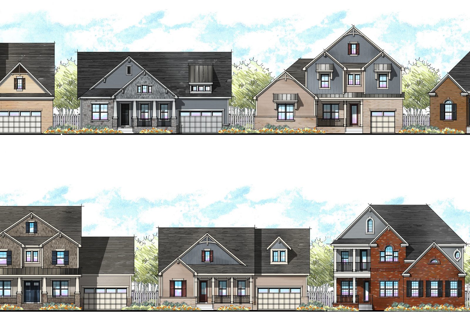
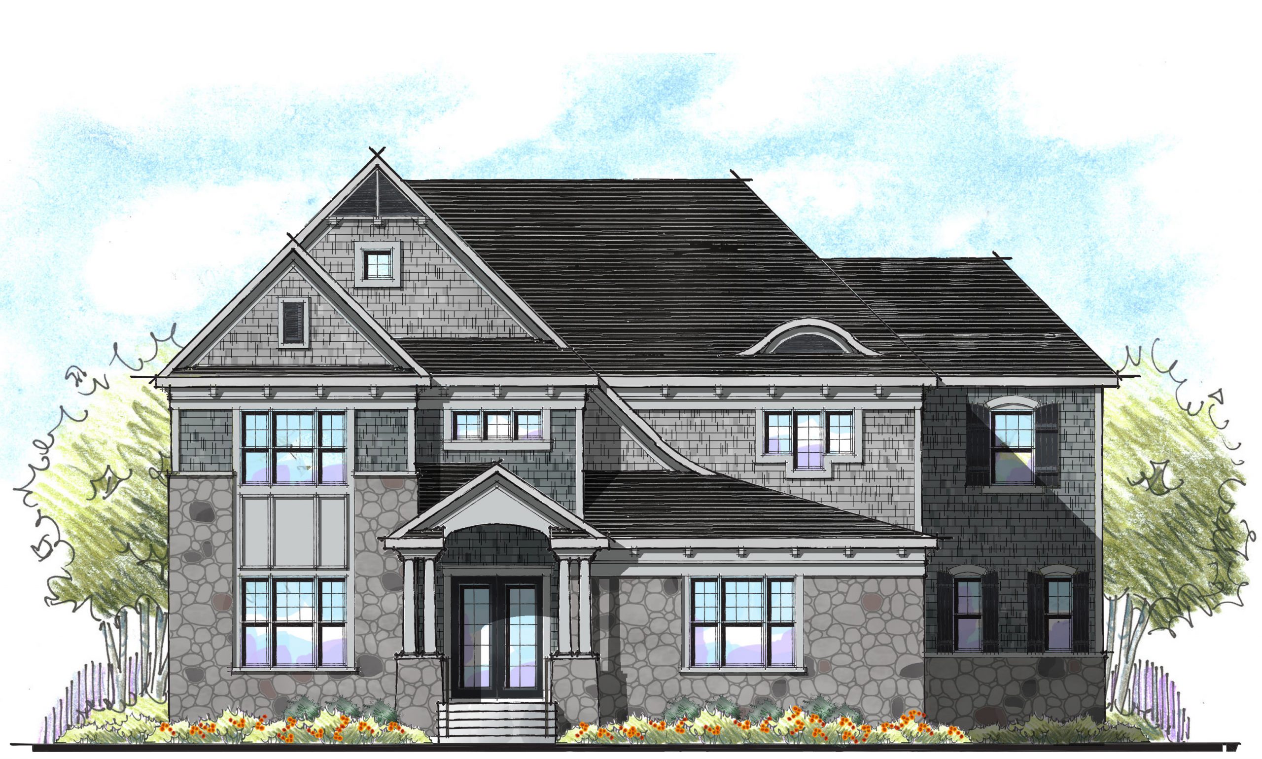
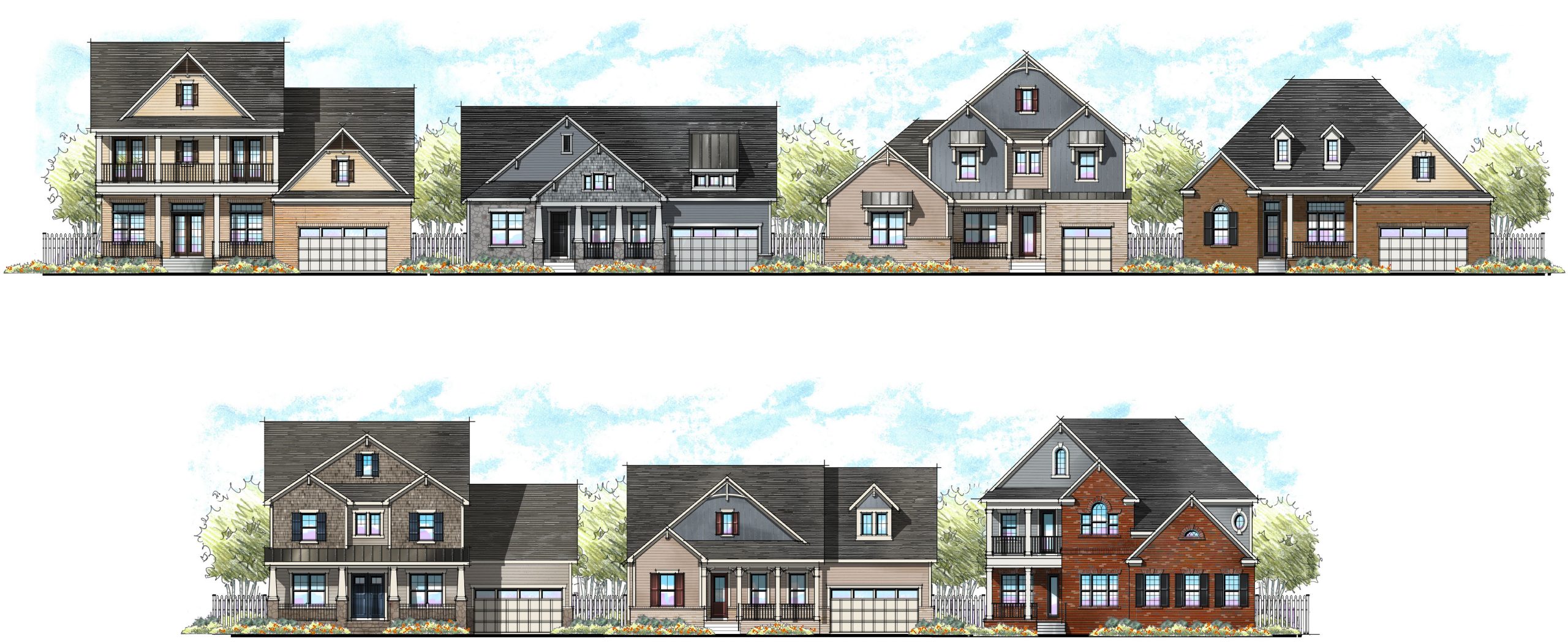
- Utilize a variety of architectural styles
- Vary the roof forms – hips vs gables, etc.
- Use a variety of colors – other than brown shutters, of course.
- Consider a variety of finishes and materials
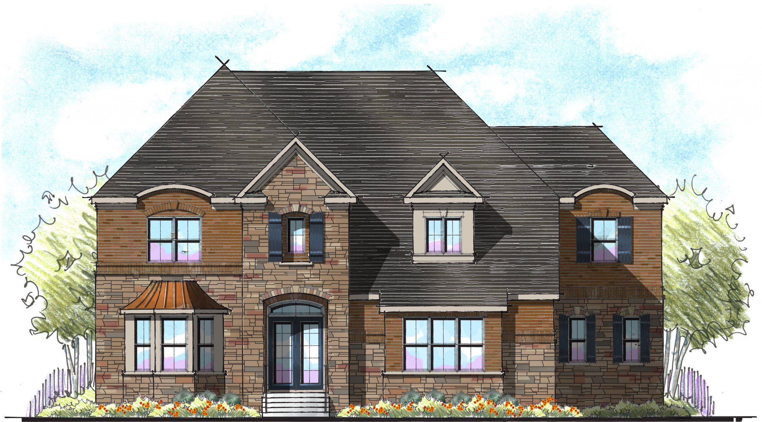
- Using multiple finishes – up to three – to create a rich look
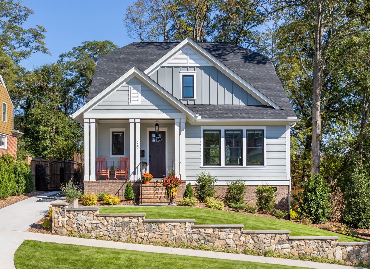
- Add front porches whenever possible
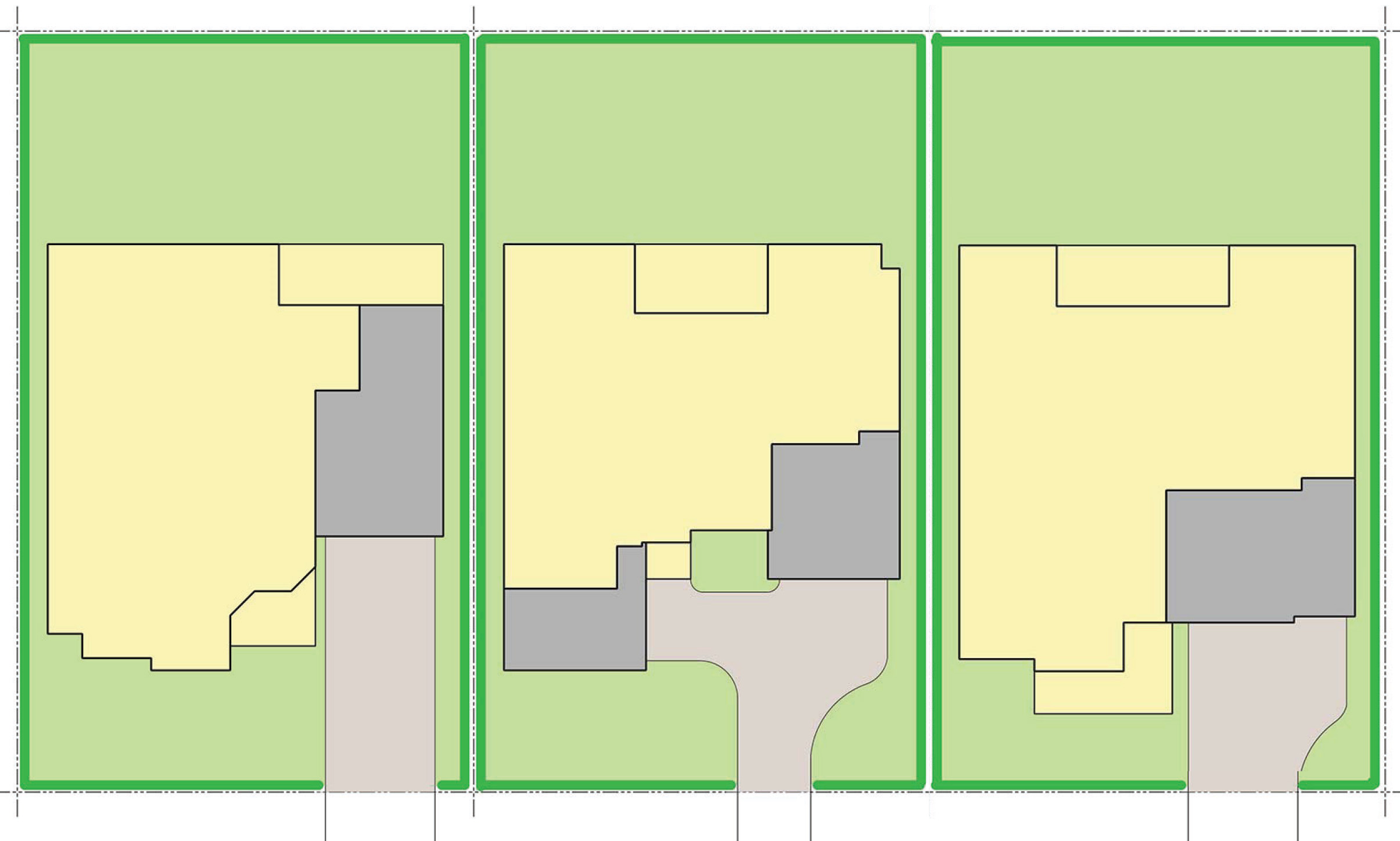
- Play down the garage – but make sure there is adequate parking
- Implement a monotony code
- Don’t skimp on the landscaping
From this list, we can create a streetscape that captures timeless qualities and was a great first step at creating a legacy streetscape.
Start with style
For me, “timeless” starts with the architectural styles. I like at least 4 or 5 different styles – even if you’re going to limit each plan to 3 styles. With this approach, you can add diversity without overextending your architectural budget. You may want to consider a fourth style for the model – since everyone wants the model. Make sure the different styles create vastly different roof forms and massing.
Can you create two elevations so different that no one will believe it is the same house? When we shared an example of this with our community group, we were accused of lying!
Colors and Materials
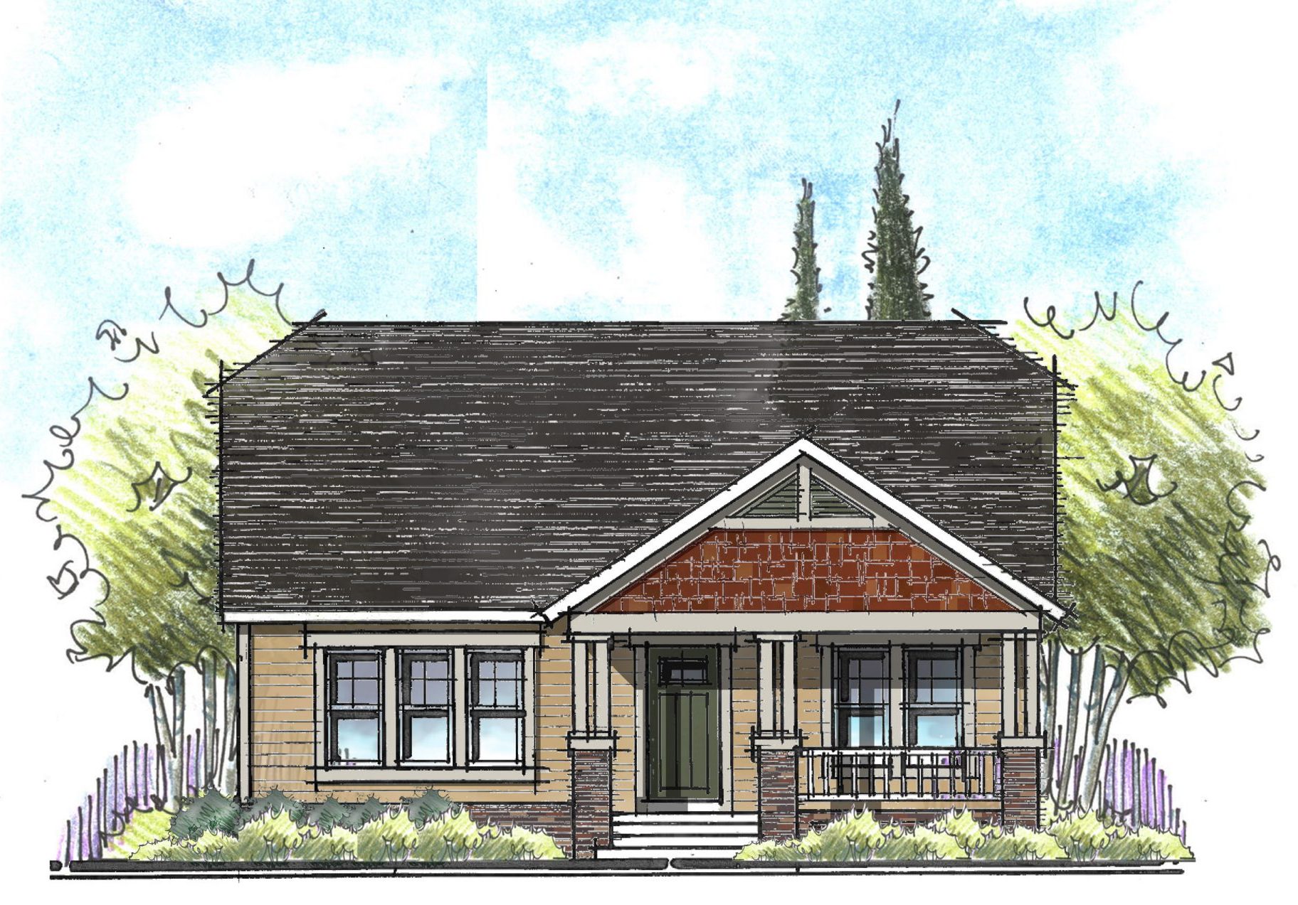
Once you have determined the architectural styles, now you can begin to select colors and materials that reinforce the style of the home. A Craftsman style home, for example, looks best in saturated, earth tones with an accent of brick or stone.
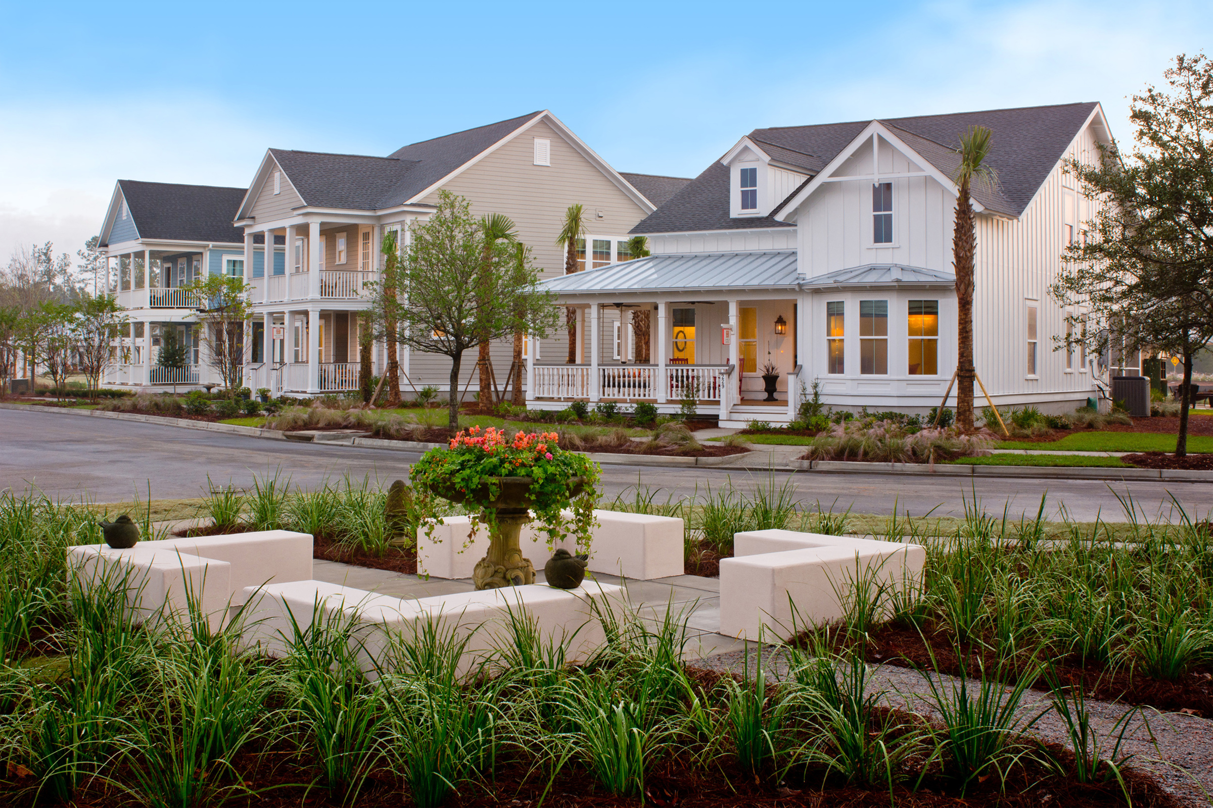
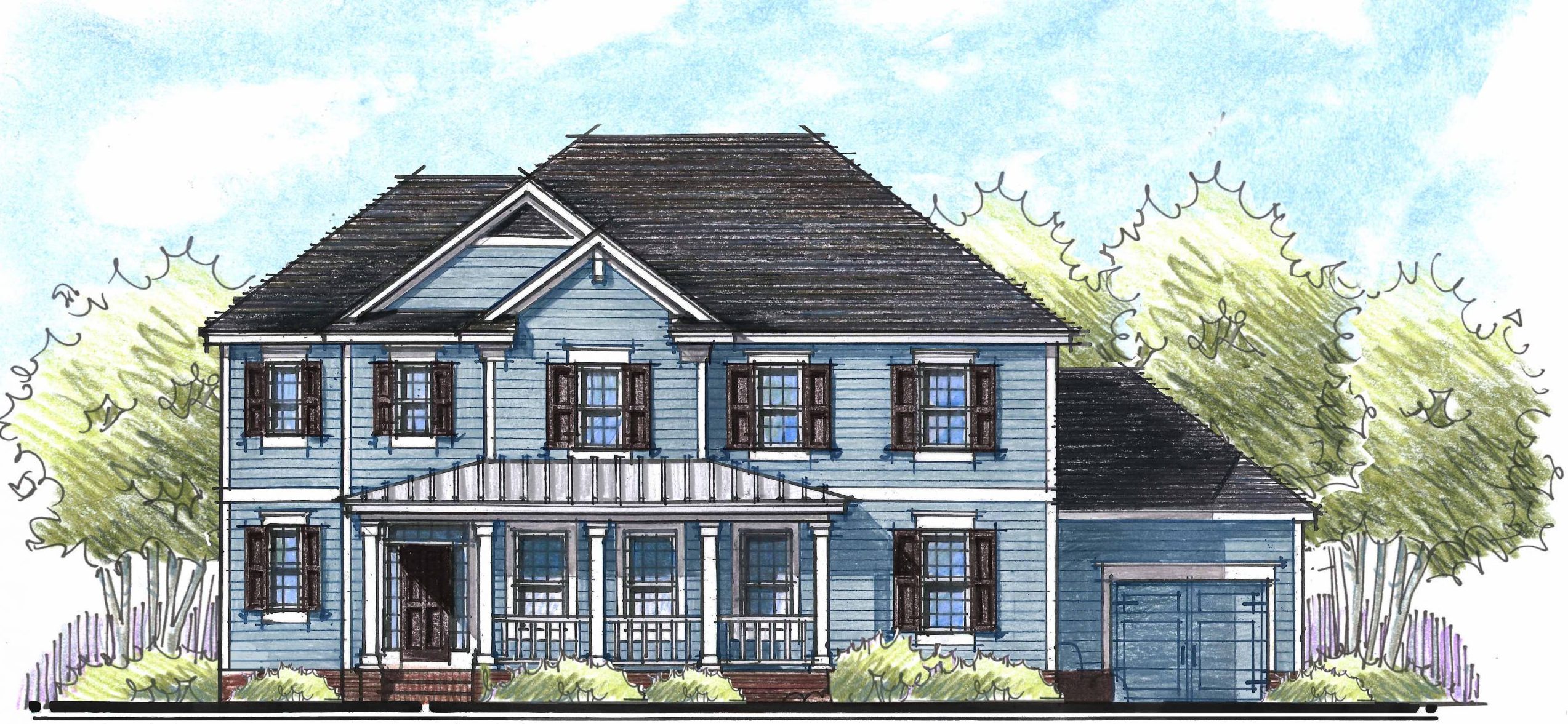
A low country elevation looks great in all siding with light, bright, breezy colors – including blue on the front porch ceiling. Complete the look with a metal roof.
When in doubt, add a porch
Readers know that I’ve talked extensively about the virtues of the front porch. We always begin by making the porch adequately sized for usability. Vary the details of the porches like the columns and handrail to further enhance the style. Vary the form of the porch: one porch with a shed roof, another with a gable roof, and another with a double stacked porch.
Solve for the automobile
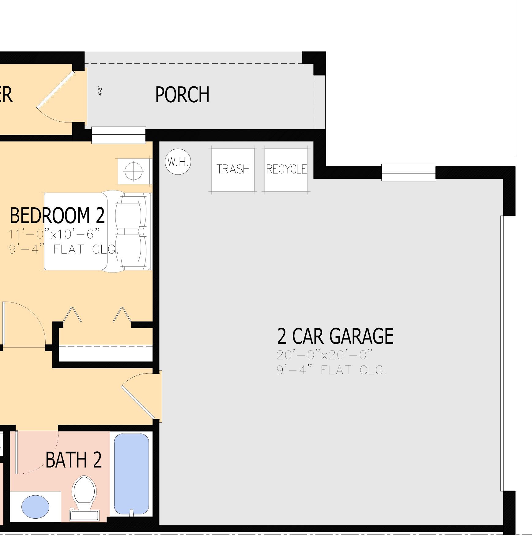
Even the cutest streetscape can be ruined by a sea of cars blocking your view and capturing your focus. First, make the garages large enough for cars plus “stuff”. In addition to full size cars, make room for two giant trash receptacles. Even if you have adequate storage throughout the house, somehow the garage still gets cluttered.
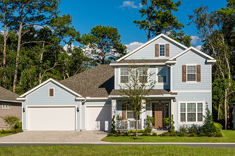
Next, vary the garage types. When adding three car garages, consider a three-car tandem, a three-car front loaded garage, and a two-one split garage. The garage should be set back behind the front plane of house or porch. This will allow the house to be the focus and the garage to be less dominant.
Monotony Code
Start by not allowing identical houses side-by-side or across the street from each other. This should also include the colors. Obviously, don’t allow the same color schemes side by side. Additionally, if you don’t have real variety in your color schemes, you could end up with a streetscape in various shades of beige or white. Keep in mind, if you have successfully varied the style and form of one house plan, you can put them side by side. You know you’ve accomplished true diversity when you’re accused of lying about same house side by side and no one can tell.
Add Landscaping
You can’t have a great streetscapes without street trees. This can sometimes be tricky with underground utilities, so have that conversation early. Then, just like the architecture, vary the landscape. Consider a variety of trees – both evergreen and deciduous. Alter the placement of plants from house to house. Select plants with varying colors, textures, and heights. Finally, add annuals for that pop of color.
At the end of the day, not everyone will love every house in the neighborhood. But if you add enough variety and personality to your streetscape, you will not only have something for everyone, but you will also go a long way to create a legacy community.
Categorized in: Community Design, Uncategorized
This post was written by Housing Design Matters

