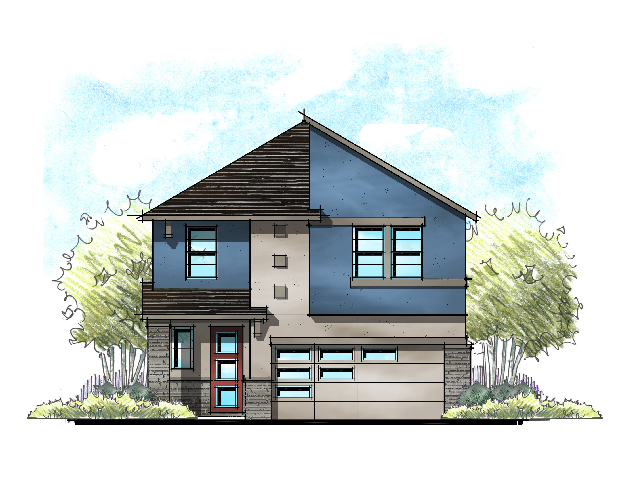
Last week, I detailed half of the speech I gave at the Southeastern Builders Conference – focusing on style selection. Any successful community needs to start with a beautiful streetscape. Let’s take it a step further with porches, colors, and materials.
Porches & Garages
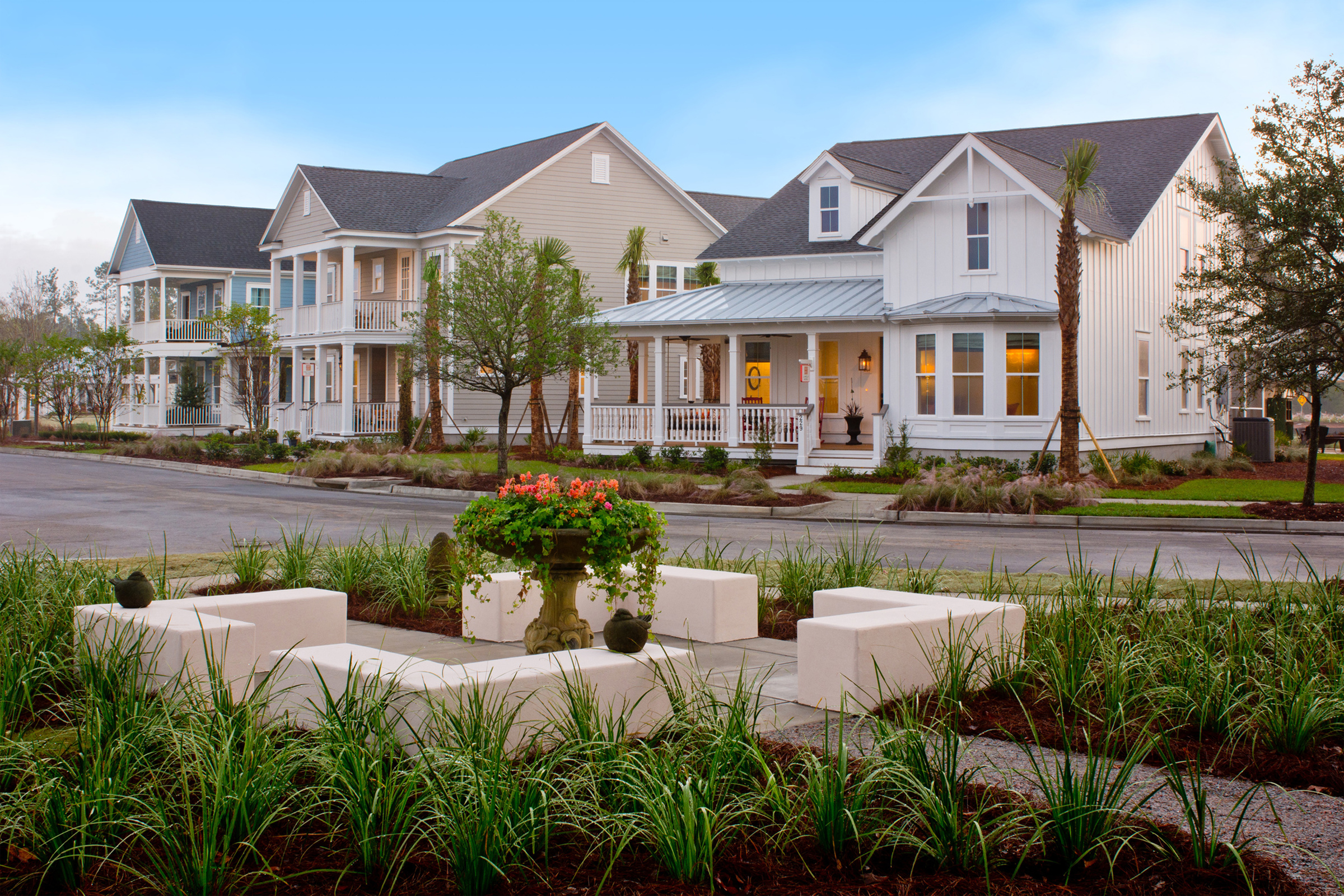
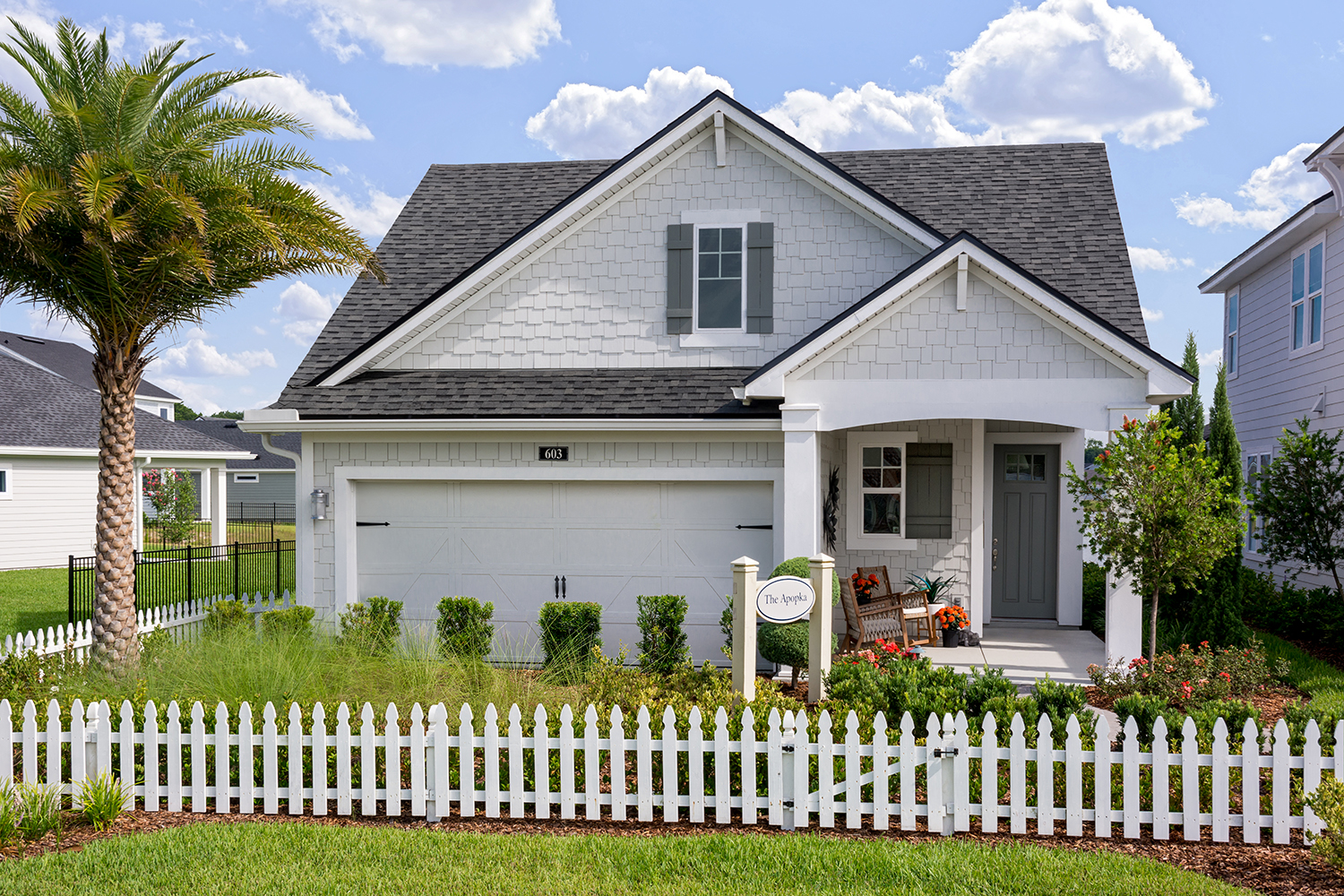
Buyers and planning commissions love front porches. Including them in your houses makes the entire community more pedestrian-friendly. Why? It’s as simple as sitting on your front porch, greeting your neighbors as they walk by with their dogs, baby strollers or are simply out for an evening stroll. Beyond a neighborly feel, porches can also diminish the garage on the front elevation – which is always a good thing!
Speaking of garages, buyers need them, and planning commissions think they are a necessary evil not to be seen. They especially hate snout garages, and you should too! A snout garage is actually more expensive to build. In the example below, the snout garage – or the garage that is forward of the main body of the house – has more exterior wall than the example where the garage is tucked into the main building envelope. The non-snout example has 240 sq. ft. of exterior wall and yet no added square footage of living space.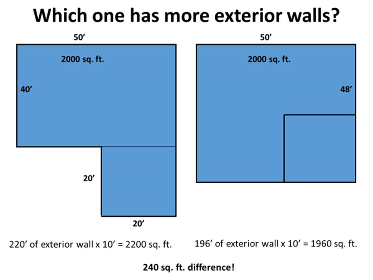
That may not seem like much, but if those walls are clad in brick at $6.00 a sq. ft. That’s an extra $1,440 for a house that’s less attractive. To add insult to injury, the snout house has 12’ less of back yard – which may translate to no pool on the lot.
Exterior colors
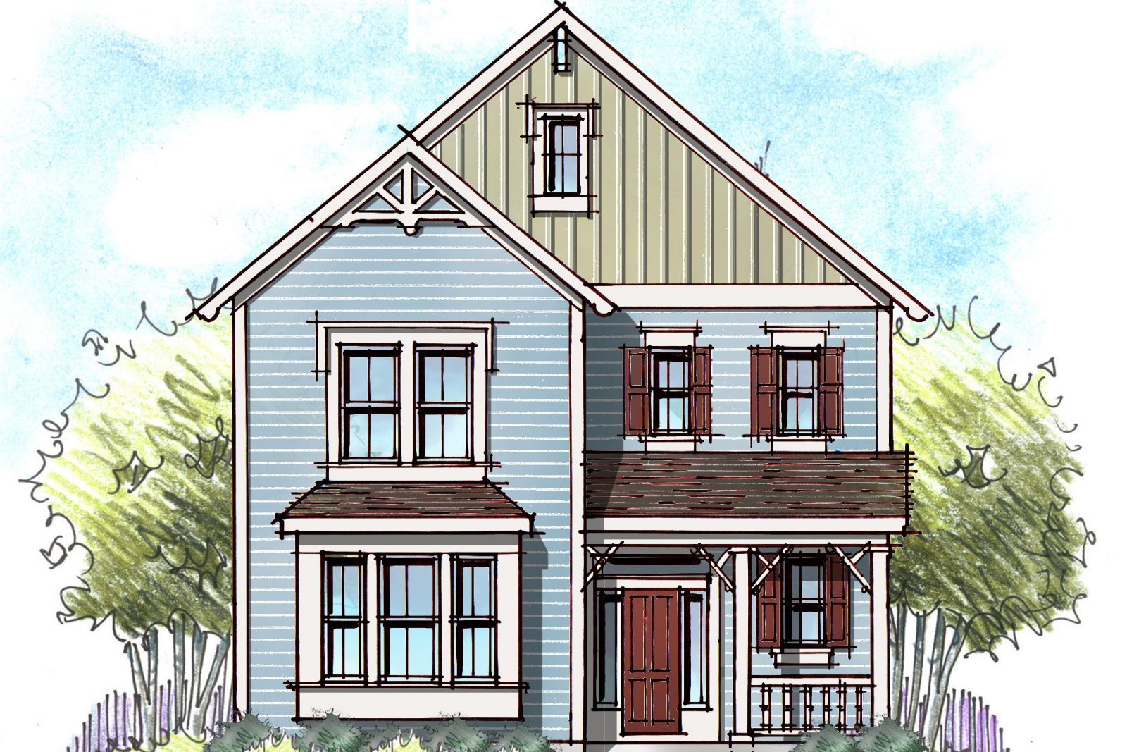
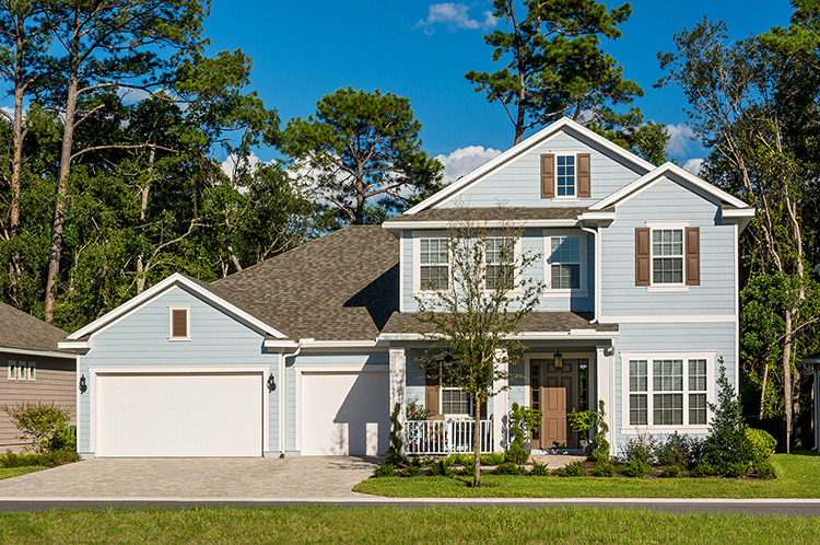
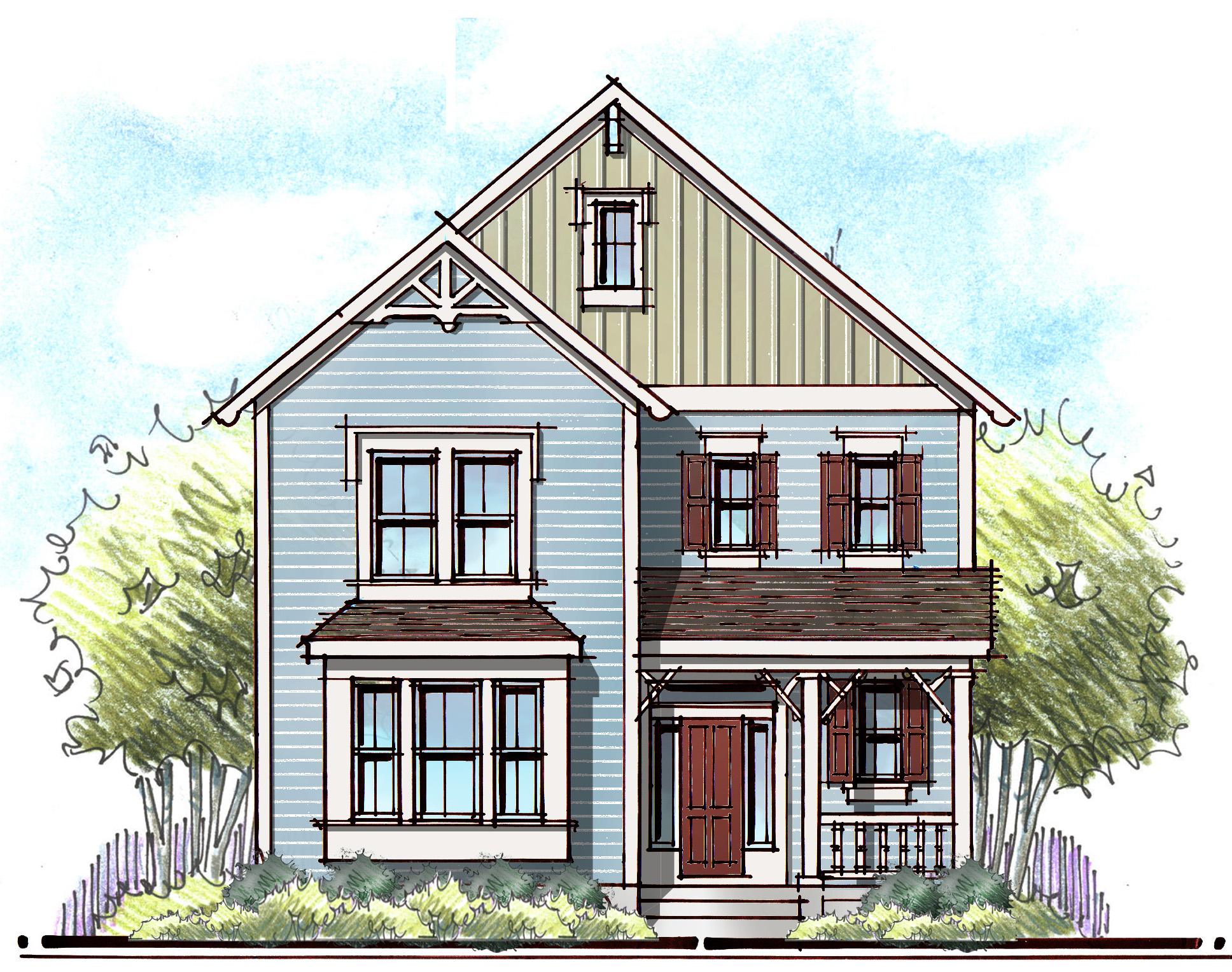
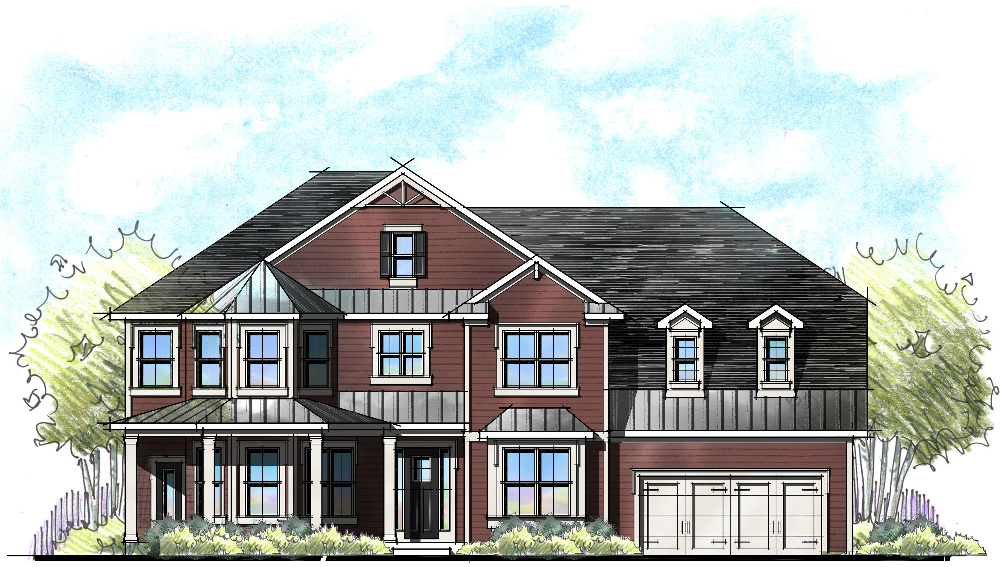
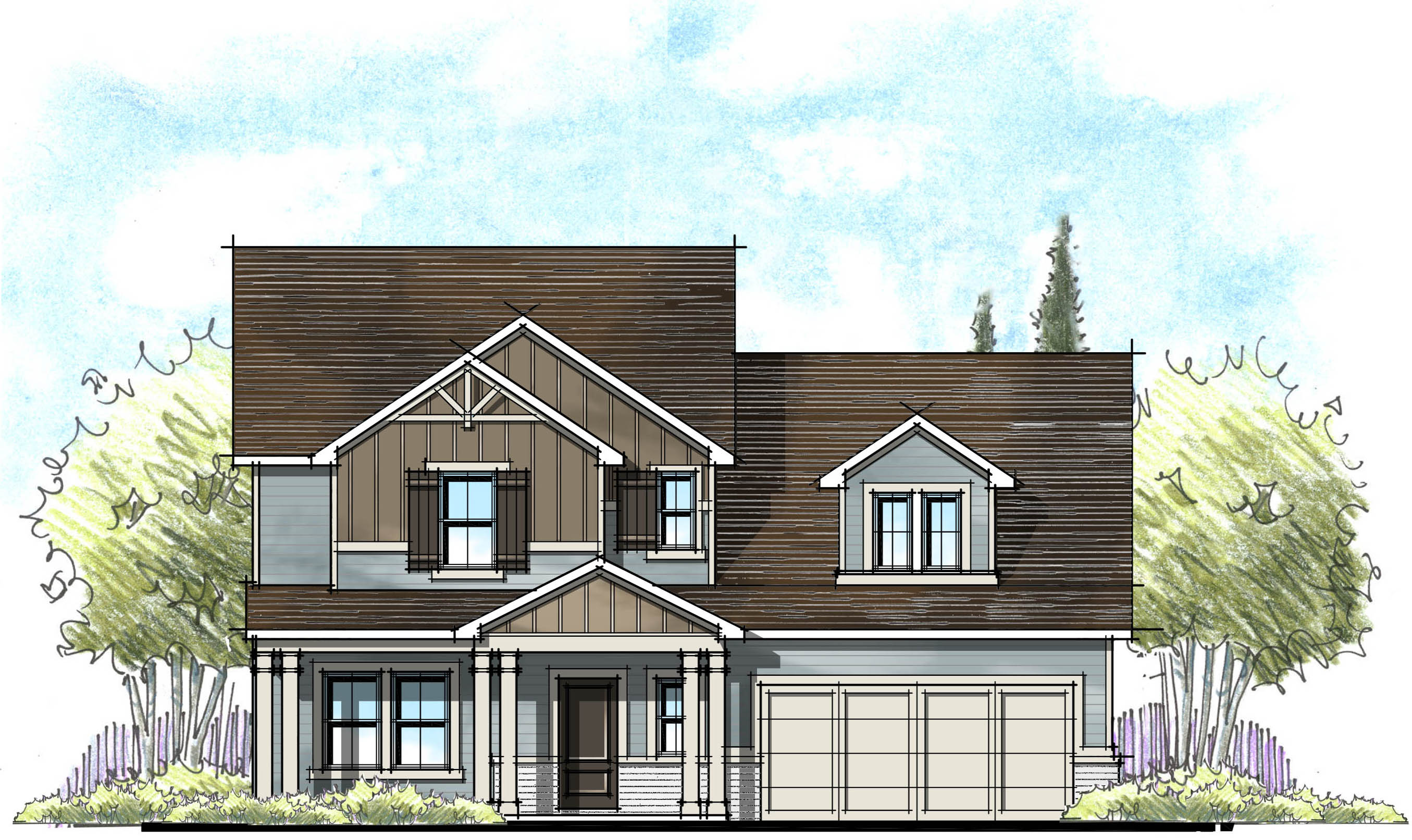
In my opinion, exterior colors are a real game changer to curb appeal. Go beyond “Builder Beige” and learn about colors that enhance and enrich the architectural style of the home. Craftsman elevations are enhanced with rich, saturated color pallets while Low Country shines in light, bright and breezier colors.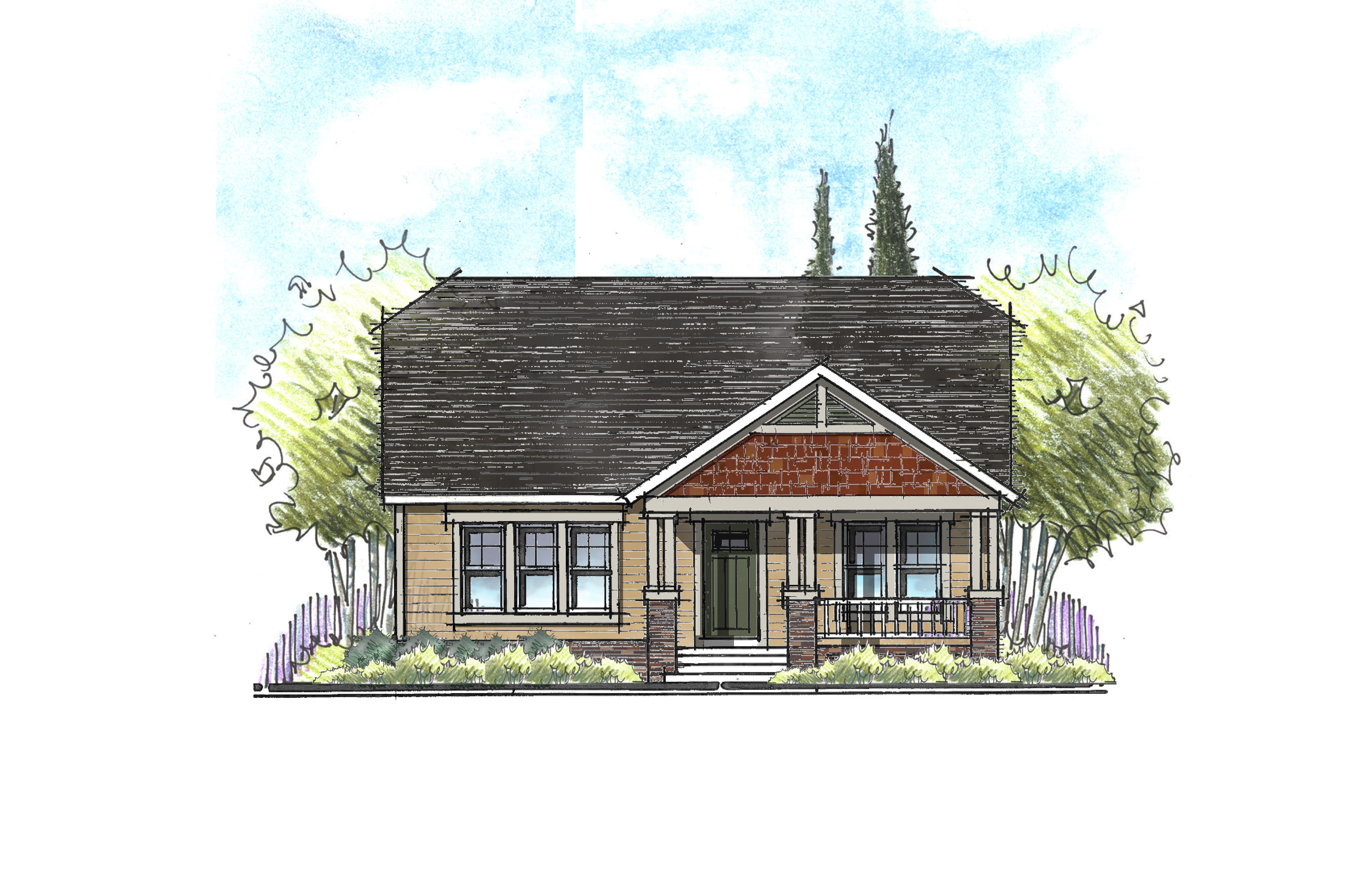
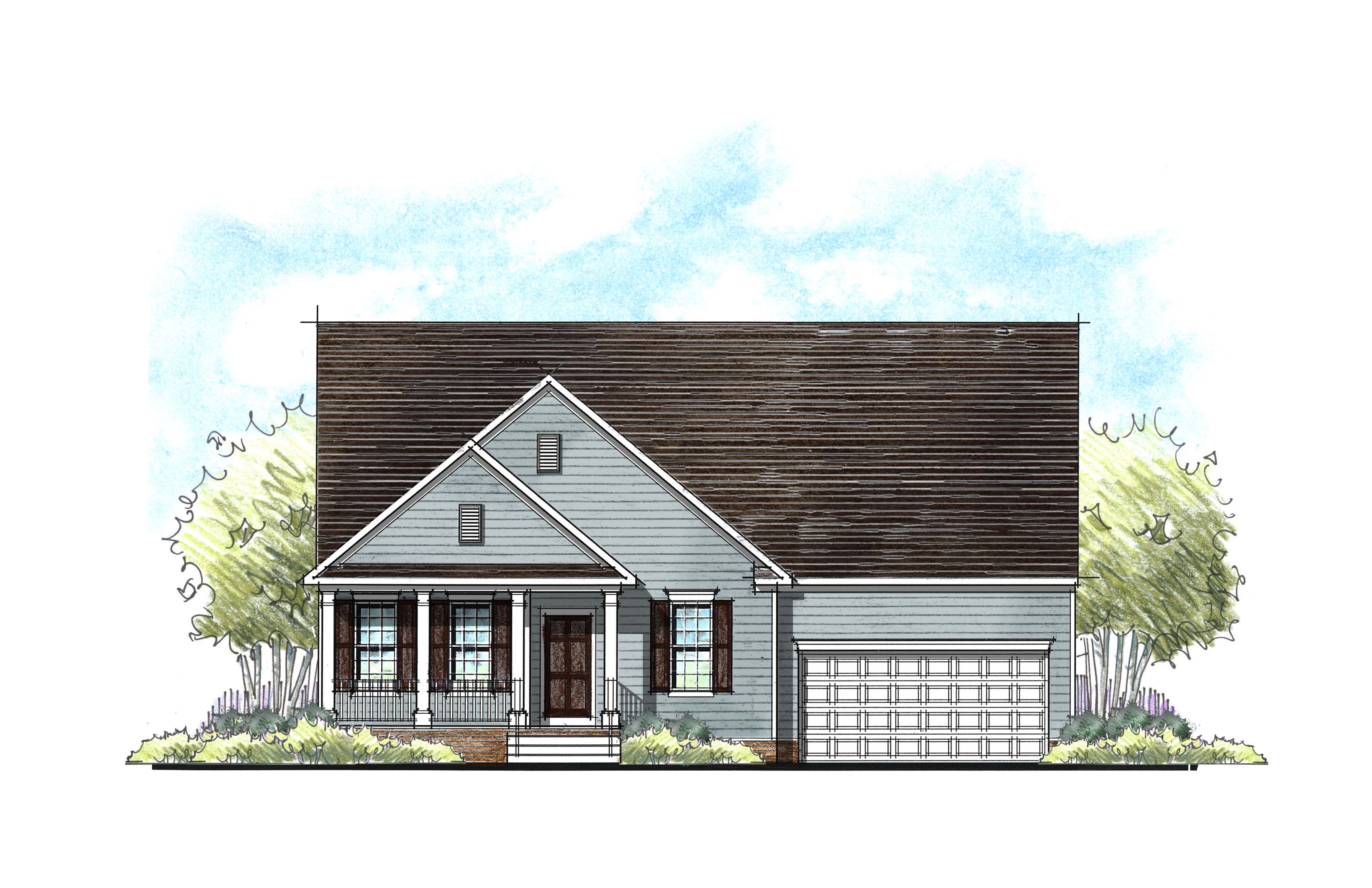
With Farmhouse being all the rage today, I want to stress that they don’t all have to be white! A white Farmhouse is quite charming, but if we are not careful, today’s white will become yesterday’s beige. Farmhouse is a descendant of the Folk Victorian style and welcomes color.
To add animation to your elevations, consider two body colors. This is very impactful way to add diversity and animation with little additional cost. Even an all-stucco exterior can come alive with two body colors. If you’re using two siding profiles, showcase that by highlighting one with a different exterior color.
Exterior Materials
What’s new in exterior materials? Are you using the same old status quo? Adding fresh new materials to your exteriors might be the revitalization your streetscape needs. In CMU markets, adding cultured stone or wood look tile is a great way to avoid an all “banded” stucco streetscape.
The Rule of 3
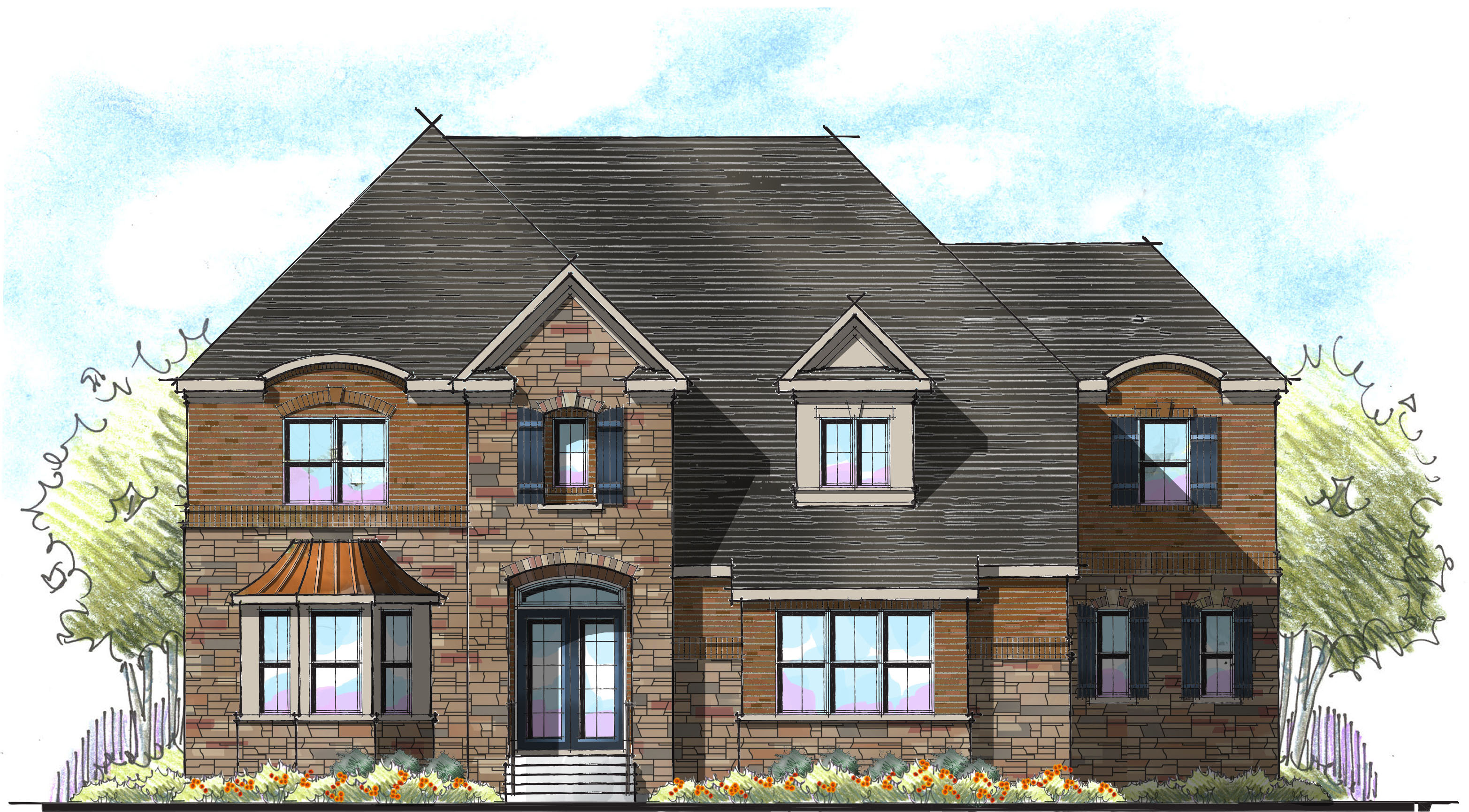
Be careful to limit your exterior materials to no more than three. More than three starts to look like a hodgepodge. If you’re offering brick and stone together, I strongly recommend pre-selecting your brick and stone combinations. Brick and stone combinations are incredibly difficult to pull off. Both materials can be visually busy – resulting in a polka dot and stripped look. Too little contrast between materials gives you a “Why bother?” look. Don’t let your buyers clutter up your streetscape because they pick their selection from a 4” square picture from a brochure. 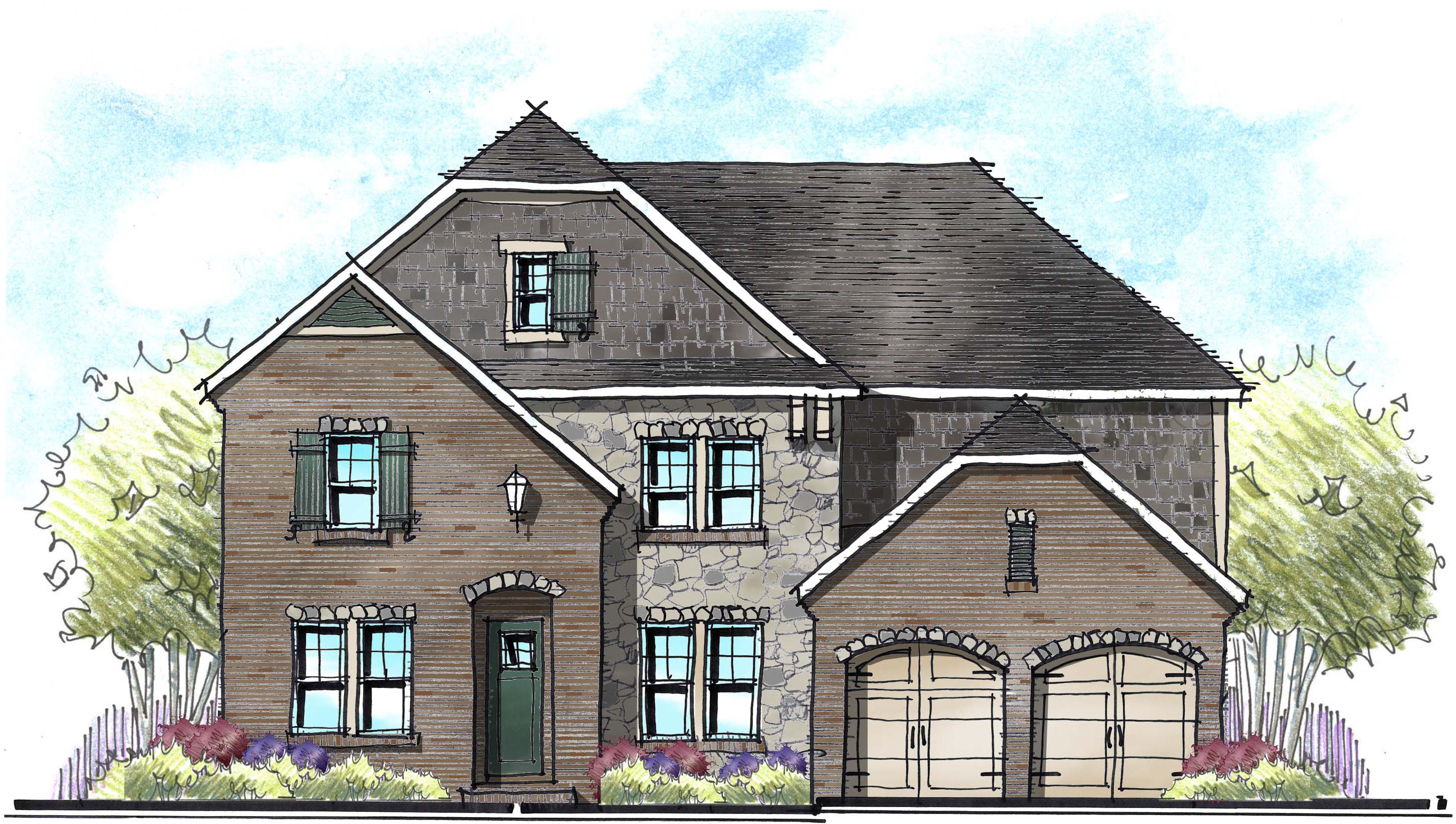
Develop a Vision for the COMMUNITY
Pre-plotting your community can ensure that your streetscape is rich, varied, and harmonious – not at all cookie cutter! I’ve seen it time and time again, put in the work ahead of time and you will be rewarded with sales.
Categorized in: Trends in Design
This post was written by Housing Design Matters
