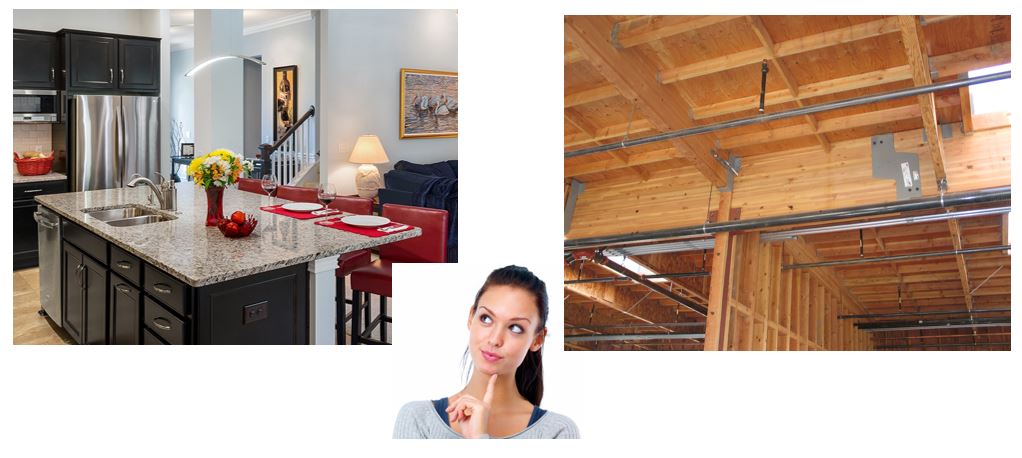
What is on your home buyer’s wish-list? Quartz counters? Beautiful light fixtures? Your client is practically foaming at the mouth. How about a giant glulam beam instead? Talk about a punch to the gut.
Last week, we talked about adding value from the consumer’s point of view. This, to put it plainly, makes your houses desirable. Now that we’ve captured the home buyer’s attention, the house needs to be affordable so they can actually afford those upgrades. How do we deliver a home with all of the must-haves without breaking the budget? Cut out the hidden costs!
Minimize Beams
Which do you think your buyers would rather pay for; a giant beam spanning the entire width of the garage or an upgraded countertop in their kitchen? I think we all know the answer to that one.
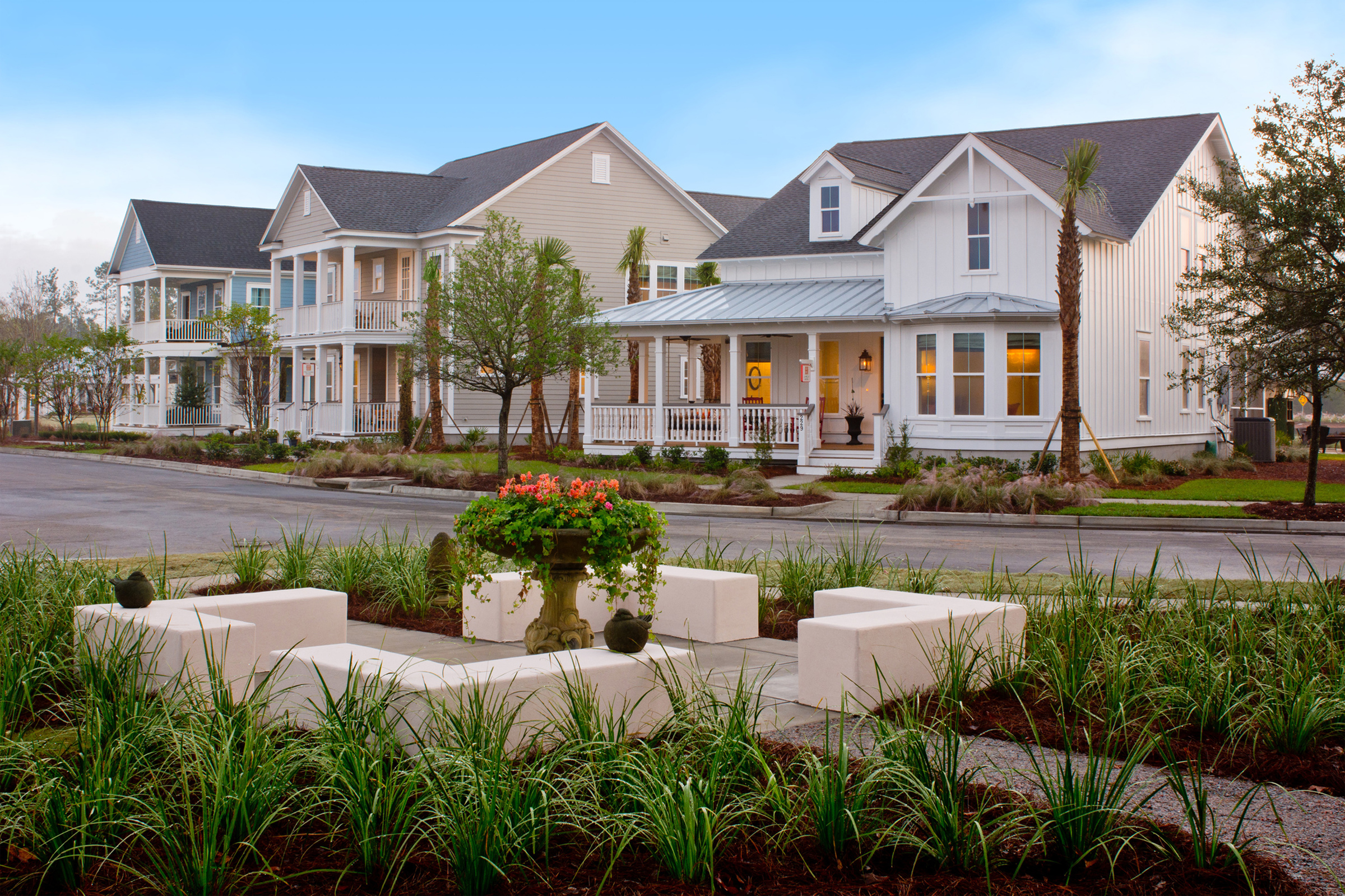
We have to respect gravity and its impact on a house – particularly when it comes to cost. Consider stacking the entire second floor over the first floor and creating a two-story box. Make it cute by adding a front porch. The front porch beam is a lot cheaper than the one holding up the second floor. In addition, you’ve now added outdoor living which buyers love.
Avoid Snout Garages.
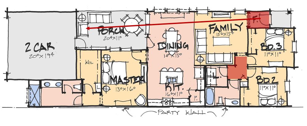
I cannot stress this enough. Snout garages are ugly and cost more to build. Below are two 50’ wide house footprints; both 2000 sq. ft. with two car garages. The snout garage has an additional 240’ of exterior walls than the more compact integrated garage. If that exterior wall is clad in brick at $6 per square foot, you’ve just tacked on an additional $1,500 to the price of the home for something that’s uglier and could have been avoided. How does that make sense?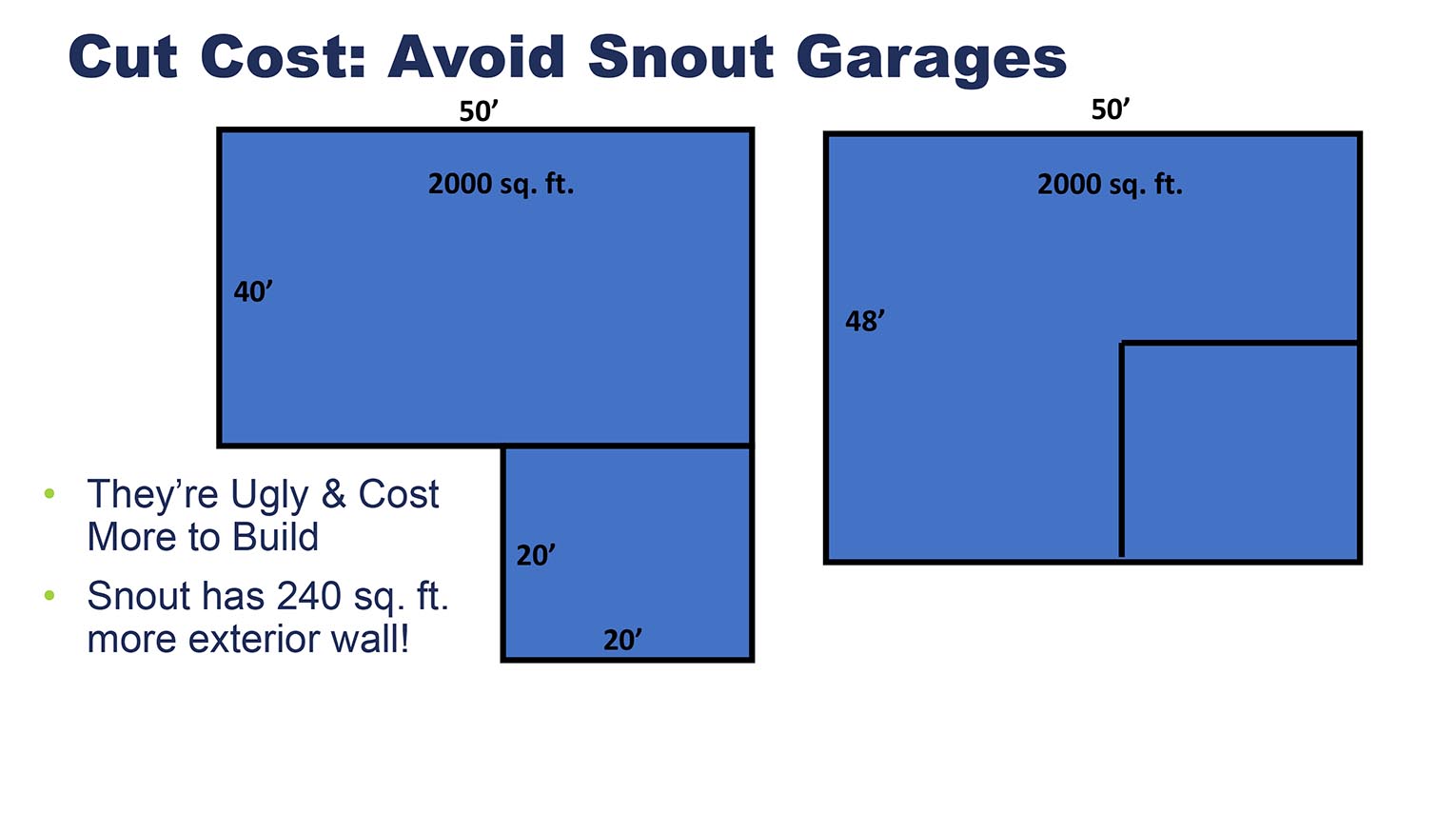
Minimize Circulation
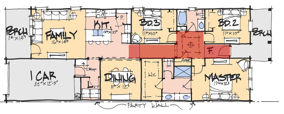
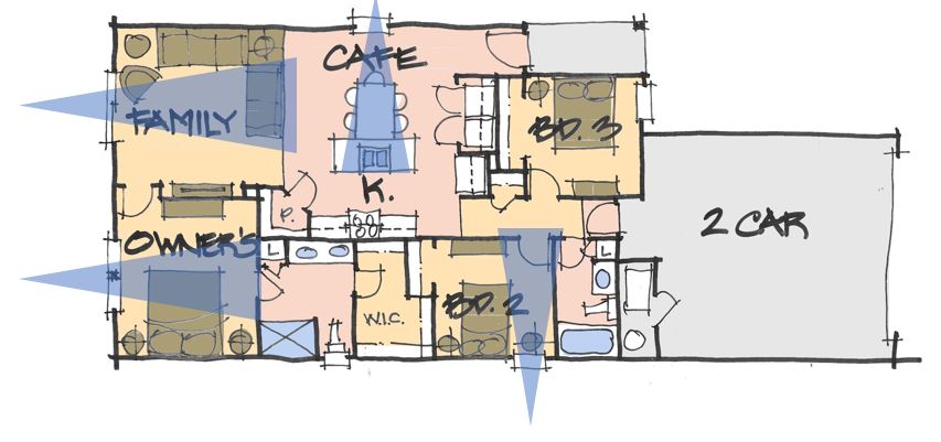
Have you ever taken a marker and highlighted the amount of circulation you have in your plans? It can be eye-opening. Buyers don’t want to pay for hallways.
Instead, consolidate the square footage and create long site lines (see below).
Minimize Windows while Maximizing Natural Light
It’s no secret that designers are obsessed with the power of windows, but they are expensive; especially energy efficient windows. Even the most energy efficient windows add to your heating and cooling load. So, it is important to limit your windows while maximizing natural light. Balancing the two conflicting principles requires being strategic with your window placement.
- Place windows where they benefit you most. I like to see natural light when you first walk into a house. It draws the buyers in, makes the house feel larger, brighter and cheerier. Let’s face it, we’re not selling to vampires. No one sets out to buy a dark, dreary house except for Count Dracula.
- Line windows up with doorways to let natural light from a bedroom spill into the hallway. Now, one window is lighting two rooms.
- Two windows together expand the space visually more than two window split apart – say on either side of the bed in the master.
Cutting the hidden costs gives consumers the opportunity to spend their money on their actual wish-list. When they look at less efficient homes and realize their budget is going towards beams and hallways instead of upgraded countertops and floors, they’ll come running back to you.
Next week I will talk about the third strategy from my IBS Budget Friendly presentation by talking about great looking and cost-effective elevations. I can’t wait to share my thoughts on that! Until next week – thanks for including me in your day!
-Deryl Patterson, AIA
Categorized in: Value Engineering, Value is Not a Dirty Word
This post was written by Housing Design Matters
