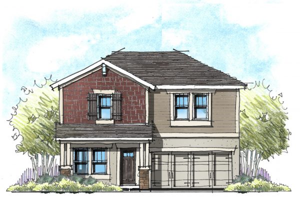
At the risk of stating the obvious: Houses should not be ugly – even budget friendly ones. I once had a builder say to me, “These elevations look too good. We can’t possibly afford them.” But when we examined the parts and pieces, nothing was outside the budget. He was just used to cheap houses looking ugly. It doesn’t have to be this way!
It starts with style
Last time I checked, “cheap” is not a style. Don’t get so focused on making the house affordable that you ignore the fact that the homeowner wants a house they can be proud of. Determining which styles you can afford starts with roof pitch and exterior materials.
Roof Pitch
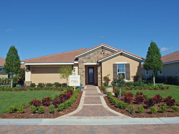 First and foremost, a lower pitched roof is more cost effective than a higher pitched. If the market will accept lower pitched roofs, here are a few styles that are comfortable with a lower pitch (4/12 to 6/12):
• Craftsman
• Mediterranean
• Prairie
• Spanish
• Tuscan
If your market wants a Farmhouse or French Country – styles that are more comfortable with higher pitched roofs – consider a dual pitched roof. A lower front to back pitch can help keep the cost down so you can better afford the higher side-to-side pitch that these styles (and home buyers) demand.
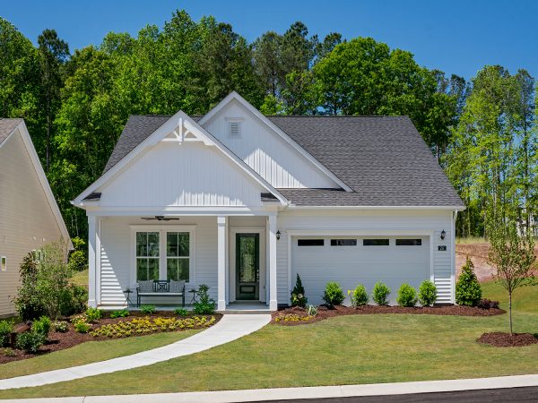
In high wind-load markets, you’ll find hip roofs more cost-effective than large gable ends that double as wind sails.
Exterior Materials
This again might sound redundant, but in all-siding markets, stick with styles that encourage siding!
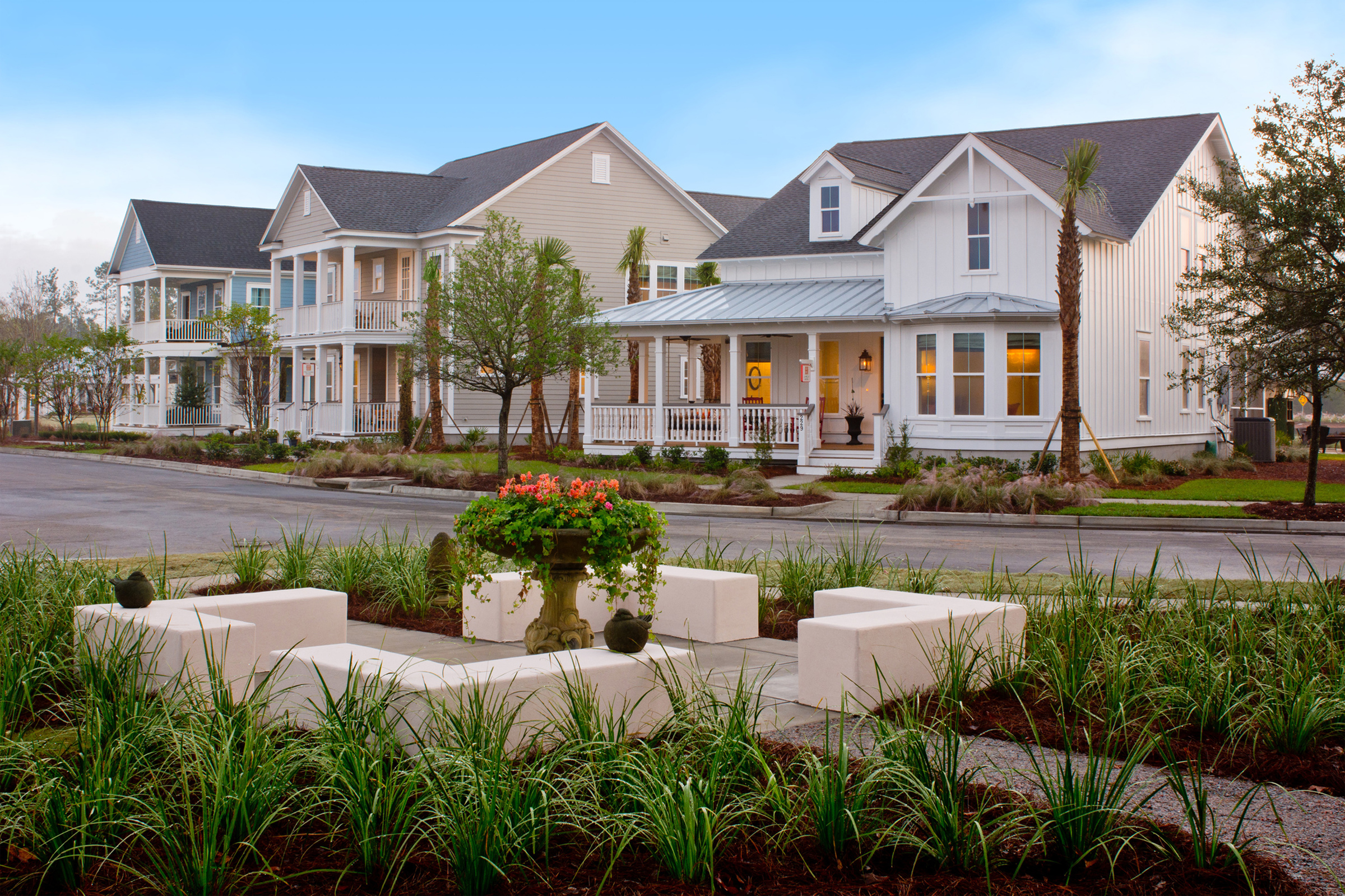
• Low Country
• Traditional
• Farmhouse
Consider a variety of siding profiles and finishes and highlight the different siding with different colors to add animation. Craftsman is another siding-dominant style, but be careful not to use too many shake shingles. Masonry accents can be limited to the base of the porch pier.
Exterior maintenance should also be considered when selecting exterior materials. The old plywood siding from the seventies (T1-11), while cost-effective, didn’t stand a chance against the Florida humidity. This resulted in wood rot, termites and mold. One value-oriented builder in just-as-humid Alabama selected locally sourced brick because he knew the residences of his workforce housing didn’t have the time to pressure wash the north side of homes where green mildew thrived.
Keep IT Simple
Keep the main body of the roof simple so your roof isn’t too chopped up. If you’ve done your homework with cutting hidden costs (as we discussed last week), then you should have a little money for the elevation.
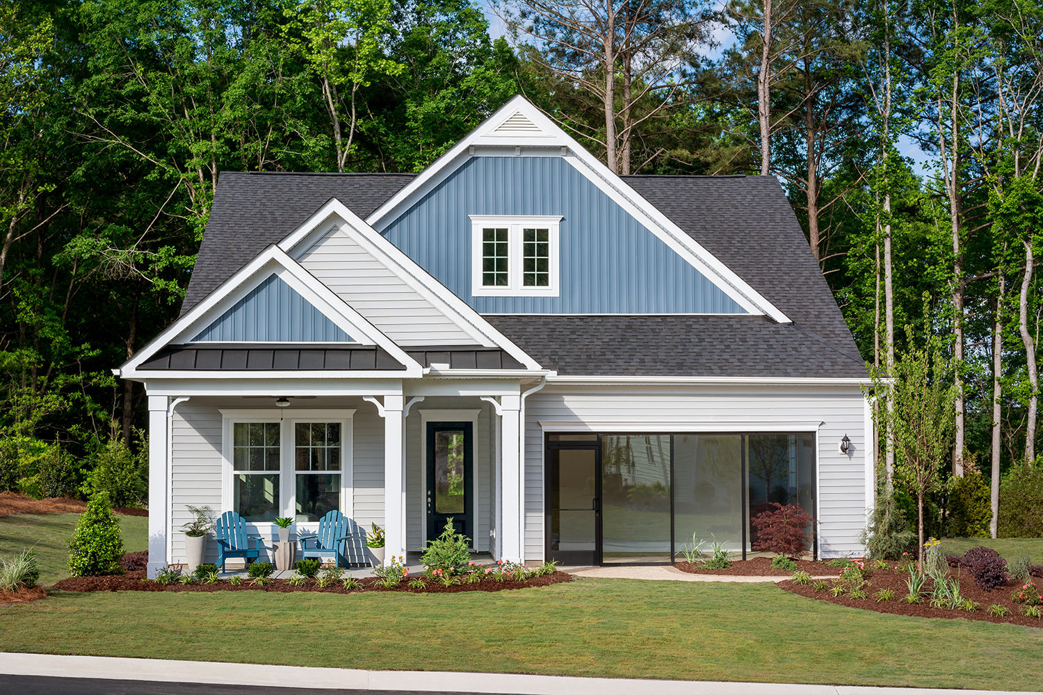
Always keep scale and proportion in mind. A simple box with a single gable can be very powerful, especially highlighted with the right color and materials. If you avoid a garage-forward (snout) elevation, this allows you to highlight the part of the home where the people live – not the cars!
color, texture and materials
Color, texture, and materials can and should be used to add animation to a simple, cost-effective house.
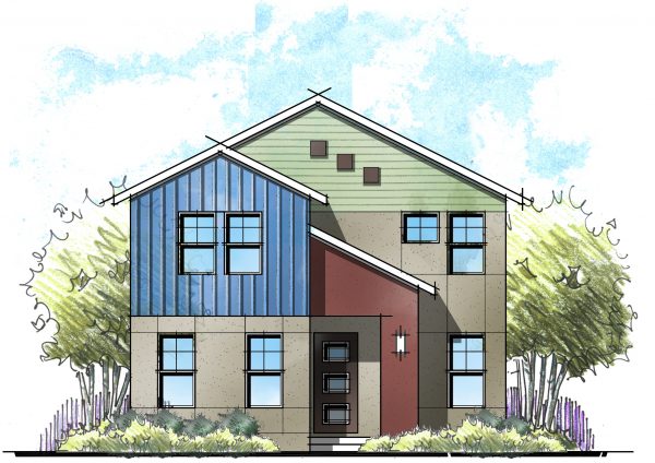 When you use a different material or siding profile, accentuate the change with color. Even a home with just one material – ie: stucco – can benefit from a main body and second body color.
- Try to change your colors and/or materials on an inside corner for a clean transition.
- If you’re using masonry accents, consider the height of the proposed landscaping. No sense paying for the expense of brick below the windows, then paying again to cover it up with plants. Consider adding the masonry in a single panel above the bushes.
The Bigger Picture
Now that you’ve figured out how to make each elevation cute and cost-effective, step back and consider the entire streetscape. Perhaps you offer a variety of styles that add diversity from house to house. If you’re offering four houses with three different exteriors, consider using four or five styles for the entire collection. You can still offer three different elevations for each house, but not every house will offer the same three styles. The result will be a much better community and streetscape, making those last few lots much easier to sell.

Remember, we’re creating places for families to live, grow and prosper. We can keep costs in check without sacrificing the American dream. Affordable shouldn’t mean ugly! In fact, I’d argue that we’ve demonstrated it can be beautiful!
In our industry, the rock star builders and designers I work with (you!) and I have the opportunity to improve the lives of a significant portion of the population. Instead of building future tear-downs, let’s build communities with a legacy worth holding onto.
Categorized in: Value Engineering, Value is Not a Dirty Word
This post was written by Housing Design Matters
